Thursday, December 13, 2007

The Crusaders of Milan?


I don't really know what to say about this story. Apparently a lawyer in Turkey has decided to sue Italian giants Inter Milan for "offending Muslim sensibilities" with their current centenary shirt. The lawyer argues that the red cross on the shirt is a symbol of the Crusades and the "bloody days of the past." Never mind that a red cross on a white background has been the city of Milan's symbol for hundreds of years. I wonder also what that lawyer would think of this or this. I just hope that this story doesn't blow out of proportion and we have some crazy s*** happen like what happened with those cartoons.

Sunday, December 2, 2007

How to Buy and Care for a Football/Soccer Shirt

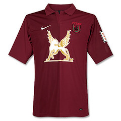
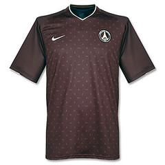
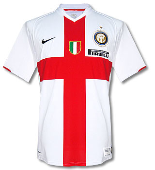
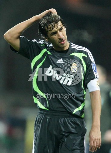
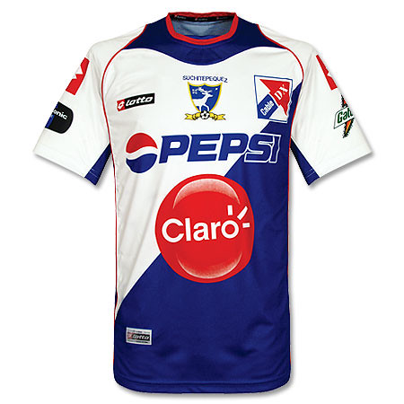
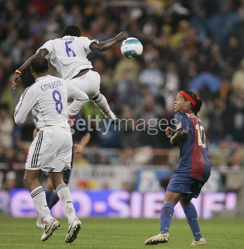
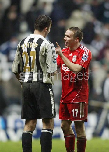
I am not only a connoisseur/admirer of football shirts, I am also a bit of a collector and a wearer of them. Over the years I have had a lot of experience with these shirts and how to care for them. There are some small, easy steps you can take to assure the longevity of your shirts. They are, after all, quite expensive nowadays, quite delicate, and I have never been one to buy my favorite club's shirt with every new edition that comes out. One caveat: here I am talking about shirts that where made post 1987. I really can't tell you much about shirts that where made before then, because as I understand the history of football shirts, different fabrics where being used before then. Furthermore, my attorneys have advised me to add this disclaimer: any information in this post is for entertainment purposes only. The footballkitblog is not responsible for any damage that may be done to your shirts from following this advice. So without further delay, here is a look into my treasure trove of knowledge:


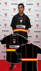
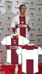
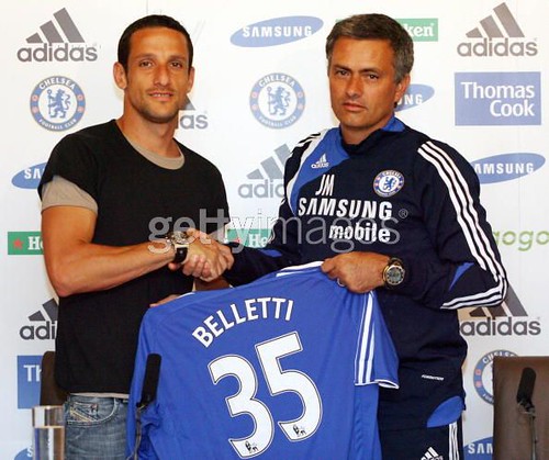
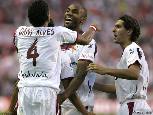
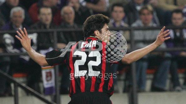
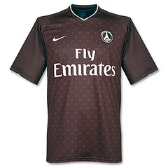
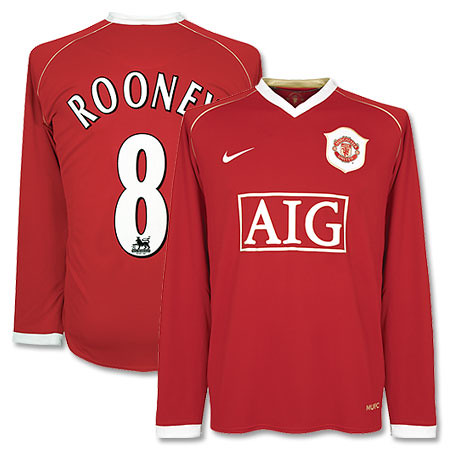
1. You need to start taking care of your shirt before you even take it out of the store. I've been to the club shops of a couple of big clubs, including AC Milan, FC Barcelona, Real Mallorca, Paris St. Germain, Marseille, and Ajax Amsterdam. I've also gone to a lot of other sports stores throughout Europe. These shops are an absolute dream for someone like me who is from the States and digs football. Aside from having all the gear they can also customize your shirt with any name/number you choose, and they do it right in front of you. Here's where you have to be careful. If you choose to buy a shirt and then have it printed, you have to make sure that it does not get folded too quickly afterward. The heat press that puts the name & number on the shirt makes the material they are made of very soft and malleable. If you fold the shirt while the numbers are too hot and let it cool folded, the name and numbers will always have big creases in them which you will never be able to do away with. It will even affect the way the shirt hangs on your back. The workers at these stores (if they are knowledgeable) will tell you that about 5 minutes is enough, but I say give it at least 10–15 minutes. I know you don't want to look like a jerk holding up your shirt in the middle of the store for 15 minutes, but this is really critical. If you can, try to find a place to lay the shirt on its front for that amount of time. If you are going to be walking around with the shirt for an extended period of time, try to fold it so that the number is not folded.

The few times that I've ordered printed shirts on the web, I haven't had any trouble with the numbers being creased. I suppose it all depends what online store you use.


2. This one may sound obvious, but don't get your shirt too dirty. These shirts can get discolored and damaged very easily, and you will enjoy them longer the less that happens. Don't smoke with one on if you can avoid it. Aside from the smell, one tiny cinder can make a hole in a football shirt a lot faster than on a cotton shirt. If you go to the movies and order some popcorn, take the shirt off and fold it, and put it underneath or behind you (for the sake of your fellow moviegoers, don't do this unless you have an undershirt). Popcorn is greasy and in a dark theatre kernels can easily slip out of your hand onto the shirt. Presto–you now have a permanent grease stain. These grease stains seem to be a lot more visible for some reason on football shirts.


3. How you launder your shirt is the single most important thing you can do to maintain the long life of your shirt. No matter what the color, ALWAYS wash your shirts in cold water, and if you can, use the washing machine's delicate setting (not absolutely necessary). Hand washing is even better, but I know that if you are on the web, then you probably have access to a washing machine. Try to use liquid detergent. Powdered detergent leaves a residue sometimes. For the love of God, NEVER, NEVER use any type of fabric softener when washing your football shirts. Fabric softener makes them permanently wrinkled. No matter what you do, you will never really be able to fix it. Also, NEVER, EVER put your football shirts in a dryer. For best results, you have to take the shirt out of the wash IMMEDIATELY after the machine's washing cycle has stopped. If you let the shirt sit in the wash for a while, or if you machine–dry it, it will also become permanently wrinkled (although not as bad as if you use softener). After taking the shirt out of the wash, dry it completely on a hanger or by laying it flat on something before folding it. Don't iron your shirts. If you want to try it, use a cold iron, but I have found that this is pretty useless.


4. Don't wear a back–pack/ruksack on top of you football shirt. The constant rubbing of the shirt in between your back and the sack is abrasive on these delicate shirts. This causes those tiny little bubbles that will appear on football shirts over time. Also, try to avoid wearing anything with velcro© as it sometimes catches on the shirt and causes ugly snags.


5. Lastly, don't buy football shirts on ebay unless you are prepared for the shirt to be a fake. My experience has been that 90% of football shirts (especially recent releases) sold on ebay are fakes, no matter where the seller is from. If you are dead–set on buying one there, make sure the seller tells you it is 100% authentic. Ask questions and be specific. For example, "Are you absolutely sure that this shirt is 100% authentic AC Milan Adidas replica?" Also, try to get the seller to guarantee your right to return the shirt if you think it's a fake. Fakes are getting so good nowadays right down to the tags, but there are always telltale signs. Mostly though, you can't tell a good fake from a real shirt unless you are comparing them side by side.


So there it is. I know this guide would have been useful to me when I first started buying football shirts 20 years ago. That's what the web is all about right, the sharing of information. Enjoy and good luck with your shirts.

Thursday, November 29, 2007

A Bad Gamble

I'm disturbed by a recent trend that's been occurring in football, mostly in Europe. That is the trend of gambling websites sponsoring teams on their shirts. Some prime examples have been Sevilla, Real Madrid, Werder Bremen, and my beloved AC Milan (Werder has since switched to Citibank as its sponsor). While I personally don't have anything against gambling per se, I believe it is a mistake for sports leagues and clubs to align themselves so closely and overtly to big-time gambling interests.


I come from the U.S. where gambling on sports is illegal in most places but there is never a problem if you want to place any type of bet. I will admit our sports leagues take a very hypocritical stance on gambling. They try to act like they are against it while encouraging and even catering to it. But I almost think that is the best approach. When you so closely embrace gambling on sports by letting gambling businesses advertise with you, you are essentially endorsing it. And if it is legal as it appears to be in Europe, then logically those folks that might have been discouraged by the illegality of it(yes, there are actually people like that) will now not have that concern. Gambling on sports will become exponentially more rampant. The main problems with that are 1. that the unfortunate truth is gambling is a serious problem for a lot of people that ends up ruining a lot of lives, and 2. gambling has called into question the integrity of many sports throughout the world at different times throughout history. Football may be gambling's biggest victim. And no club has been involved in more scandal than AC Milan, who had to endure a match fixing scandal in 79/80's as well as in 2006/07. Match fixing happens because of gambling. So why the club would now have bwin as their sponsor is just baffling to me. Milan along with Real Madrid are supposed to be two of the classiest operations in world football, yet are accepting advertising on their sacred shirts from an industry that at best is a human vice and at worst undermines the integrity of the game. It leaves me scratching my head.


I guess this is something that is here to stay, but I just wanted to put my two cents in. I want to keep the social commentary to a minimum here, but at the same time this issue cuts to the heart of the games we love so much. Hopefully this trend won't become too wide spread.

Monday, November 26, 2007

You Could Set Your Calendar to This...


It is that time in the football kit cycle, when just before a major competition (in this case, Euro 2008), national sides introduce their new kits that they will wear for the next couple of years. There have been a whole slew of new national team shirts that have been released over the past few weeks. Many of them debuted during the last round of Euro qualifiers. Here are some of the highlights:

Adidas released new shirts for Germany and France, and I have to say both of them are quite nice. Looks like someone at Adidas was listening when we told them to ditch the boring templates. I especially like how the main design accents on the shirts reflect the respective cultures. The German design is rigid, with a lot of straight lines and seems to evoke the concept of moving forward together. Meanwhile, the French design is more artsy and the design seems to be splitting off in different directions. Sounds like France to me. Adidas also released a new shirt for Argentina, which is pretty basic and classic. Argentina almost always has a boss shirt.

Puma also released a bunch of new away shirts, for Austria, Czech, and others. Sad to see that Puma have adopted the former strategy of their German brethren Adidas with that template. It's pretty boring and lazy if you ask me. One exception is Italy's new away shirt, which I dig, except for that whacked–out font(you can't really tell from the photo, but trust me, it sucks–especially the lettering).

Nike also released some shirts, notably Brazil's new home and Holland's new away. Brazil's new shirt doesn't really do anything for me, but that new Holland away is really nice. It was always going to be tough to duplicate the success of Holland's previous away shirt, which was absolutely gorgeous. But Nike have done a pretty good job here.

All in all, it is a pretty successful period of kit releases as there was nothing absolutely horrible released, and we are heartened by Adidas' apparent ditching of the templates. Bravo.


footballkitblogupdate: looks like despite coach Hugo Sanchez's rantings about changing Mexico's home shirt from green to white, el tri will still be decked in green most of the time. They just released the new home shirt, and it is green. I wonder what that will do to Hugo's ego.

Wednesday, October 3, 2007

Blacked Out


I was looking at this image of last night's Champions League match between Glasgow Rangers and Olympique Lyon in Lyon when I noticed that Rangers usual "Carling" advertisement had been blacked out. I was very curious about this but I was too tired and lazy to look into it. Well, thanks to the fantastic uniwatch blog I now know why this was done. It turns out that advertising for alcohol on football shirts is banned in France, so that's why Rangers had to black out Carling, which I believe is a beer. Ahh, the French.
If you ask me, it would have looked better just to leave the logo off completely for this match instead of having a big black rectangle on the front of your shirt.

Saturday, September 22, 2007

Someone Should Get Fired For This

Very interesting and bush league development in a French Ligue 1 clash between Marseille and Auxerre last night. Apparently the change strip that Marseille brought with them(they were away) was too similar to Auxerre's home design. So match officilas ruled that Marseille had to wear Auxerre's away top. What a complete fiasco if you ask me. More pictures here and here.

Cuauhtémoc en Blanco

So according to this article the Mexican national team is going to switch their home jersey from green to white. The change is being made by Mexican coach/legend Hugo Sanchez, who says that the green shirts blend in too well with the pitch and therefore the players cannot pick each other out as well. In fact, Sanchez is going to do away with the green shirts altogether and introduce an all-red kit as the away. This is the first time I can think of that an established national team is going to change the primary color of their home shirt. Mexico has been using green shirts forever, so this is really a bold move. On a purely aesthetic level, I believe the change is great because an all-white kit will always look better than a green one. This is yet another sign that Mexico is an up and coming nation among the soccer powers.

Tuesday, September 4, 2007

Different Day, Different Kit


It's common nowadays for clubs to have a 3rd kit. The 3rd kit is a kit that is used when neither the home or away are used. Some teams even have a 4th kit. But what is going on at Sevilla FC has to be unprecedented.


Last week we showed you Sevilla's new home, away, and 3rd kits for the 06/07 season. All well and dandy but on Friday I watched Sevilla play my beloved AC Milan in the European Super Cup. Sevilla wore a kit that is none of those previous kits. It's similar to the home in that it has all-white shirt and shorts, but other design elements are completely different.OK so that is the 4th kit. Then on the following Monday, Sevilla wore this against AEK Athens in the Champions League. So if you are keeping score at home, that is at least 5 different kits they will wear this season. Who knows, maybe they will wear yet another kit in their next match.


Actually, Maybe they will. After a little digging around I discovered that these two shirts are what Sevilla calls their "previa Champions" kits, meaning pre-Champions. I guess they are only going to be worn during the qualifying round of the Champions League, but who knows. What is for sure is that makes a total of 6 kits.


The kit they wore in the Super Cup was a one-off special edition for that event. It just shows you the difference in pedigree between Milan and Sevilla that Sevilla would get a special kit made just for the occasion. I could understand if there was a conflict between Milan' shirts and all of Sevilla's kits, but that is not the case here. It's almost as if Sevilla is celebrating just being there while Milan is there to take care of business. This one-off kit stuff is not new for Sevilla, they did the same thing for last year's UEFA Cup final. It's all a bit much for me.


That being said, the Super Cup kit is my favorite of the lot, with the all-black number running a close second. In fact, all the designs are pretty good except for the awful, vomit-inducing fuischia outfit. I've said it before pink is not necessarily bad, but that shade of pink belongs nowhere on any sporting field.

Saturday, September 1, 2007


Very Nice Tribute in Today's European Super Cup final between AC Mian and Sevilla FC. All the players on both teams wore the name "PUERTA" in honor of Sevilla's Antonio Puerta, who passed away this week after collapsing on the pitch. Milan won the match 3-1.

Friday, August 31, 2007

Adidas Is Ruining Football

Adidas has been ruining the game from an aesthetic point of view. I know they have been a pioneer in football kit design for many years, but recently they have been coming out with some awful designs. Then they exacerbate the problem by using these crappy designs as templates that they use for many different teams around the world. Let's be honest a lot of these shirts look like training shirts. I mean it's friggin' ridiculous. They are taking all these football federations and clubs for granted. I mean some kid at Parson's could come up with something better than this crap. Say what you want about Nike, they were innovative this past world cup by ditching the templates and giving each team their own identity. The other major kit manufacturer is using templates. Templates, templates, templates. It's like if you are an Adidas-supplied team, you're getting one of 3 templates and maybe if you're lucky they'll embellish it a little bit. If you agree with me, leave a comment and hopefully someone at Adidas will read this and get the message. You are dressing some of the greatest teams in all of sport. Give them their own individuality. And not every single shirt has to have those damn stripes running down the sleeves. And if you do have to put the stripes on there, they don't always have to be contrasting. I've seen regular Adidas gear where the stripes are not contrasting and that looks pretty cool. Sometimes the best type of branding and marketing can be subtle.

Saturday, August 25, 2007

2007/2008 kits: An assessment


Now is the time of the year that clubs all over Europe release their new shirts for the upcoming season. I'm sure many of the die-hard football kit enthusiasts have already seen some of the designs that have popped up on the web and are slowly being introduced on the pitch. There have been some interesting designs, and I think the time is right for a report:


Some of the Worst - Let's start with the bad news. I think that Man. United's new home shirt is classy enough, but last year's shirt was nice and simple too, in fact, very similar to the new design. So why fleece your supporters so disgracefully by changing kits after just one season? It's just so unnecessary and anyone who buys both of those shirts is a sucker. Tottenham Hotspur released some really smart designs, but they should have kept their gorgeous brown shirt(trust me they looked better in action) , which was only in use for one season. Not that Arsenal's new designs aren't nice, it's just that they are a little boring for a team that has had some great kits. At least all of these teams have not fallen victim to those awful templates that are the bane of football shirt design. It's depressing how many teams and goalkeepers have that squiggly thing on their shirts.

Barça's new away shirt is pretty bad. The greens used are ugly, which is the main problem with the shirt. Sevilla keeps insisting on that putrid fuschia outfit(although that white shirt with the red slash looks pretty sharp). Borussia Dortmund's new home shirt looks OK in pictures, but I'm sure in on the pitch they will make the players look like giant bumblebees, not a good thing.

However the most disappointing development is over at my beloved AC Milan. that home shirt is really bad. It just breaks my heart because Milan haven't had a decent home shirt for years now. The new number font is bad too. A club as great as Milan doesn't have to resort to that futuristic B.S. Mr. Berlusconi needs to fire someone for this fiasco.

On a funny aside, this disgusting thing reminds me of the Islanders (of the National Hockey League) "Fishstick Guy" design in hockey.


The Best - While adidas continues to try to make all clubs around the world look the same, there are some good designs that stand out, mostly from other manufacturers. Inter's new centenary shirt is really nice. Parma also looks good in the same design. I also like the new Manchester City designs. Real Madrid kept it simple as always. while Chelsea took a bold step in color. Very loud yes, but I'm not sure I don't like it. And boy do those new Premier League numbers look snazzy. And with the way the match up with the font of the Premier League wordmark means teams in England just took a major step up sartorially. All in all not a groundbreaking year for kit design but things can always be worse I suppose.


football kit blog Update: Khalid Boulharouz was loaned away from Chelsea, which means we no longer have to put up with the uncomfortable sight of seeing a defender wearing number 9. Now if only William Gallas would be so kind as to oblige.

Wednesday, July 11, 2007

David Beckham Will Wear 23 at LA Galaxy

There's been no official announcement yet, but it looks like David Beckham will wear #23 on the LA Galaxy. I was perusing through their team shop and noticed that they are already selling a t-shirt with "BECKHAM 23" on it. I must say that the new LA kits are classy and I'm glad that adidas didn't use that horrible squiggly template.

Friday, June 15, 2007

Digging in the Vaults: Atletic Bilbao Centenary Shirt


This little number is the Athletic Bilbao centenary shirt from 1998. I really like this shirt, I know it's really loud, but I don't really care. Bilbao's Basque-only policy is pretty admirable and they are one of only 3 clubs in Spanish football (the others being Real Madrid and Barcelona) that have never been relegated (that is in jeopardy at the moment). Perhaps best of all, they are one of a few clubs that don't wear any ads on their jersey. I hope they stay in the Primera Liga so that the no-ads policy can continue. I'm sure that if the club loses the revenue of not being in the top flight, they might compensate by getting a sponsor for their shirt.

The jersey is made by Kappa, whose male/female logo is pretty cool. Their logo is sewn on the right chest as well as running up and down the sleeves. The shirt is also a departure from the usual Bilbao home shirt, which has red and white vertical stripes. There is a huge dragon-like logo on the front of the shirt, and the back looks like the the back of the dragon if you look at it from the right angle. On the back of the shirt is the name and number of Bilbao stalwart Joseba Etxeberria. To top it off there's a special logo commemorating the centenary on the collar placket. This article says that Bilbao also had a second Centenary shirt in 2004, which looked like this. Not sure how they can have two centenaries but I have to say that second one is pretty hideous.

Sunday, June 10, 2007

Catalan Controversy


There was an interesting football kit related incident in last week's international friendly between Spain and Latvia. It seems that two players on Spain's team, Xavi and Carles Puyol, turned the top of their socks inside to hide the trim which is the color of the Spanish national flag. Xavi (#8) and Puyol (#5) are both from Catalonia, which is fiercely proud of being an "Autonomous community" within Spain. In this article, Xavi says that the suggestion that he and Puyol did this deliberately as a show of Catalan unity is to start a "ridiculous and malicious debate(s)." The photo from the match above shows that this has to be more than a coincidence. I personally dig it, and if Catalonia really is autonomous , UEFA should let their national team, which already plays friendlies, to play full internationals. It would be interesting to see how an all-Catalan team would do on the international scene.

Tuesday, May 15, 2007

This is Rumored to Be...


...The much-anticipated new LA Galaxy shirts. The image circulating on the web seems to be legit enough, if not it's a very good fake. The logo is another matter entirely as it does look somewhat amateurish. So who knows, we will just have to wait and see how this plays out. I wonder if Becks has any imput?

Wednesday, April 18, 2007

Preview of Premiership's New Names & Numbers


It looks like England's Premier League will launch their new name & number system on May 15th. I found this neat graphic illustrating the change, which I definitely think is a huge step forward. The new numbers are a lot more sleek than the previous version. The change also addresses one big problem with the old font, which was that the 1 and the 7 looked very similar. Kudos to England, I think these numbers look so good, I'm willing to overlook for the time being that England doesn't have an "open" shirt number policy. I'm strongly in favor of teams being able to choose their own fonts, but I also believe there needs to be some regulations and oversight so the disaster that Sevilla FC has been this season can be avoided at all costs.

Wednesday, April 4, 2007

Ajax Switch Things Up


On April 1st Ajax Amsterdam in a match against Heracles wore a special one-off kit. I noticed it on Tuesday when I was watching eredivisie highlights on Fox Soccer Channel. The kit is identical to the one they usually wear in the Dutch league save for the advertising on the shirt. For God knows how long Ajax have been sponsored by Dutch bank ABN-AMRO. In fact the only other sponsor I could think of Ajax having was TDK way back.


I couldn't make out what the advertising said on the highlights so I did a little digging and found out it was a one-off shirt to introduce ABN-AMRO's new mortgage branch Florius. The whole story can be found here. Also mentioned in that piece is that Ajax have done this before in 2003, which I didn't know about. There's not much to say about the change since it's not really a major one. The most important thing is that they preserved the tradition of aligning the lettering on the Ajax shirt vertically. Tradition is good.


Another interesting note from Holland is that Feyenoord has introduced their new kits for the 2007/08 season. Not much of a change on the home, but the new away kit is quite new and fresh.

Monday, March 26, 2007

MLS Gets With The Program


On Friday, Real Salt Lake (RSL) became the first MLS club to announce a front-of the-shirt sponsor (something called Xango). Technically, the New York Red Bulls were the first to do this last season, but their case is a little different because the entire team was purchased by the company that owns Red Bull and re-named ( A quick aside on Red Bulls, they need to tone down the size of that ad, that thing is way too big). RSL was followed by LA Galaxy and today by Toronto FC, who released their first ever kit sponsored by BMO Bank. I'm sure there are soccer fans here in the States and Canada that are up in arms about this development. We (and when I say we I mean me) here at footballkitblog hold a different, more pragmatic view. I believe this is a positive development for American soccer on its road to legitimacy.

Since its inception in 1996, MLS clubs have worn advertising on the back of the jersey, with the team name usually on the front. Of course, the rest of the football/soccer world wears ads on the front of the jersey among other places. This difference along with some others (the "breakaway" tie-breakers, the loud colors and cartoonish nature of most of the jerseys and logos, the huge, empty stadiums) differentiated the American game, and frankly, we were a laughingstock. Recently MLS has made strides towards putting out a better product, and putting ads on the front of the shirts is another step in the right direction. The advertising on the shirt boat has sailed, kids. Now our clubs will look like real football teams.

As far as the new Toronto shirt is concerned, I think the colors are pretty nice and the ad for BMO is done tastefully enough, and at least adidas used the least unattractive or their latest crappy templates. More on how adidas is destroying the game soon to come. I'm curious to see what LA Galaxy is going to do, they are due to release a complete re-design of their look soon. I hear that either black or navy blue will be used as one of the team colors. Anything is better than the puke-a-thon they've been wearing.

New U.S. 3rd Jersey Makes Its Debut


The new United States 3rd made its debut today in an international friendly against Ecuador. The jesey was paired with a blue short. I wonder why they didn't use the white short which I think would have looked much better. Also, Ecuador wore blue shorts, so the U.S. had a ready made excuse to wear the white shorts. I guess they intend on using the white shorts as change shorts, which is unfortunate.

The jersey proved to be lucky today as the U.S. won 3-1 on the strength of a hat-trick by Landon Donovan.

I personally think the jersey looks pretty good. It's true the other jerseys the U.S. is currently using are probably nicer, but this jersey is a nice change of pace. And really, it could be a lot worse. Just look at the horror that Ecuador was wearing.

Wednesday, March 21, 2007

U.S. Soccer Inroduces New 3rd Jersey


The United States national team has released a new 3rd jersey, a royal blue affair with thin white pinstripes. I don't hate the design, but I'm not sure yet if I like it. I have to soak it in a little and see how it actually looks on the pitch. This jersey will make its debut this March 27th when the U.S. takes on Ecuador in a friendly. A few observations:
I like the fact that a royal blue shirt has been re-introduced. The U.S. team has been wearing white home shirts and navy blue away shirts for some time but in the 80's I think the home shirt was royal blue. So the shirt is a throwback of sorts. I mention the 80's also because the pinstripes are definitely an 80's thing.

It seems the shirt will be paired with both royal blue or white shorts and royal blue socks. I think the kit will look much better with the white shorts.

The 3rd jersey is a rarity for national teams. I know I've seen a few national sides wear them, Wales being one other example.

One interesting note from the website: the shirt features "raised nodes on the underside that lift the shirt away from the players' bodies to keep their skin drier and reduce shirt cling." Now, I don't want to come off as a Nike marketing guy but that is pretty badass. That's some future-is-here type of stuff.


More on this story to come...

Friday, March 16, 2007

Is this Football or Racing?


It's disturbing to me when I see certain football clubs go out of control with the advertising on the shirt. Take a look at this mess. Or this. That's a complete bastardization of the kit. While I know these uniforms are not sacred things (well, except maybe a one or two), they are the closest things the fans have to a connection with their favorite club and therfore should be treated with a little respect and reverence.

I've noticed some leagues are worse than others in terms of how many ads they'll allow on the shirt. The French league seems to be unfortunately liberal. I have to give the British credit, I don't think they would ever allow such a thing. There are some scattered holdouts throughout the world that don't have any ads on the shirt. Barcelona caved recently, although it was for a very good cause so you can't really be mad at that. I can think of Vasco Da Gama & Roma off the top of my head that don't have any ads at the moment. I don't mind the ads so much, especially when they don't take up a lot of space on the shirt. There needs to be a modicum of decorum.

Tuesday, March 13, 2007

Before the Advent of Squad Numbers

Many of you know that in the old days, football teams didn't use the squad numbering system that is in use now. For those of us that did know, bear with me on this.

In the old days (probably around pre-1993), football clubs would name a starting eleven, then assign the numbers 1-11 to those eleven players. Then the substitutes would get assigned the numbers 12-16. As an example, this was Milan's staring eleven on Wednesday, March 7 2007 against Glasgow Celtic in the Champions League:


1 Dida

25 Daniele Bonera

3 Paolo Maldini

44 Massimo Oddo

23 Massimo Ambrosini

8 Gennaro Gattuso

22 Kaka

18 Marek Jankulovski

21 Andrea Pirlo

10 Clarence Seedorf

9 Filippo Inzaghi


Milan's lineup would have looked something like this in the old days:


1 Dida

2 Daniele Bonera

3 Paolo Maldini

4 Massimo Oddo

5 Massimo Ambrosini

8 Gennaro Gattuso

10 Kaka

6 Marek Jankulovski

7 Andrea Pirlo

11 Clarence Seedorf

9 Filippo Inzaghi


Certain star players would always remain the same number, but other less established players would get assigned different numbers throughout the season. Generally, the goalkeeper would be number 1, the defenders would get 2 through 5, midfielders 6, 8, & 10, and attackers 7, 9, & 11.

The beginning of the end of the "1 through 11" system was the World Cup and other international competitions, where players were assigned a number for the whole "finals" tournament. Finally sometime in the 90's all the leagues switched to the fixed squad number system. While I have no major problem with the current system, I kind of miss the old days of looking in the match summary and seeing which players got what numbers. For Milan I remember seeing Van Basten mostly wear 9 but he also came off the bench wearing 16. I also don't like how some players are choosing to stand out by wearing high numbers. Case in point Ronaldo with Milan, and Francesco Coco(No pictures available, but he wears #77 or 76). Those numbers just don't look right on a soccer jersey. Keep the shirt numbers low, fellas. Also, clubs are starting to retire numbers, leaving less and less single digits and low numbers available. I think that is ridiculous. We never used to retire numbers in football, why are we starting now? What, are going to start going back and retiring numbers retroactively? Should Santos now retire Pele's 10, or Real Di Stefano's 9? No disrespect to Gianluca Pessotto, whose number 7 was retired by Juventus. But if he deserves that, then there is a list a mile long of players that deserve the same honor. If we don't get this situation under control, we will no longer have any good numbers left. Even stranger is this development of defenders getting numbers usually reserved for attacking players. Like Gallas wearing number 10 at Arsenal and Boulahrouz wearing 9 at Chelsea.

I like seeing who will be Brazil or Argentina's new number 10. So let's keep the squad numbering system because it is pretty useful, but let's do away with this number retiring business. If only it where that easy.

For more information on this topic, check out this page.

Saturday, March 10, 2007

Update: Premiership to Introduce New Name/Number Lettering

Looks like England's Premier League took at least part of my advice and will be changing the font of the names and numbers on the back of all clubs' shirts for the 2007/08 season. Special thanks to uniwatch blog and football-shirts.co.uk for being on top of this.

Wednesday, March 7, 2007

Ricky Strikes Again


This is a good opportunity to put up a picture of two of the best kits in the world, the famous hoops of Celtic and the Rossoneri of AC Milan. I must say that I don't like the "BWIN" advertising on the Milan shirt, it's a gambling website. It's pretty disappointing that a club as prestigious as Milan would stoop to putting a gambling website on the shirts. It looks even worse in light of the Calciopoli scandal.

Anyway, here Ricardo Kaka is flying by a Celtic defender to score the winning goal in Milan's 1-0 extra time UEFA Champions League win over the Bhoys at the San Siro. As a Milan supporter I am very excited about all this, and don't discount Milan in this year's Champions League, they could definitely win it all. They have the talent and are one of the few teams left that is not in contention for their league title, so they can focus on European competition.

Tuesday, March 6, 2007

Digging in the Vaults: SC Heerenveen


Every once in a while we'll go digging in the footballkitblog vault. In the vault there are all manner of unique and interesting football shirts.

Today we're looking at the home shirt of SC Heerenveen, from the Dutch Eredivisie, the top flight of Dutch football. This particular shirt I picked up in Amsterdam in a little store near the Leidsplein. I believe it's the 2006/07 model. It's made by umbro, and there is a red cross on the right shoulder, similar to what England was wearing until recently.

I'm always on the lookout for interesting and unique shirts, and this one certainly fit the bill(Although it is a little gay, oops not supposed to say that). The design of the shirt is vertical blue and white stripes adorned by red hearts. Yes, red hearts. While on the surface it sounds absurd that a football team would put big red hearts on their shirt, there is a deeper explanation. You see, the home shirt is actually patterned after the flag of the Dutch Province of Friesland, where the town of Heerenveen is located. You judge for yourself if that justifies putting those hearts on there. I personally like it but will probably never wear it outside(especially in the states). I also like the tongue twister advertising on the front. It says "VERZEKERINGEN". Say that three times quickly.

Monday, March 5, 2007

Champions League Mystery

I've noticed something different in this year's Champions League. I noticed that a couple of teams in this year's competition that are from leagues with an "open" shirt number policy (see here) have slightly tweaked the back of their home shirts for the Champions League. Take a look at this picture of the back of Barcelona's regular home shirt. Now look at what they have been wearing in the Champions League. Notice any difference? The Champions League shirt has more blue in the back. The red stripes have been practically wiped out.

The second case involves my favorite club, AC Milan. Here is their usual home shirt. Now look at the Champions League version. The numbers for the regular shirt are gold, while the numbers on the Champions League version are white.

In both of these cases I have no idea why these teams would implement these minor changes. I'd like to think it has to do with some special UEFA regulation about making the back of the shirts more legible, but I doubt it. It probably has to do with selling more shirts. I know for sure I've seen the AC Milan shirt for sale with both of the shirt number colors, and I'm sure both Barcelona versions are out there too.

These two teams are the only ones that I know of that are doing this type of thing. If you know of any others or if you know the reason for this, drop us a line here at footballkitblog.com.

Tuesday, February 27, 2007

And the Jersey Goes to...

Since it's Oscar time, I've decided to hand out the 1st annual footballkitblog awards, officially called the Jerseys (aren't' I clever?). There are three categories, best home kit, best away kit, and best keeper kit. The respective winners were able to stay aesthetically pleasing while bringing something new and dynamic to the table. So without further delay here are this year's winners, for the 2006-2007 football/soccer season:


1. Best Home Kit: The Winner this year is Russian club Rubin Kazan. Their 2006/07 UEFA cup shirt is a thing of beauty. It is simple yet distinctive, as any good uniform should be. The burgundy color is striking, a rarely used color in football shirts. But the kicker here is the cool logo on the chest of the shirt. It's some kind of cat-like creature with wings. I'm sure it's an advert of some sort, but I don't know of what. This is possibly the first time a shirt looks better because of advertising. Take that logo away and the shirt becomes quite ordinary.


2. Best Away Kit: The winner is Paris St. Germain. At first glance this kit didn't look like much to me, but on further inspection, it became a different story. See, the small sublimated pattern on the shirt is actually a nod to fashion house Louis Vuitton and their famous "Monogram" pattern. I think that's killer. That, coupled with the fact that the shirt is a maroonish brown which is quite nice. Also, for the first few months, the shirt was available without the hideous "Fly Emirates" advertising that PSG now wear.


3. Best Goalkeeper Kit: This was perhaps the easiest choice of all the categories. This one goes to the Italian national team. Not sure if this was the home or away jersey, but the gold jersey was beautiful. You can see it in action here. hands down, I can't think of another goalkeeper jersey released this year that came close to this.


So there are this year's winners. Feel free to let us know how you feel about the choices, and what if anything you would have done differently.

Tuesday, February 20, 2007

An Open Letter to the Premier League (And the Scottish Premier, and Ligue 1, and MLS)


Most of you know by now that England's Premier League along with a few other leagues around the world have a policy of making all the clubs in the league wear the same shirt numbers on the back of the jersey. For example, Manchester United, Arsenal, Chelsea and every other team in the Premiership wear these numbers. The same is true of the Scottish Premier League along with Ligue 1 in France and MLS here in the good ol' U.S. of A. Let's take a moment to analyze the pros and cons of such a policy and then I'll tell you why we here at footballkitblog are opposed to this policy.

First the pros. Obviously with a uniform code for all shirt numbers, you don't end up with wild variations of shirt numbers. This can be helpful in cases like this, where the team obviously used poor judgement in picking their shirt numbers. Also, since many of the Premier League's clubs also compete in the UEFA Champions League or the UEFA Cup, the teams get to wear different shirt numbers like Man. U., which this year is wearing these numbers in Europe, or Chelsea which this year is wearing this in Europe. This makes for a scenario where many die-hard fans will go out and buy this year's Home "league" shirt and the Home "europe" shirt. The only difference on the shirt being the shirt numbers (and in some case, certain sleeve patches). That translates to a fleecing of the supporters, oops, sorry, increased revenue for the clubs and kit makers. Lastly, I must say that the Premier League's numbers are very well-made and are higher quality that many shirt numbers around the world. The material they are made from seems to be thicker and they have a felt-type of finish. I also like the little Premier League Badge at the bottom of each digit.

Now to the cons. The biggest one is that this uniform policy stifles creativity. I mean c'mon, these Premier League numbers are at least 10-15 years old by now. That means 10-15 years of watching your team in the same old shirt numbers in a sport where shirt numbers are constantly evolving. Just look at this picture of the Spanish Primera League, which has an "open" shirt number policy. Doesn't that look much better than this? And for once can these clubs and manufacturers go easy on the fans? Why make us go out and buy 2 of the same shirt? As far as the bottom of the digits, it's much nicer to have the club badge on there instead of the League badge. Just look at this. In most cases, the league badge is already on the sleeve of the shirt. Yeah, I know the club badge is already on the chest, but it is the club's shirt, not the league's.

So I'm urging the Premier League to look into this matter. If I'm not mistaken, the Premiership was the first to implement the uniform shirt number policy, and surely the other copy-cat leagues would reassess the situation if England did the same. Perhaps a compromise would be to come up with a uniform standard for shirt numbers, in terms of height, width, materials, thickness, number of colors used, etc.

Monday, February 19, 2007

Mexico Releases New Adidas Shirt


Mexico has just released their new kit made by Adidas. I'll let you judge for yourself if it's a step back for Mexico. I put up the new Adidas shirt above the most recent shirt, which was made by Nike. My commentary on this is that to me Mexico is constantly changing their kit manufacturer, at least every couple of years. Off the top of my head I can think of the following brands that have made Mexico's kit in the past 10 years or so: Umbro, ABA Sport, Athletica, Nike, Adidas. My point is that this environment does not provide consistency for the Mexican football aesthetic. They should stick with one brand like most associations do.

Some of My Favorites


Here are some of my favorite football kit designs. This is by no means a comprehensive list. It is also not year-specific, meaning that only the teams that have the best uniforms year-in and year-out are listed here. Eventually I'll do a list of the best year-specific designs. So here they are in no particular order:
#1. Vasco Da Gama - Home/Away: This Brazilian team has a simple yet elegant design in white or black with a diagonal sash. I particularly like the black shirt. This club has managed to steer clear of adverts on the front of the jersey. I also heard somewhere that the club chose its colors of black and white as a symbol of racial unity and that the club was at the forefront of racial integration in Brazilian football. You gotta like that.
#2. Sampdoria - Home: I don't know the story behind this design, but I like it. A royal blue shirt with red and black stripes inside a white rectangle. And in the middle is a shield with a cross on it. The current cut of the shirt notwithstanding, this is a nice shirt.
#3. Boca Juniors - Home: This shirt is famous around the world because of Diego Maradona and the club's many international achievements. The blue and yellow is distinctive and classy. They usually alternate every year or so between a royal blue shirt and a more navy blue design. I prefer when they use the royal blue.
#4. Italy - Home: This jersey has always been simple and classic. I think it's the best example of a country using a color not on their national flag as a primary color on their uniform.
#5. Peru - Home/Away: Maybe you are seeing a pattern. I like Royal blue and diagonal sashes. Seriously, the Peru jersey is very nice. I prefer the away red jersey to the home white. We can also throw River Plate in this mix but I won't put up their picture because I'm a Boca fan!

Welcome to the Football Kit Blog


I'm a football fanatic. When I say football I mean what Americans call Soccer. I love all aspects of the game. I believe that the football/soccer uniform is the best uniform in all of sports. It's simple, practical, and is the most wearable for fans. Some folks won't wear soccer jerseys because they have advertising on them. While I consider myself an aesthetic purist, I realize that advertising is a part of the game, and while most of the best soccer jerseys have minimal to no advertising, certain advert-laden jerseys can still be quite beautiful. Case in point the ABN-AMRO advertising vertically aligned on the Ajax Amsterdam jersey. Besides, the reality of football economics tells us that the advertising helps to pay for the big-name players our teams bring in.