Showing posts with label M.L.S.. Show all posts

Wednesday, October 22, 2014

MLS: Set the Kits Free!


The U.S. likes to go out on its own. We don't use the metric system, unlike every other country in the world. We call our league champions "World Champs" as if the world is confined to our borders. Call it arrogance, call it swagger, it is what it is. Another striking example is our national football league: MLS. Unlike every other major professional Division 1 in world football, MLS forces all of its clubs to wear kits made by the same manufacturer(Adidas).

This is actually general practice in U.S. sports. All the major pro leagues here sell their "kit" apparel contract to one single company, whoever happens to be the highest bidder, of course. The NFL's kits are made by Nike, the NBA has Adidas, MLB has Majestic, and the NHL has Reebok. There are definite benefits to this kind of a system. Uniformity of design standards and distribution channels to name two of the most important. But we here at the Football Kit Blog feel that the benefits are outweighed by the negatives of not having a league in which clubs can negotiate their own contracts.

For one, the overall value of the combined contracts would surely be more than one bid to outfit the entire league. In football, you have Nike and Adidas warring for Man United, Roma, etc, bidding up the contracts, which just translates to more money for the clubs. Clearly in Europe and beyond the more important clubs get the higher value contracts. But in a league like MLS in which there is a lot more parity, this is not as much of an issue. Now, I'm not an owner, but I can see the benefit there.

But the most important reason to let each club control its own contract is creativity and aesthetic variation in design. MLS is a rather ho-hum league aesthetically. Adidas has done a poor job of giving MLS clubs a unique identity. Portland, Colorado, KC, and Seattle are some of the better programs. Philadelphia has a decent Ajax-style home shirt(but the colors and sponsor are dreadful). The majority of the league however, is woefully under-designed. There is very little "visual sizzle" to most MLS match-ups.

Opening up the designs to other manufacturers would surely create some variety and interesting visuals for a league in sorely need of them. The rest of the world realizes this, and MLS did once too, so now its time once again for a change. If its good enough for the rest of the world, its good enough for us.

Friday, April 18, 2008

Toronto FC Kit: The Best of M.L.S. in 2008


Looking over the league's crop of new uniforms, what strikes me is the dullness of all the team's jerseys looking essentially the same just in different colors. All 14 M.L.S. clubs are outfitted by German sportswear giants adidas, and their famous/infamous three stripes. I personally like the stripes but I wonder if it's really necessary for adidas to put them on the sleeves of every single shirt. Some shirts would just look better without the 3 stripes.

Some other random observations:

The Red Bulls do not make sense to me. First, they go ahead and make their home shirt white. Huh? I thought it was Red Bulls, not White Bulls. Then, they make navy blue their away color, meaning they don't have a red shirt at all! I want to root for this team so badly, and I do, but c'mon. Someone get with the program over there. And tone down the size of that huge advertisement on your shirt. Don't they understand that they would sell so many more of those Angel and Altidore jerseys if that ad was just a little smaller? In fact, they should just put the "Red Bull" typeface right on the front, like a normal club. That would be so much more legit. The Clashing Bull logo is already on the crest. Which brings me to that. Why is the logo two red bulls clashing with each other? Shouldn't they be teammates? I know that's the logo on a regular can of Red Bull but couldn't they have put some effort and thought onto this? Just one bull in the crest would have been so much better. There, Red Bulls. That'll be $20,000.

The Galaxy re–branding was pretty lame. Their logo is decent, but they should have gone with navy blue instead of all–white as their home shirt. Don't give me that "Oh, it's summer and it's really hot in L.A., so white is the smart choice" b.s. Most M.L.S. games are at night and the season starts in April when it's still not that hot. Besides, during day matches where it's really hot, they could have always switched to the white kit. I just think this was a lame attempt to keep up the Beckham/Real Madrid continuity in order to sell more jerseys worldwide. Pfeh.

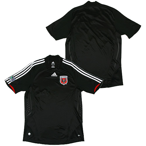
One place I actually miss the 3 stripes is on DC United. Adidas has been outfitting them since their inception and those 3 horizontal stripes across the chest where there forever. It's a little bizarre that adidas would remove them after all these years.

Colorado's jerseys are actually quite nice. They've got that whole Aston Villa/West Ham vibe. They would qualify as my 2nd favorite M.L.S. kit design. My favorite would have to be...
Toronto F.C. Last year's expansion team really has the league's best kit. Mainly because of the seldom used but gorgeous red and gray color scheme. I also think that the template used for the kits is one of the nicer ones adidas currently has on offer. I may be in the minority on this, but the gray away shirt is a thing of beauty too. I just wish it was paired with a black or gray short.

Note: Time is quickly running out on our first ever raffle. Don't forget to mail your entry to footballkitblog@gmail.com before 12:00 noon this coming Sunday, April 20th. Anyone that sends an email before then to the above address with the subject line "Raffle" will be entered in the drawing. Limit 3 entries per person please. The winner will be announced on Monday, April 21st. Full details here.Good luck everyone.