


Since it's Oscar time, I've decided to hand out the 1st annual footballkitblog awards, officially called the Jerseys (aren't' I clever?). There are three categories, best home kit, best away kit, and best keeper kit. The respective winners were able to stay aesthetically pleasing while bringing something new and dynamic to the table. So without further delay here are this year's winners, for the 2006-2007 football/soccer season:
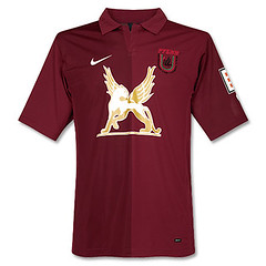
1. Best Home Kit: The Winner this year is Russian club Rubin Kazan. Their 2006/07 UEFA cup shirt is a thing of beauty. It is simple yet distinctive, as any good uniform should be. The burgundy color is striking, a rarely used color in football shirts. But the kicker here is the cool logo on the chest of the shirt. It's some kind of cat-like creature with wings. I'm sure it's an advert of some sort, but I don't know of what. This is possibly the first time a shirt looks better because of advertising. Take that logo away and the shirt becomes quite ordinary.
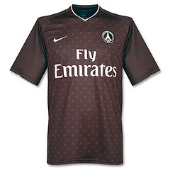
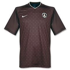
2. Best Away Kit: The winner is Paris St. Germain. At first glance this kit didn't look like much to me, but on further inspection, it became a different story. See, the small sublimated pattern on the shirt is actually a nod to fashion house Louis Vuitton and their famous "Monogram" pattern. I think that's killer. That, coupled with the fact that the shirt is a maroonish brown which is quite nice. Also, for the first few months, the shirt was available without the hideous "Fly Emirates" advertising that PSG now wear.
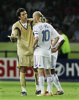
3. Best Goalkeeper Kit: This was perhaps the easiest choice of all the categories. This one goes to the Italian national team. Not sure if this was the home or away jersey, but the gold jersey was beautiful. You can see it in action here. hands down, I can't think of another goalkeeper jersey released this year that came close to this.

So there are this year's winners. Feel free to let us know how you feel about the choices, and what if anything you would have done differently.
8 comments:
I saw your blog after it was linked from UniWatch! Nice job, I'm big on soccer kits too (lifelong player). Regarding that logo on the Rubin Kazan club jersey, the creature is a Griffon - a medieval make-believe character that was supposed to be a cross between a lion and an eagle (or maybe a dragon). Either way, it looks good.
Hi Casey, thanks for the info. Would you happen to know if this is an advert (and if so, of what) or is this something that Rubin Kazan just puts on their shirt?
Great Blog, Great Post, Keep up the good work!
Love the Kazan shirt, do you know where I could get one?
Hi Thanks for checking out the blog.
I got my Rubin Kazan shirt here:
http://www.subsidesports.com/uk/store/product_list.jsp?id=72057594037929174
doesn't look like they have too many sizes available at the moment, but they are always updating their inventory...
Hey, the advert is for a Russian company called TAIF. I don't know what they do but I think their an insurance company or something
Hello Kane i see that you got one Rubin Kazan shir in subside sports are you intrested in sell it?
Thanks
It's not a griffon, it's an Ak Bars (or Aq Bars)--a snow leopard. It's on the coat of arms of Tatarstan, the Republic of which Kazan is the capital. TAIF was founded in Kazan as a gas company, but they've branched out a bit from petrochem into other sectors.
Everybody share their experience here and this is truly pleasant to peruse distinctive sort of speculations identified with same theme. Everybody setting their distinctive feeling and it demonstrates differing qualities. Value this stage.
เสื้อบอลพรีเมียร์ลีก
Post a Comment