It's time for footballkitblog's 2nd annual Jersey awards. Here we honor what I believe to be the best kits of the past season. To be eligible for a Jersey, kits have to have been released for the 2007/2008 season. There are 4 categories, best home kit, best away kit, best keeper kit, and best national team kit(home or away). So without further adieu, here are the winners:
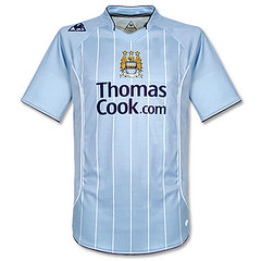
1. Best Home Kit: This was a tough decision, as most of the big clubs don't ever change their home kits around that much. The winner here is Manchester City FC, whose light blue shirt and white shorts has always been a classy kit. This year their shirt was made by Le Coq Sportif, and I have to say they did quite a nice job. I like the white pinstripes very much. I also dig the Le Coq logo being on the shoulder. The Thomas Cook advert is minimal. Nothing groundbreaking in the kit, just an overall very solid design.

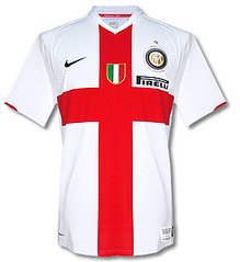
2. Best Away Kit: As an AC Milan supporter it pains me to say this, but the winner is Inter Milan for their "Ambrosiana" centenary kit. This kit is a tribute to the early days of the club, and to the flag of the city of Milan. The simplicity of the design and the contrast between the white shirt and the red cross is what appeals to me here. I also love the fact that they minimized the Pirelli sponsor logo on the shirt. This would have been a completely different shirt with a full–sized sponsor logo. I especially like this kit when it is worn with black shorts. All the controversy aside, this is a splendid kit. Being a Milan supporter, I vowed never to purchase an Inter shirt, but I had to renege on that vow this one time. I'm sure some of my fellow rossoneri supporters would not be too happy about that, but oh well.

3. Best Keeper Kit: I come from the Jorge Campos/Peter Schmeichel school of keeper kit design(OK, maybe Campos was a bit much). I believe the keeper kit is the one kit on the field that can afford to be colorful and loud. A lot of recent goalkeeper kits have gone for the understated look, with Nike, Adidas, etc putting out simple templates in different colors. With all that being said, the winner in this category is Club America and this Aztec–inspired number. Sure, it's loud and I would never ever wear it outside, and that "Bimbo" advert is atrocious. But I very much like this design for a keeper and I love that America's keeper Memo Ochoa helped design the shirt.

4. Best National Team Kit (Home or Away): This was also a tough decision as there were several impressive national team designs released this past season. Some that come to mind are Holland(away), Scotland(away), Italy(home), Germany(home) and Japan(home). There can only be one winner, however, and this year the winner is Russia(away). This kit is simply beautiful. The Russian flag proudly adorns the chest, and the white collar provides a sharp contrast to the red of the shirt. If I didn't still hold on to remnants of the cold war mentality, I would definitely pick one of these up.

So there you have it, our picks for best kits of the past season. Feel free to let us know what you have done differently.


2 comments:
nice blog! look at my blog, i´m from Argentina
http://camisetasparatodos.blogspot.com/
that is the number one time I came to this blog and i discovered a few applicable stuff proper right here. essentially I keen to realize new parameters of writing every-time and someday it turn out to be actually very tough to find such type of platform.
football jersey
Post a Comment