Tuesday, February 27, 2007

And the Jersey Goes to...

Since it's Oscar time, I've decided to hand out the 1st annual footballkitblog awards, officially called the Jerseys (aren't' I clever?). There are three categories, best home kit, best away kit, and best keeper kit. The respective winners were able to stay aesthetically pleasing while bringing something new and dynamic to the table. So without further delay here are this year's winners, for the 2006-2007 football/soccer season:


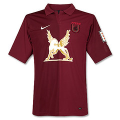
1. Best Home Kit: The Winner this year is Russian club Rubin Kazan. Their 2006/07 UEFA cup shirt is a thing of beauty. It is simple yet distinctive, as any good uniform should be. The burgundy color is striking, a rarely used color in football shirts. But the kicker here is the cool logo on the chest of the shirt. It's some kind of cat-like creature with wings. I'm sure it's an advert of some sort, but I don't know of what. This is possibly the first time a shirt looks better because of advertising. Take that logo away and the shirt becomes quite ordinary.


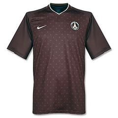
2. Best Away Kit: The winner is Paris St. Germain. At first glance this kit didn't look like much to me, but on further inspection, it became a different story. See, the small sublimated pattern on the shirt is actually a nod to fashion house Louis Vuitton and their famous "Monogram" pattern. I think that's killer. That, coupled with the fact that the shirt is a maroonish brown which is quite nice. Also, for the first few months, the shirt was available without the hideous "Fly Emirates" advertising that PSG now wear.


3. Best Goalkeeper Kit: This was perhaps the easiest choice of all the categories. This one goes to the Italian national team. Not sure if this was the home or away jersey, but the gold jersey was beautiful. You can see it in action here. hands down, I can't think of another goalkeeper jersey released this year that came close to this.


So there are this year's winners. Feel free to let us know how you feel about the choices, and what if anything you would have done differently.

Tuesday, February 20, 2007

An Open Letter to the Premier League (And the Scottish Premier, and Ligue 1, and MLS)


Most of you know by now that England's Premier League along with a few other leagues around the world have a policy of making all the clubs in the league wear the same shirt numbers on the back of the jersey. For example, Manchester United, Arsenal, Chelsea and every other team in the Premiership wear these numbers. The same is true of the Scottish Premier League along with Ligue 1 in France and MLS here in the good ol' U.S. of A. Let's take a moment to analyze the pros and cons of such a policy and then I'll tell you why we here at footballkitblog are opposed to this policy.

First the pros. Obviously with a uniform code for all shirt numbers, you don't end up with wild variations of shirt numbers. This can be helpful in cases like this, where the team obviously used poor judgement in picking their shirt numbers. Also, since many of the Premier League's clubs also compete in the UEFA Champions League or the UEFA Cup, the teams get to wear different shirt numbers like Man. U., which this year is wearing these numbers in Europe, or Chelsea which this year is wearing this in Europe. This makes for a scenario where many die-hard fans will go out and buy this year's Home "league" shirt and the Home "europe" shirt. The only difference on the shirt being the shirt numbers (and in some case, certain sleeve patches). That translates to a fleecing of the supporters, oops, sorry, increased revenue for the clubs and kit makers. Lastly, I must say that the Premier League's numbers are very well-made and are higher quality that many shirt numbers around the world. The material they are made from seems to be thicker and they have a felt-type of finish. I also like the little Premier League Badge at the bottom of each digit.

Now to the cons. The biggest one is that this uniform policy stifles creativity. I mean c'mon, these Premier League numbers are at least 10-15 years old by now. That means 10-15 years of watching your team in the same old shirt numbers in a sport where shirt numbers are constantly evolving. Just look at this picture of the Spanish Primera League, which has an "open" shirt number policy. Doesn't that look much better than this? And for once can these clubs and manufacturers go easy on the fans? Why make us go out and buy 2 of the same shirt? As far as the bottom of the digits, it's much nicer to have the club badge on there instead of the League badge. Just look at this. In most cases, the league badge is already on the sleeve of the shirt. Yeah, I know the club badge is already on the chest, but it is the club's shirt, not the league's.

So I'm urging the Premier League to look into this matter. If I'm not mistaken, the Premiership was the first to implement the uniform shirt number policy, and surely the other copy-cat leagues would reassess the situation if England did the same. Perhaps a compromise would be to come up with a uniform standard for shirt numbers, in terms of height, width, materials, thickness, number of colors used, etc.

Monday, February 19, 2007

Mexico Releases New Adidas Shirt


Mexico has just released their new kit made by Adidas. I'll let you judge for yourself if it's a step back for Mexico. I put up the new Adidas shirt above the most recent shirt, which was made by Nike. My commentary on this is that to me Mexico is constantly changing their kit manufacturer, at least every couple of years. Off the top of my head I can think of the following brands that have made Mexico's kit in the past 10 years or so: Umbro, ABA Sport, Athletica, Nike, Adidas. My point is that this environment does not provide consistency for the Mexican football aesthetic. They should stick with one brand like most associations do.

Some of My Favorites


Here are some of my favorite football kit designs. This is by no means a comprehensive list. It is also not year-specific, meaning that only the teams that have the best uniforms year-in and year-out are listed here. Eventually I'll do a list of the best year-specific designs. So here they are in no particular order:
#1. Vasco Da Gama - Home/Away: This Brazilian team has a simple yet elegant design in white or black with a diagonal sash. I particularly like the black shirt. This club has managed to steer clear of adverts on the front of the jersey. I also heard somewhere that the club chose its colors of black and white as a symbol of racial unity and that the club was at the forefront of racial integration in Brazilian football. You gotta like that.
#2. Sampdoria - Home: I don't know the story behind this design, but I like it. A royal blue shirt with red and black stripes inside a white rectangle. And in the middle is a shield with a cross on it. The current cut of the shirt notwithstanding, this is a nice shirt.
#3. Boca Juniors - Home: This shirt is famous around the world because of Diego Maradona and the club's many international achievements. The blue and yellow is distinctive and classy. They usually alternate every year or so between a royal blue shirt and a more navy blue design. I prefer when they use the royal blue.
#4. Italy - Home: This jersey has always been simple and classic. I think it's the best example of a country using a color not on their national flag as a primary color on their uniform.
#5. Peru - Home/Away: Maybe you are seeing a pattern. I like Royal blue and diagonal sashes. Seriously, the Peru jersey is very nice. I prefer the away red jersey to the home white. We can also throw River Plate in this mix but I won't put up their picture because I'm a Boca fan!

Welcome to the Football Kit Blog


I'm a football fanatic. When I say football I mean what Americans call Soccer. I love all aspects of the game. I believe that the football/soccer uniform is the best uniform in all of sports. It's simple, practical, and is the most wearable for fans. Some folks won't wear soccer jerseys because they have advertising on them. While I consider myself an aesthetic purist, I realize that advertising is a part of the game, and while most of the best soccer jerseys have minimal to no advertising, certain advert-laden jerseys can still be quite beautiful. Case in point the ABN-AMRO advertising vertically aligned on the Ajax Amsterdam jersey. Besides, the reality of football economics tells us that the advertising helps to pay for the big-name players our teams bring in.