On Friday, Real Salt Lake (RSL) became the first MLS club to announce a front-of the-shirt sponsor (something called Xango). Technically, the New York Red Bulls were the first to do this last season, but their case is a little different because the entire team was purchased by the company that owns Red Bull and re-named ( A quick aside on Red Bulls, they need to tone down the size of that ad, that thing is way too big). RSL was followed by LA Galaxy and today by Toronto FC, who released their first ever kit sponsored by BMO Bank. I'm sure there are soccer fans here in the States and Canada that are up in arms about this development. We (and when I say we I mean me) here at footballkitblog hold a different, more pragmatic view. I believe this is a positive development for American soccer on its road to legitimacy.
Since its inception in 1996, MLS clubs have worn advertising on the back of the jersey, with the team name usually on the front. Of course, the rest of the football/soccer world wears ads on the front of the jersey among other places. This difference along with some others (the "breakaway" tie-breakers, the loud colors and cartoonish nature of most of the jerseys and logos, the huge, empty stadiums) differentiated the American game, and frankly, we were a laughingstock. Recently MLS has made strides towards putting out a better product, and putting ads on the front of the shirts is another step in the right direction. The advertising on the shirt boat has sailed, kids. Now our clubs will look like real football teams.
As far as the new Toronto shirt is concerned, I think the colors are pretty nice and the ad for BMO is done tastefully enough, and at least adidas used the least unattractive or their latest crappy templates. More on how adidas is destroying the game soon to come. I'm curious to see what LA Galaxy is going to do, they are due to release a complete re-design of their look soon. I hear that either black or navy blue will be used as one of the team colors. Anything is better than the puke-a-thon they've been wearing.
Monday, March 26, 2007
MLS Gets With The Program
New U.S. 3rd Jersey Makes Its Debut
The new United States 3rd made its debut today in an international friendly against Ecuador. The jesey was paired with a blue short. I wonder why they didn't use the white short which I think would have looked much better. Also, Ecuador wore blue shorts, so the U.S. had a ready made excuse to wear the white shorts. I guess they intend on using the white shorts as change shorts, which is unfortunate.
The jersey proved to be lucky today as the U.S. won 3-1 on the strength of a hat-trick by Landon Donovan.
I personally think the jersey looks pretty good. It's true the other jerseys the U.S. is currently using are probably nicer, but this jersey is a nice change of pace. And really, it could be a lot worse. Just look at the horror that Ecuador was wearing.
Wednesday, March 21, 2007
U.S. Soccer Inroduces New 3rd Jersey
The United States national team has released a new 3rd jersey, a royal blue affair with thin white pinstripes. I don't hate the design, but I'm not sure yet if I like it. I have to soak it in a little and see how it actually looks on the pitch. This jersey will make its debut this March 27th when the U.S. takes on Ecuador in a friendly. A few observations:
I like the fact that a royal blue shirt has been re-introduced. The U.S. team has been wearing white home shirts and navy blue away shirts for some time but in the 80's I think the home shirt was royal blue. So the shirt is a throwback of sorts. I mention the 80's also because the pinstripes are definitely an 80's thing.
It seems the shirt will be paired with both royal blue or white shorts and royal blue socks. I think the kit will look much better with the white shorts.
The 3rd jersey is a rarity for national teams. I know I've seen a few national sides wear them, Wales being one other example.
One interesting note from the website: the shirt features "raised nodes on the underside that lift the shirt away from the players' bodies to keep their skin drier and reduce shirt cling." Now, I don't want to come off as a Nike marketing guy but that is pretty badass. That's some future-is-here type of stuff.
More on this story to come...
Friday, March 16, 2007
Is this Football or Racing?
It's disturbing to me when I see certain football clubs go out of control with the advertising on the shirt. Take a look at this mess. Or this. That's a complete bastardization of the kit. While I know these uniforms are not sacred things (well, except maybe a one or two), they are the closest things the fans have to a connection with their favorite club and therfore should be treated with a little respect and reverence.
I've noticed some leagues are worse than others in terms of how many ads they'll allow on the shirt. The French league seems to be unfortunately liberal. I have to give the British credit, I don't think they would ever allow such a thing. There are some scattered holdouts throughout the world that don't have any ads on the shirt. Barcelona caved recently, although it was for a very good cause so you can't really be mad at that. I can think of Vasco Da Gama & Roma off the top of my head that don't have any ads at the moment. I don't mind the ads so much, especially when they don't take up a lot of space on the shirt. There needs to be a modicum of decorum.
Tuesday, March 13, 2007
Before the Advent of Squad Numbers
Many of you know that in the old days, football teams didn't use the squad numbering system that is in use now. For those of us that did know, bear with me on this.
In the old days (probably around pre-1993), football clubs would name a starting eleven, then assign the numbers 1-11 to those eleven players. Then the substitutes would get assigned the numbers 12-16. As an example, this was Milan's staring eleven on Wednesday, March 7 2007 against Glasgow Celtic in the Champions League:
1 Dida
25 Daniele Bonera
3 Paolo Maldini
44 Massimo Oddo
23 Massimo Ambrosini
8 Gennaro Gattuso
22 Kaka
18 Marek Jankulovski
21 Andrea Pirlo
10 Clarence Seedorf
9 Filippo Inzaghi
Milan's lineup would have looked something like this in the old days:
1 Dida
2 Daniele Bonera
3 Paolo Maldini
4 Massimo Oddo
5 Massimo Ambrosini
8 Gennaro Gattuso
10 Kaka
6 Marek Jankulovski
7 Andrea Pirlo
11 Clarence Seedorf
9 Filippo Inzaghi
Certain star players would always remain the same number, but other less established players would get assigned different numbers throughout the season. Generally, the goalkeeper would be number 1, the defenders would get 2 through 5, midfielders 6, 8, & 10, and attackers 7, 9, & 11.
The beginning of the end of the "1 through 11" system was the World Cup and other international competitions, where players were assigned a number for the whole "finals" tournament. Finally sometime in the 90's all the leagues switched to the fixed squad number system. While I have no major problem with the current system, I kind of miss the old days of looking in the match summary and seeing which players got what numbers. For Milan I remember seeing Van Basten mostly wear 9 but he also came off the bench wearing 16. I also don't like how some players are choosing to stand out by wearing high numbers. Case in point Ronaldo with Milan, and Francesco Coco(No pictures available, but he wears #77 or 76). Those numbers just don't look right on a soccer jersey. Keep the shirt numbers low, fellas. Also, clubs are starting to retire numbers, leaving less and less single digits and low numbers available. I think that is ridiculous. We never used to retire numbers in football, why are we starting now? What, are going to start going back and retiring numbers retroactively? Should Santos now retire Pele's 10, or Real Di Stefano's 9? No disrespect to Gianluca Pessotto, whose number 7 was retired by Juventus. But if he deserves that, then there is a list a mile long of players that deserve the same honor. If we don't get this situation under control, we will no longer have any good numbers left. Even stranger is this development of defenders getting numbers usually reserved for attacking players. Like Gallas wearing number 10 at Arsenal and Boulahrouz wearing 9 at Chelsea.
I like seeing who will be Brazil or Argentina's new number 10. So let's keep the squad numbering system because it is pretty useful, but let's do away with this number retiring business. If only it where that easy.
For more information on this topic, check out this page.
Saturday, March 10, 2007
Update: Premiership to Introduce New Name/Number Lettering
Wednesday, March 7, 2007
Ricky Strikes Again
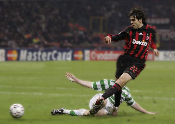
This is a good opportunity to put up a picture of two of the best kits in the world, the famous hoops of Celtic and the Rossoneri of AC Milan. I must say that I don't like the "BWIN" advertising on the Milan shirt, it's a gambling website. It's pretty disappointing that a club as prestigious as Milan would stoop to putting a gambling website on the shirts. It looks even worse in light of the Calciopoli scandal.
Anyway, here Ricardo Kaka is flying by a Celtic defender to score the winning goal in Milan's 1-0 extra time UEFA Champions League win over the Bhoys at the San Siro. As a Milan supporter I am very excited about all this, and don't discount Milan in this year's Champions League, they could definitely win it all. They have the talent and are one of the few teams left that is not in contention for their league title, so they can focus on European competition.
Tuesday, March 6, 2007
Digging in the Vaults: SC Heerenveen
Every once in a while we'll go digging in the footballkitblog vault. In the vault there are all manner of unique and interesting football shirts.
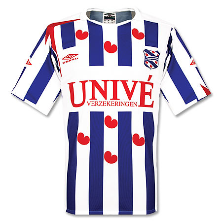
Today we're looking at the home shirt of SC Heerenveen, from the Dutch Eredivisie, the top flight of Dutch football. This particular shirt I picked up in Amsterdam in a little store near the Leidsplein. I believe it's the 2006/07 model. It's made by umbro, and there is a red cross on the right shoulder, similar to what England was wearing until recently.
I'm always on the lookout for interesting and unique shirts, and this one certainly fit the bill(Although it is a little gay, oops not supposed to say that). The design of the shirt is vertical blue and white stripes adorned by red hearts. Yes, red hearts. While on the surface it sounds absurd that a football team would put big red hearts on their shirt, there is a deeper explanation. You see, the home shirt is actually patterned after the flag of the Dutch Province of Friesland, where the town of Heerenveen is located. You judge for yourself if that justifies putting those hearts on there. I personally like it but will probably never wear it outside(especially in the states). I also like the tongue twister advertising on the front. It says "VERZEKERINGEN". Say that three times quickly.
Monday, March 5, 2007
Champions League Mystery
I've noticed something different in this year's Champions League. I noticed that a couple of teams in this year's competition that are from leagues with an "open" shirt number policy (see here) have slightly tweaked the back of their home shirts for the Champions League. Take a look at this picture of the back of Barcelona's regular home shirt. Now look at what they have been wearing in the Champions League. Notice any difference? The Champions League shirt has more blue in the back. The red stripes have been practically wiped out.
The second case involves my favorite club, AC Milan. Here is their usual home shirt. Now look at the Champions League version. The numbers for the regular shirt are gold, while the numbers on the Champions League version are white.
In both of these cases I have no idea why these teams would implement these minor changes. I'd like to think it has to do with some special UEFA regulation about making the back of the shirts more legible, but I doubt it. It probably has to do with selling more shirts. I know for sure I've seen the AC Milan shirt for sale with both of the shirt number colors, and I'm sure both Barcelona versions are out there too.
These two teams are the only ones that I know of that are doing this type of thing. If you know of any others or if you know the reason for this, drop us a line here at footballkitblog.com.