

 Posts
Posts


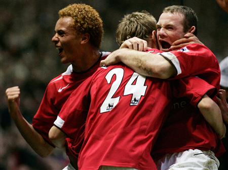
So according to this study, football teams clad in red are more successful. The study focused on England, and the results showed that "Red shirts give the team(s) an advantage due to deep-rooted biological response to the colour." I swear this is not the first I heard of this, I remember similar suggestions being made about 10 years ago. It can't be a coincidence that Liverpool, Manchester United, and Arsenal are 3 of the most successful clubs in English football, no?
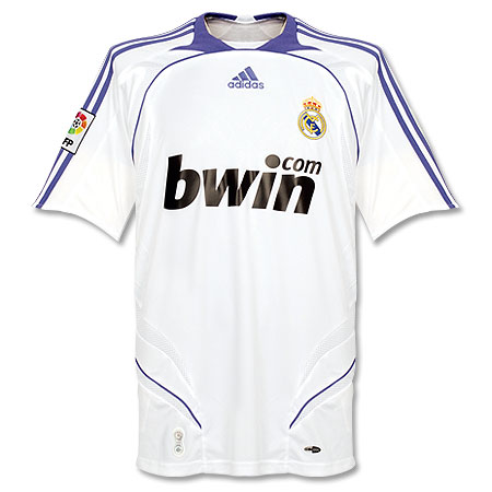
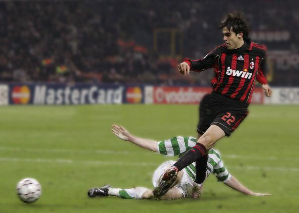
I actually agree with this study and have something to add. White must also be included as one of the most successful football colors. If you think about it, almost every major football league in the world has an epic club that wears either red or white. From the aforementioned England, to Brazil (Vasco and Flamengo), Spain (Real Madrid), Italy (AC Milan, Juve), France (Lyon), Germany (Bayern Munich), Argentina (River Plate), Holland (The big three all use red and white). At the very least, this merits further investigating.
That color can affect human beings psychologically is nothing new. That this would apply to the world of football is only logical.
Tuesday, March 25, 2008



Sunday, March 23, 2008
Those Snazzy Hondurans

I had to put up a picture of this brilliant kit from Honduras(It's the one with the stripes). They have been wearing it for the CONCACAF Olympic qualifying tournament. They may have started wearing it earlier, but this is the first I've seen of it.
I had never been impressed by Honduras' kit, until now. This kit is absolutely gorgeous. No wonder the team was able to upset Mexico and make it to the Olympics in Beijing. The Mexicans, in their snooz-o-rama Adidas template kit never stood a chance. Note: The caption in that photo on Yahoo incorrectly identifies Mexico's opponent as Guatemala.
Thursday, March 20, 2008
Football Kit Blog Book Review: True Colours by John Devlin

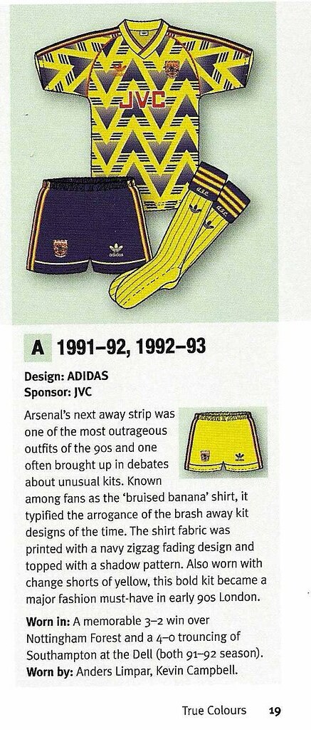
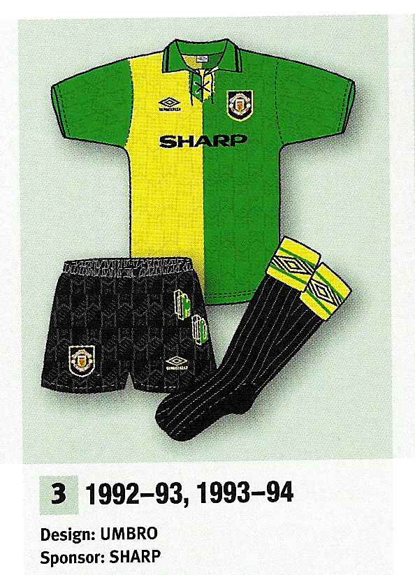
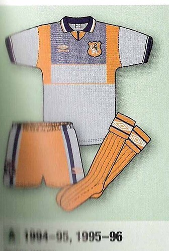
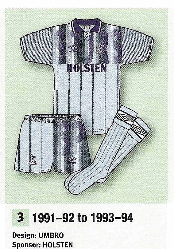
I recently got this great book from amazon uk. It is called True Colours: Football Kits from 1980 to the Present Day, by John Devlin. It is a must have for any football kit enthusiast. The only pity here is that there are not more volumes of this masterpiece covering all the clubs from all over the world. For it's slim size, it is a very impressive work in breadth and scope. It basically details every home, away, 3rd, and 4th kits of every English Premier League side that was in the top flight in 2005-06, spanning back to 1980. Along with the artwork for each kit there is a brief description of who made the kit, who the shirt sponsor was, a brief story about the shirt, and in what important matches it was worn in and by whom. Going through the pages you really get an understanding for trends in design, fabric, and colors that have taken place over the last few decades. Also, I realized that the Golden Age of Football shirt design was the late 80's/early 90's. There were just so many innovations that took place back then that we take for granted today. There are some really great shirts in here, like Arsenal's "bruised banana" shirt (I couldn't tell you why, but I love that shirt) as well as Manchester United's groundbreaking "Newton Heath" shirt. There are some real disasters here too like Chelsea's tangerine nightmare and this vomit-inducing number from Spurs.
If you are into this kind of stuff, you should not go without this book. I am hooked and just put in my order for Volume 2.
Saturday, March 15, 2008
New and Improved
Welcome to the new and improved Football Kit Blog. I decided to customize the layout a bit, and I must say, it was about time. I liked the blogger template I was working with, so I just enhanced it a bit with a spiffy new header and a custom background. Hope you like. I thought now would be a good opportunity to re-introduce the blog.
Why I Started this blog:
I got a lot of my inspiration from Paul Lukas' fabulous uniwatch column, which I discovered about 10 years ago. I used to look for it in the Village Voice every week. It was one of the only reasons to pick up the Voice along with Savage Love. Anyways, when Paul moved his column to espn and eventually to uniwatch blog, I went along and have practically read every column/post since. When I first discovered it, I was surprised to learn that there were other people who were obsessed with sports uniforms as I was. I still greatly enjoy uniwatch to this day, but it tends to focus on the major American sports and football/soccer sort of takes a back seat. Well, football/soccer is my favorite sport, and I happen to think that the football kit is the most beautiful uniform in all of sports. See this.
That lead me to here. The Football Kit Blog. My take on football kits past, present, and future. I will definitely not be anywhere near as proficient and meticulous as uniwatch is, and I can never hope to match Mr. Lukas' talent for writing, but I will be throwing my two cents in from time to time. I'm interested to hear from people all over the world, especially from the supporters of the teams I may write about. I want to know what the local fans think.
While you're here why not leave a small donation. Any donation is greatly appreciated and will go to improving and maintaining the blog. And be sure to stay tuned to this space for exciting announcements in the future.
Why I Started this blog:
I got a lot of my inspiration from Paul Lukas' fabulous uniwatch column, which I discovered about 10 years ago. I used to look for it in the Village Voice every week. It was one of the only reasons to pick up the Voice along with Savage Love. Anyways, when Paul moved his column to espn and eventually to uniwatch blog, I went along and have practically read every column/post since. When I first discovered it, I was surprised to learn that there were other people who were obsessed with sports uniforms as I was. I still greatly enjoy uniwatch to this day, but it tends to focus on the major American sports and football/soccer sort of takes a back seat. Well, football/soccer is my favorite sport, and I happen to think that the football kit is the most beautiful uniform in all of sports. See this.
That lead me to here. The Football Kit Blog. My take on football kits past, present, and future. I will definitely not be anywhere near as proficient and meticulous as uniwatch is, and I can never hope to match Mr. Lukas' talent for writing, but I will be throwing my two cents in from time to time. I'm interested to hear from people all over the world, especially from the supporters of the teams I may write about. I want to know what the local fans think.
While you're here why not leave a small donation. Any donation is greatly appreciated and will go to improving and maintaining the blog. And be sure to stay tuned to this space for exciting announcements in the future.
Thursday, March 13, 2008
U.S.A. (United States of Anticipation)

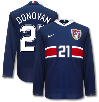
This is a photo I found floating around a discussion board, purporting to be the new USMNT Away shirt. The official release of the shirt is scheduled for mid-April. So, could this be a Photoshop fake? Absolutely, especially considering that I know I saw Clint Dempsey in that same pose when the new Home Shirt was released a couple of months ago. But a little rank speculation never hurt, and I actually think this is a classy shirt. Much better than the last USMNT away shirt, which was great in concept, but faulty in execution. Up close the shirt had a weird cut to it, the collar was freakishly big and puffy, and the crest was also way too big. It was more like a shield.
Hat Tip: Big Soccer.
Saturday, March 8, 2008
A Golden Touch

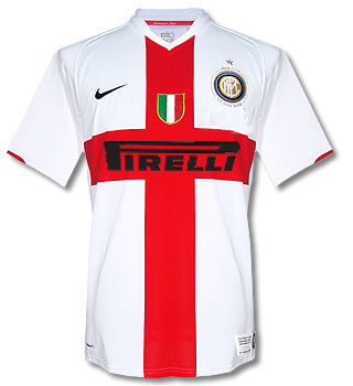
Here is Inter Milan's new gold-trimmed kit, which was debuted tonight in a Serie A match against Reggina. The gold trim will be employed on Inter's kit for one month to commemorate the club's centenary. While I like this touch very much, my only gripe is that they should have rolled this kit out for the whole season so the die-hard fans wouldn't be compelled to buy both the white-trimmed and gold-trimmed home shirt.
BTW, in this post we mentioned that Inter Milan's current centenary shirt would look a lot different with a full-sized sponsor logo. Well I went ahead and did a mock-up of what it would look like, and it pretty much vindicates Inter's move to make the Pirelli logo smaller.
Tuesday, March 4, 2008
A Tip of the Cap

A tip of the cap to Arsenal, who beat my beloved AC Milan 2–0 tonight at the San Siro in the 2nd leg of their Champions League round of 16 match. Arsene Wenger's side won the pulse–pounding tie on aggregate 2–0. I have to admit that Arsenal was the better side over the tie, and some of Milan's players looked very long in the tooth by the end of the match. Nevertheless, it was a thrilling match. Barcelona now has to be the favorite to win this year's competition.
On a kit related note, Arsenal's white away duds are nice. I know there is a bit of an uproar in Goonerland about them (cuz they look like Spurs with red shorts), but I had a chance to see this shirt at Niketown. It has an inscription of sorts, something about Herbert Chapman. I always like it when manufacturers add little touches like that to the shirt.
Subscribe to:
Posts (Atom)