Showing posts with label newly released kits. Show all posts

Monday, September 22, 2008

2008/09 Season Preview

The season has kicked off all around Europe, so it is an appropriate time to reflect on the new kits that were released for the new season. So without further delay, here is the good, the bad, and the ugly:
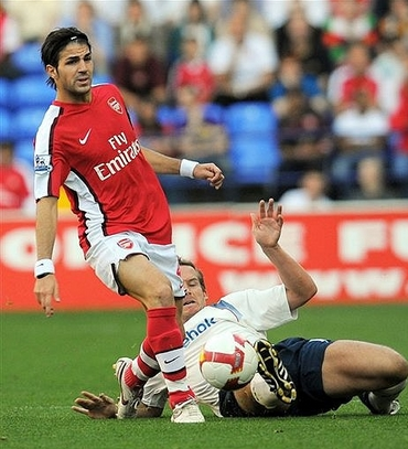
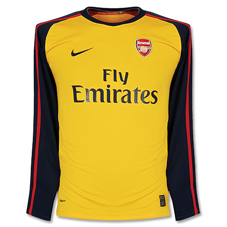
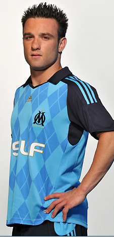
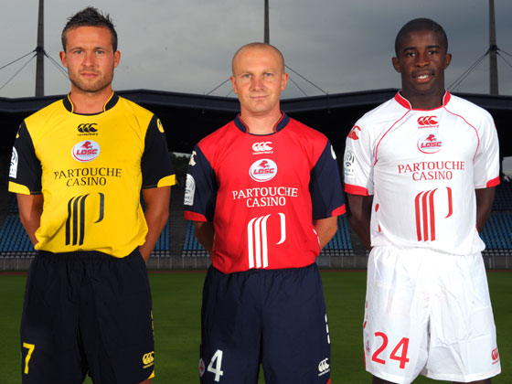
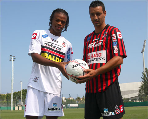
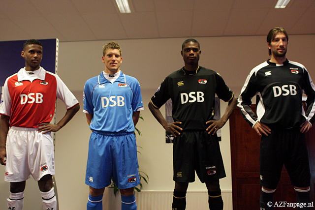
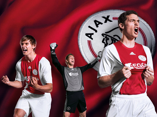
Let's start with the bad. I really don't like Arsenal's new home kit. Arsenal belong in all–white sleeves, period. That's my main gripe about the shirt. On the other hand, their away shirt is quite spiffy. Manchester United's new designs are so boring to me that I won't even link to them. I will give them credit though for not changing their home kit from last season's. I can't seem to get my head around Marseille's new away kit. Is it a breakthrough in football fashion or is it a horror show? I am leaning towards the latter. I think the argyle pattern might have worked if the colors were a bit more subdued. Honestly, can Lille's shirt sponsor be any bigger? Ligue 1 must be in major financial difficulty if French clubs are whoring out their shirts like this. It's been said in these pages before, that is no longer a football shirt. It is a racing shirt. AZ Alkmaar will be wearing collars reminiscent of 1890's football clubs. Big change at Ajax, where ABN–AMRO's familiar vertical advert has been supplanted by something called Aegon. I usually do not mourn the changing of a shirt sponsor, but c'mon. Ajax and that ad went hand in hand. 
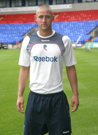
But the hands–down worst kit of the season has to go to Bolton Wanderers and this horrible Reebok outfit. That looks like a third–rate club's training shirt! Are they for real? Who looked at the prototype of that kit and said "Hey, that's nice. Let's go with that." ?
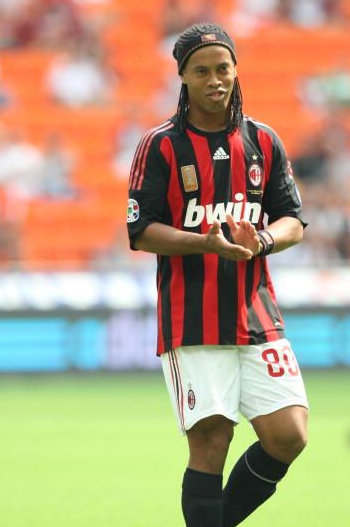
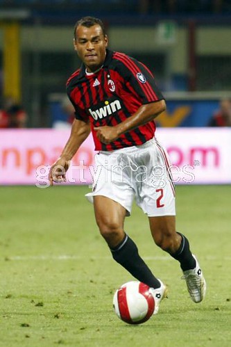
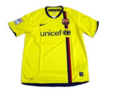
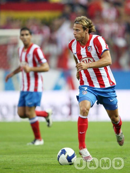
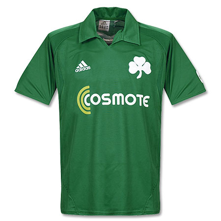
Now on to the good stuff: AC Milan restored order to their world by coming out with a fresh update to their timeless kit. A big improvement over last year's shirt. There was a lot of hubub over Barcelona's ditching of their famous stripes, but I say relax, people. That new home kit is splendid and evocative of their centenary shirt from back in the 1998 season. The away kit is also quite nice. Too bad they will continue to use their teal ensemble as their 3rd kit.  Let's hope there are not too many occasions for that. Athletico Madrid went back to wearing blue shorts with their home kit, and the results speak for themselves. That is one of the best kits in the world. I thought  Borussia Dortmund's home shirt was also a fresh take on a classic style. Those pinstripes just scream of the '80's to me. I like their away kit as well, but unfortunately it is ruined by that loud, diagonal sponsor. A couple of minimalist designs that I really like: Sporting Lisbon's away and Panathinaikos' home. I love that huge clover leaf on the shirt, reminds me of something out of the turn of the 20th century. Call me crazy but I like this design from Sevilla(one of their dozens of kits).
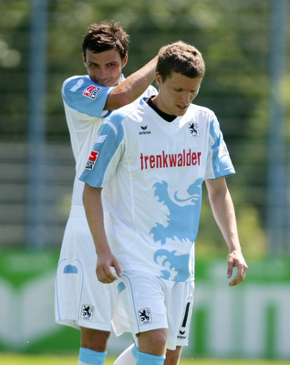
But my favorite kit of the new season: 1860 Munich. Here is a better view. I just love that design, it's fun and the color scheme ensures that it is not too tacky. This jersey would be absolutely perfect if they had Löwenbräu as the shirt sponsor(they used to back in the day).

Wednesday, July 30, 2008

The End of An Era

According to this article, Athletic Bilbao of Spain will start wearing advertising on their shirt for the 2008/08 campaign. This is an unfortunate development, as Bilbao was one of the last clubs to have a shirt without a sponsor. Is there any club left now that is sponsor–free?

Tuesday, July 1, 2008

New AC Milan Away shirt 08/09


This is rumored to be AC Milan's new away shirt for the 2008/09 campaign. Milan invariably choose white as their away color, and in fact, white has been viewed as a lucky color for the club. Assuming this leak is legit, I think this is a pretty nice shirt for my beloved rossoneri. I like the cross on the shirt, it goes well with the motif of the club. Though it's a little surprising that Milan would feature a cross so prominently on their shirt after all the controversy last year with Inter. What I don't like is that bwin advert, I wish Milan would dump them ASAP. All in all, a pretty good shirt. Now I hope that Milan will release a new home kit. Last season's home kit was one of the worst in memory.

Wednesday, May 21, 2008

Heaven for the Red Devils


Congratulations to Manchester United for their victory in tonight's UEFA Champion's League Final. Football-wise it was a thrilling match, a very testy affair. There were many underlying dramas leading into this game and upon the start of the match a couple of other dramas were introduced. The rain and the condition of the newly installed grass field at Luzhniki Stadium were big factors in the game. The pitch tonight was a disgrace. UEFA must takes steps to make sure the fiasco that occurred today never happens again. The players were slipping all over the place and it wasn't just because of the rain. There were also many more players cramping up than usual and those lads all risked being injured on that poor excuse for a pitch. How can a stadium be a "UEFA 5 star" stadium and not have a proper natural grass pitch?

I actually thought Chelsea was the better team on the night but as we all know the penalty spot definition can be a lottery. So it's United who walk away with the trophy. Onto some of the kit analysis:

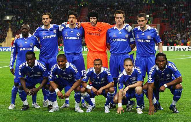
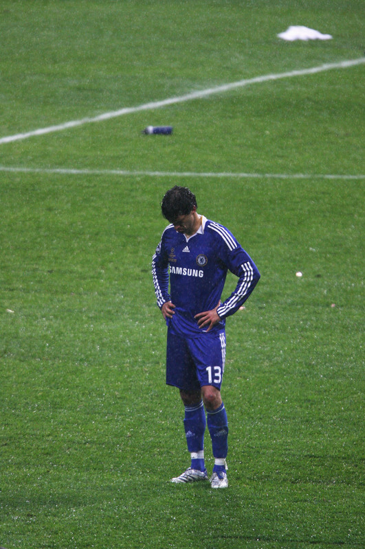
United came out in their red shirts, white shorts & socks look, I thought they might go with black socks since Chelsea usually wears white socks. Instead, Chelsea came out in an all–blue number right down to the socks. I still think they could have waited to introduce their new kit until after the final, but that being said that new Chelsea home kit is splendid. United's kit is nice too, although I think that "AIG" ad looks a bit, well, awkward. Chelsea were also sporting some new name and number font on the back of their jerseys. I tried to make out what the little logo was on the bottom of each digit, I think it was the Champions League logo. Could this be some new Champions League font? In last week's UEFA Cup final both Rangers and Zenit came out wearing the same font on the back of their jerseys with the UEFA Cup logo on the bottom. Maybe this is the direction UEFA is going in for the next season, making clubs wear standardized names & numbers in continental competitions. United were still wearing their Nike names & numbers.

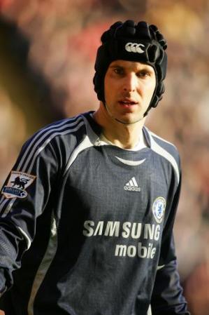
According to this story, Chelsea goalie Petr Cech had a new kit designed for this final, a fluorescent orange number that he believes will trick players subconsciously to shoot right at him. It didn't seem to work too well, as Cech was only able to save 1 of United's 7 penalty shots.

Hat Tip: Football Shirts News

Thursday, May 15, 2008

Chelsea FC: Tempting Fate?


I am somewhat superstitious. I know football supporters are a fairly superstitious lot as well. That is why my eyebrows were raised when I caught wind of this: Chelsea FC is planning on wearing their 08/09 shirt in next week's Champions League Final against Manchester United.

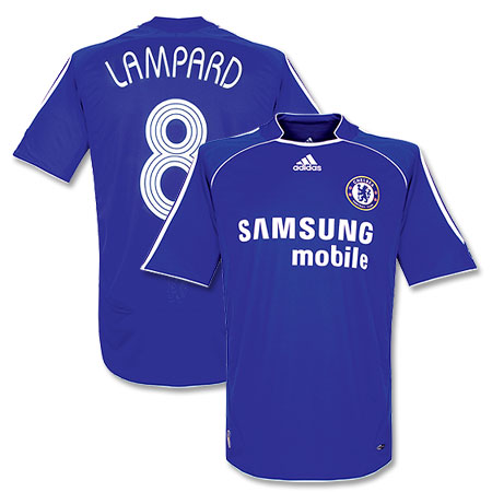
Chelsea have been wearing this shirt (06/08) for the past two campaigns. Last weekend in a vital Premier League match against Bolton Wanderers Chelsea debuted their new kit which they will be wearing in the upcoming season(Chelsea ended up drawing 1–1 with Bolton). Debuting new kits during the final matches of the season has become somewhat of a tradition, especially in England. Here's my beef: Chelsea have had such a gritty campaign coming back from a lot of adversity. All along the way they did it wearing this shirt. Now, on the eve of the biggest match in Chelsea FC history they are going to wear a kit different from the one that got them there? Sounds like a bad omen to me. I had been leaning towards Chelsea winning the match in Moscow, but now I am not so sure. United will be wearing the kit they have worn all season. If I was a Chelsea supporter, I would be raising hell over this.

I would love to hear from Chelsea supporters. What do you say? Am I making too big a deal out of this? Or is there something to this?

Tuesday, May 6, 2008

New Liverpool 08/09 Shirt Makes its Debut


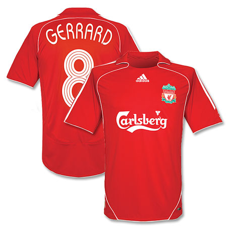
Liverpool debuted their new shirt for the 08/08 campaign in this past weekend's Premiership match against Manchester City. This kit replaces their 06/08 kit which was Liverpool's first Adidas kit in ages.
Some analysis:
The main differences between the old and the new kit are the lack of a collar and piping on the new shirt. The old kit had both. I personally like this new version of the iconic Liverpool shirt but I do have one gripe: that collar is a little weird. The way it juts out like that I think is a case of over–thinking. A simple white trim along the collar would have been so much nicer.

Btw that City kit is pretty sweet...

Friday, April 18, 2008

Toronto FC Kit: The Best of M.L.S. in 2008


Looking over the league's crop of new uniforms, what strikes me is the dullness of all the team's jerseys looking essentially the same just in different colors. All 14 M.L.S. clubs are outfitted by German sportswear giants adidas, and their famous/infamous three stripes. I personally like the stripes but I wonder if it's really necessary for adidas to put them on the sleeves of every single shirt. Some shirts would just look better without the 3 stripes.

Some other random observations:

The Red Bulls do not make sense to me. First, they go ahead and make their home shirt white. Huh? I thought it was Red Bulls, not White Bulls. Then, they make navy blue their away color, meaning they don't have a red shirt at all! I want to root for this team so badly, and I do, but c'mon. Someone get with the program over there. And tone down the size of that huge advertisement on your shirt. Don't they understand that they would sell so many more of those Angel and Altidore jerseys if that ad was just a little smaller? In fact, they should just put the "Red Bull" typeface right on the front, like a normal club. That would be so much more legit. The Clashing Bull logo is already on the crest. Which brings me to that. Why is the logo two red bulls clashing with each other? Shouldn't they be teammates? I know that's the logo on a regular can of Red Bull but couldn't they have put some effort and thought onto this? Just one bull in the crest would have been so much better. There, Red Bulls. That'll be $20,000.

The Galaxy re–branding was pretty lame. Their logo is decent, but they should have gone with navy blue instead of all–white as their home shirt. Don't give me that "Oh, it's summer and it's really hot in L.A., so white is the smart choice" b.s. Most M.L.S. games are at night and the season starts in April when it's still not that hot. Besides, during day matches where it's really hot, they could have always switched to the white kit. I just think this was a lame attempt to keep up the Beckham/Real Madrid continuity in order to sell more jerseys worldwide. Pfeh.

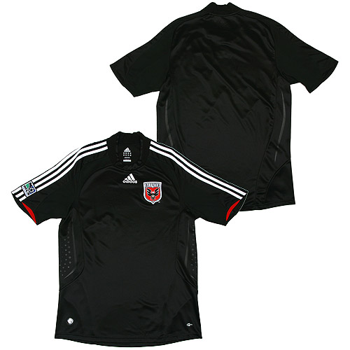
One place I actually miss the 3 stripes is on DC United. Adidas has been outfitting them since their inception and those 3 horizontal stripes across the chest where there forever. It's a little bizarre that adidas would remove them after all these years.

Colorado's jerseys are actually quite nice. They've got that whole Aston Villa/West Ham vibe. They would qualify as my 2nd favorite M.L.S. kit design. My favorite would have to be...
Toronto F.C. Last year's expansion team really has the league's best kit. Mainly because of the seldom used but gorgeous red and gray color scheme. I also think that the template used for the kits is one of the nicer ones adidas currently has on offer. I may be in the minority on this, but the gray away shirt is a thing of beauty too. I just wish it was paired with a black or gray short.

Note: Time is quickly running out on our first ever raffle. Don't forget to mail your entry to footballkitblog@gmail.com before 12:00 noon this coming Sunday, April 20th. Anyone that sends an email before then to the above address with the subject line "Raffle" will be entered in the drawing. Limit 3 entries per person please. The winner will be announced on Monday, April 21st. Full details here.Good luck everyone.

Monday, March 3, 2008

And the Jersey Goes to...

It's time for footballkitblog's 2nd annual Jersey awards. Here we honor what I believe to be the best kits of the past season. To be eligible for a Jersey, kits have to have been released for the 2007/2008 season. There are 4 categories, best home kit, best away kit, best keeper kit, and best national team kit(home or away). So without further adieu, here are the winners:

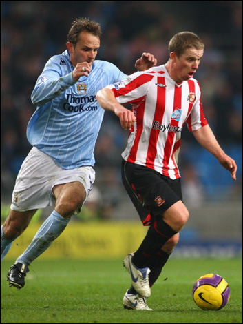
1. Best Home Kit: This was a tough decision, as most of the big clubs don't ever change their home kits around that much. The winner here is Manchester City FC, whose light blue shirt and white shorts has always been a classy kit. This year their shirt was made by Le Coq Sportif, and I have to say they did quite a nice job. I like the white pinstripes very much. I also dig the Le Coq logo being on the shoulder. The Thomas Cook advert is minimal. Nothing groundbreaking in the kit, just an overall very solid design.


2. Best Away Kit: As an AC Milan supporter it pains me to say this, but the winner is Inter Milan for their "Ambrosiana" centenary kit. This kit is a tribute to the early days of the club, and to the flag of the city of Milan. The simplicity of the design and the contrast between the white shirt and the red cross is what appeals to me here. I also love the fact that they minimized the Pirelli sponsor logo on the shirt. This would have been a completely different shirt with a full–sized sponsor logo. I especially like this kit when it is worn with black shorts. All the controversy aside, this is a splendid kit. Being a Milan supporter, I vowed never to purchase an Inter shirt, but I had to renege on that vow this one time. I'm sure some of my fellow rossoneri supporters would not be too happy about that, but oh well.


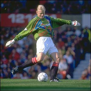
3. Best Keeper Kit: I come from the Jorge Campos/Peter Schmeichel school of keeper kit design(OK, maybe Campos was a bit much). I believe the keeper kit is the one kit on the field that can afford to be colorful and loud. A lot of recent goalkeeper kits have gone for the understated look, with Nike, Adidas, etc putting out simple templates in different colors. With all that being said, the winner in this category is Club America and this Aztec–inspired number. Sure, it's loud and I would never ever wear it outside, and that "Bimbo" advert is atrocious. But I very much like this design for a keeper and I love that America's keeper Memo Ochoa helped design the shirt.


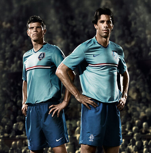
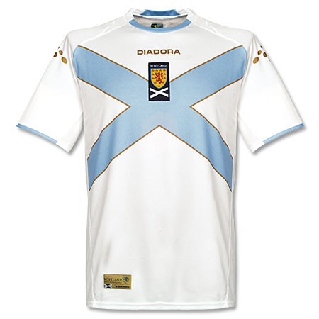
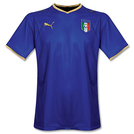
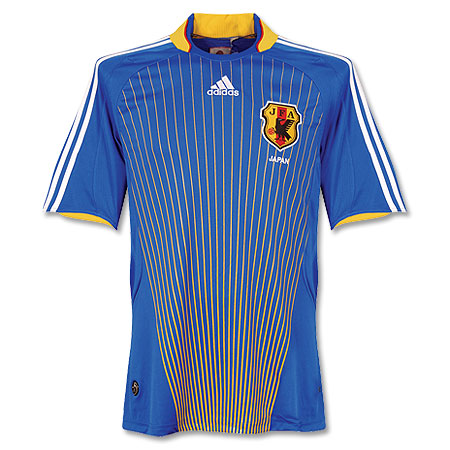
4. Best National Team Kit (Home or Away): This was also a tough decision as there were several impressive national team designs released this past season. Some that come to mind are Holland(away), Scotland(away), Italy(home), Germany(home) and Japan(home). There can only be one winner, however, and this year the winner is Russia(away). This kit is simply beautiful. The Russian flag proudly adorns the chest, and the white collar provides a sharp contrast to the red of the shirt. If I didn't still hold on to remnants of the cold war mentality, I would definitely pick one of these up.


So there you have it, our picks for best kits of the past season. Feel free to let us know what you have done differently.

Monday, November 26, 2007

You Could Set Your Calendar to This...


It is that time in the football kit cycle, when just before a major competition (in this case, Euro 2008), national sides introduce their new kits that they will wear for the next couple of years. There have been a whole slew of new national team shirts that have been released over the past few weeks. Many of them debuted during the last round of Euro qualifiers. Here are some of the highlights:

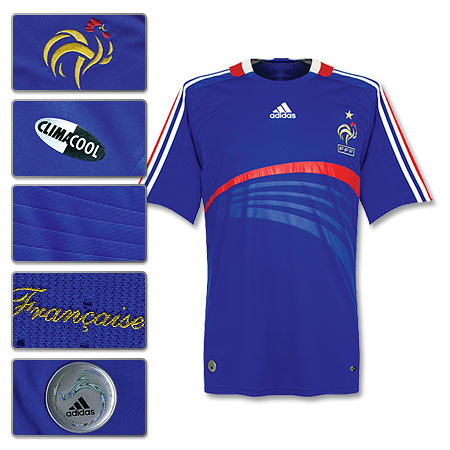
Adidas released new shirts for Germany and France, and I have to say both of them are quite nice. Looks like someone at Adidas was listening when we told them to ditch the boring templates. I especially like how the main design accents on the shirts reflect the respective cultures. The German design is rigid, with a lot of straight lines and seems to evoke the concept of moving forward together. Meanwhile, the French design is more artsy and the design seems to be splitting off in different directions. Sounds like France to me. Adidas also released a new shirt for Argentina, which is pretty basic and classic. Argentina almost always has a boss shirt.

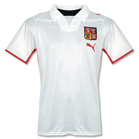
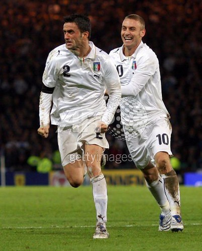
Puma also released a bunch of new away shirts, for Austria, Czech, and others. Sad to see that Puma have adopted the former strategy of their German brethren Adidas with that template. It's pretty boring and lazy if you ask me. One exception is Italy's new away shirt, which I dig, except for that whacked–out font(you can't really tell from the photo, but trust me, it sucks–especially the lettering).

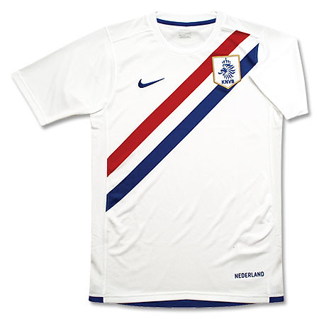
Nike also released some shirts, notably Brazil's new home and Holland's new away. Brazil's new shirt doesn't really do anything for me, but that new Holland away is really nice. It was always going to be tough to duplicate the success of Holland's previous away shirt, which was absolutely gorgeous. But Nike have done a pretty good job here.

All in all, it is a pretty successful period of kit releases as there was nothing absolutely horrible released, and we are heartened by Adidas' apparent ditching of the templates. Bravo.


footballkitblogupdate: looks like despite coach Hugo Sanchez's rantings about changing Mexico's home shirt from green to white, el tri will still be decked in green most of the time. They just released the new home shirt, and it is green. I wonder what that will do to Hugo's ego.