Showing posts with label special edition kits. Show all posts

Saturday, March 8, 2008

A Golden Touch


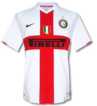
Here is Inter Milan's new gold-trimmed kit, which was debuted tonight in a Serie A match against Reggina. The gold trim will be employed on Inter's kit for one month to commemorate the club's centenary. While I like this touch very much, my only gripe is that they should have rolled this kit out for the whole season so the die-hard fans wouldn't be compelled to buy both the white-trimmed and gold-trimmed home shirt.

BTW, in this post we mentioned that Inter Milan's current centenary shirt would look a lot different with a full-sized sponsor logo. Well I went ahead and did a mock-up of what it would look like, and it pretty much vindicates Inter's move to make the Pirelli logo smaller.

Monday, February 11, 2008

A Fitting Tribute


In yesterday's FA Premier League match between Manchester United and Manchester City, both teams paid tribute to the victims of the 1958 Munich Air Disaster by wearing kits from that era complete with no sponsors. I wasn't sure how this was going to look on the pitch, but the results that you can see in these pictures were simply breathtaking, especially for Manchester United.

Tuesday, September 4, 2007

Different Day, Different Kit


It's common nowadays for clubs to have a 3rd kit. The 3rd kit is a kit that is used when neither the home or away are used. Some teams even have a 4th kit. But what is going on at Sevilla FC has to be unprecedented.


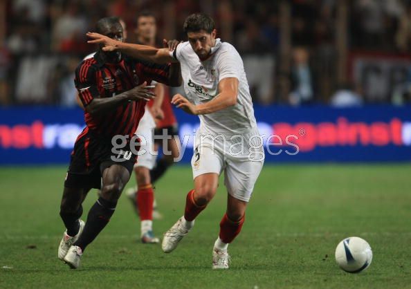
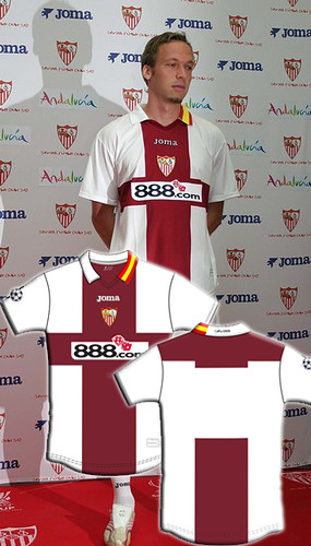
Last week we showed you Sevilla's new home, away, and 3rd kits for the 06/07 season. All well and dandy but on Friday I watched Sevilla play my beloved AC Milan in the European Super Cup. Sevilla wore a kit that is none of those previous kits. It's similar to the home in that it has all-white shirt and shorts, but other design elements are completely different.OK so that is the 4th kit. Then on the following Monday, Sevilla wore this against AEK Athens in the Champions League. So if you are keeping score at home, that is at least 5 different kits they will wear this season. Who knows, maybe they will wear yet another kit in their next match.


Actually, Maybe they will. After a little digging around I discovered that these two shirts are what Sevilla calls their "previa Champions" kits, meaning pre-Champions. I guess they are only going to be worn during the qualifying round of the Champions League, but who knows. What is for sure is that makes a total of 6 kits.


The kit they wore in the Super Cup was a one-off special edition for that event. It just shows you the difference in pedigree between Milan and Sevilla that Sevilla would get a special kit made just for the occasion. I could understand if there was a conflict between Milan' shirts and all of Sevilla's kits, but that is not the case here. It's almost as if Sevilla is celebrating just being there while Milan is there to take care of business. This one-off kit stuff is not new for Sevilla, they did the same thing for last year's UEFA Cup final. It's all a bit much for me.


That being said, the Super Cup kit is my favorite of the lot, with the all-black number running a close second. In fact, all the designs are pretty good except for the awful, vomit-inducing fuischia outfit. I've said it before pink is not necessarily bad, but that shade of pink belongs nowhere on any sporting field.

Friday, June 15, 2007

Digging in the Vaults: Atletic Bilbao Centenary Shirt


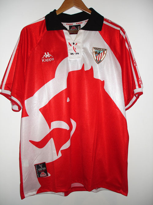
This little number is the Athletic Bilbao centenary shirt from 1998. I really like this shirt, I know it's really loud, but I don't really care. Bilbao's Basque-only policy is pretty admirable and they are one of only 3 clubs in Spanish football (the others being Real Madrid and Barcelona) that have never been relegated (that is in jeopardy at the moment). Perhaps best of all, they are one of a few clubs that don't wear any ads on their jersey. I hope they stay in the Primera Liga so that the no-ads policy can continue. I'm sure that if the club loses the revenue of not being in the top flight, they might compensate by getting a sponsor for their shirt.

The jersey is made by Kappa, whose male/female logo is pretty cool. Their logo is sewn on the right chest as well as running up and down the sleeves. The shirt is also a departure from the usual Bilbao home shirt, which has red and white vertical stripes. There is a huge dragon-like logo on the front of the shirt, and the back looks like the the back of the dragon if you look at it from the right angle. On the back of the shirt is the name and number of Bilbao stalwart Joseba Etxeberria. To top it off there's a special logo commemorating the centenary on the collar placket. This article says that Bilbao also had a second Centenary shirt in 2004, which looked like this. Not sure how they can have two centenaries but I have to say that second one is pretty hideous.