Showing posts with label classic kits. Show all posts
Wednesday, November 12, 2014
Poll Results: Best International Kit and Best-Dressed Football Rivalry
The polls are closed, the results are in. The readers of the Football Kit Blog have picked the best international shirt and the best-dressed football rivalry. One poll was close, the other, not so much...
When it comes to international shirts, the winner by a slim margin was Argentina(22% of the vote), which happens to be my favorite international shirt. So, good choice readers. Rounding out the results were Italy(21%), Brazil(20%), and Spain(19%). The "other" option came in last(15%), which I can't help but interpret as somewhat of an endorsement of my decisions when putting forth the choices for the poll. I cannot stress enough however that Argentina belongs in black shorts, let's hope FIFA does away with this silliness of making the albiceleste wear white shorts in the World Cup.
As for the best-dressed club rivalry, the winner far and away was Real Madrid-Barcelona(44%). A good choice, even if it's not my personal choice of River-Boca, which interestingly came in dead last(6%). Rounding out the results were Man United-Man City(12%), Celtic-Rangers(10%), and Lazio-Roma(8%).
Thanks to all of those that participated in the voting!
Thursday, October 9, 2014
Best of the Strange Kits: Arsenal Away 91-93
Here for your viewing (dis)pleasure is the Arsenal 91-93 away shirt. This is the infamous "bruised banana" shirt. No great imagination required to see why that name stuck. On the pitch, it was the days of David Seaman, Ian Wright, and George Graham's "boring boring Arsenal." This is a truly ugly, ugly football shirt. If nothing else, one has to say that it was a ballsy shirt for a club of Arsenal's magnitude. The early 90's was a period of brash experimentation for most kit manufacturers, who implemented wild, vividly colorful, geometric designs on their kits to make them stand out. It seemed like the most liberties were taken with away kits. I think any rational human being can agree that this Arsenal shirt is truly dreadful. But the question is...why do I love it so???
For starters, there's the nostalgia factor. This kit was used in an era during which I was in my adolescent years, when I first started following club football deeply. My initial exposure to football was through the World Cup. Once I found out about club football and the rich traditions of all these global clubs, I just got more and more hooked on the game and the culture of the game. I remember thinking how cool it was that the north Londoners were simply called "Arsenal" in a league full of F.C.s, Uniteds, and Citys. So I gravitated towards them as I first immersed myself in the English league. Perhaps that is one reason I am partial to the shirt.
Another factor for me is that I have always believed that the away shirt is the right place for experimentation. Most clubs have iconic home shirts, and the vast majority of these designs are quite simple(see Liverpool, Real Madrid to name a couple). And that's the way most of us supporters like it. You don't mess with icons. But the away shirt(save for one glorious club) is another matter entirely. Why not have a little fun?
At the time, there were no blogs, no Bleacher Report to put this shirt in a "Top 10 worst kits" article. In fact, football kits were barely covered at all by the media save for the occasional snide remark by a commentator during a match, and I was not exposed to much live football at the time. So instead of having "tastemakers" influence my opinion, I was just left to my own sensibilities when assessing this or any other kit. And I must say, something about this kit appealed to me. Perhaps it was the "so ugly it's beautiful" frame of mind that also comes into play when looking at ugly dogs like pugs or a Jackson Pollock, for example. Or maybe I just liked the way the yellow pops when contrasted with the red and navy blue. One qualifier: this kit looked completely different and did not work for me at all when paired with the yellow change shorts. It is truly extraordinary to me how such a slight change could alter the whole look so.
This shirt is also a historical footnote for Arsenal as it is the first away shirt the club wore in the the Premier League. That was in the inaugural season of 92-93(notice also how the kit had a life cycle of two seasons). Nowadays, unanimous consensus seems to be that this is one of the worst if not the worst Arsenal shirt of all time. However, according to John Brewin, author of True Colors: Football Kits from 1980 to the Present Day, this shirt "became a major fashion must-have in early 90's London." So somebody must have liked it along with me!
Friday, August 1, 2008
Best of the Strange Kits: Denmark '86
This interesting kit for the Danish National Team was made by Hummel for the 1986 World Cup. Denmark had a great opening round in this tournament, with famous wins over West Germany and Uruguay, who they beat 6–1. I was a young boy watching this tournament and I was mesmerized by the Danes' fantastic team play. They had some great players like Michael Laudrup, Preben Elkjaer, and Søren Lerby. I thought the Danes might be the heirs of total football.
I remember thinking at the time that the Danes kits looked like no other teams' in the tournament. I thought they looked so futuristic compared to the fairly simple designs of the other nations.
Unfortunately for the Danes, their good start in the tournament didn't carry over to the knock–out stage, where they were eliminated in the round of 16 by Spain.
Monday, July 7, 2008
Best of the Strange Kits: Borussia Dortmund
Over the next couple few posts we are going to exhibit some kits which deviated from the norm. I always try to keep an open mind when seeing new kits, and these kits certainly pushed the envelope.
First up is this neon yellow number from Borussia Dortmund, circa the mid 90s. Dortmund have been a Nike club for a very long time, save for a rather unfortunate period in the early 2000s when the club was making their own kits.
I liked this kit very much. It coincided with one of the greatest periods of success for the club, maybe that's why I always thought it looked so intimidating. To me it was futuristic yet classic. The thin hoops on the socks were a great touch.
Friday, April 25, 2008
Digging in the Vaults: Arsenal away kit 2002/2003

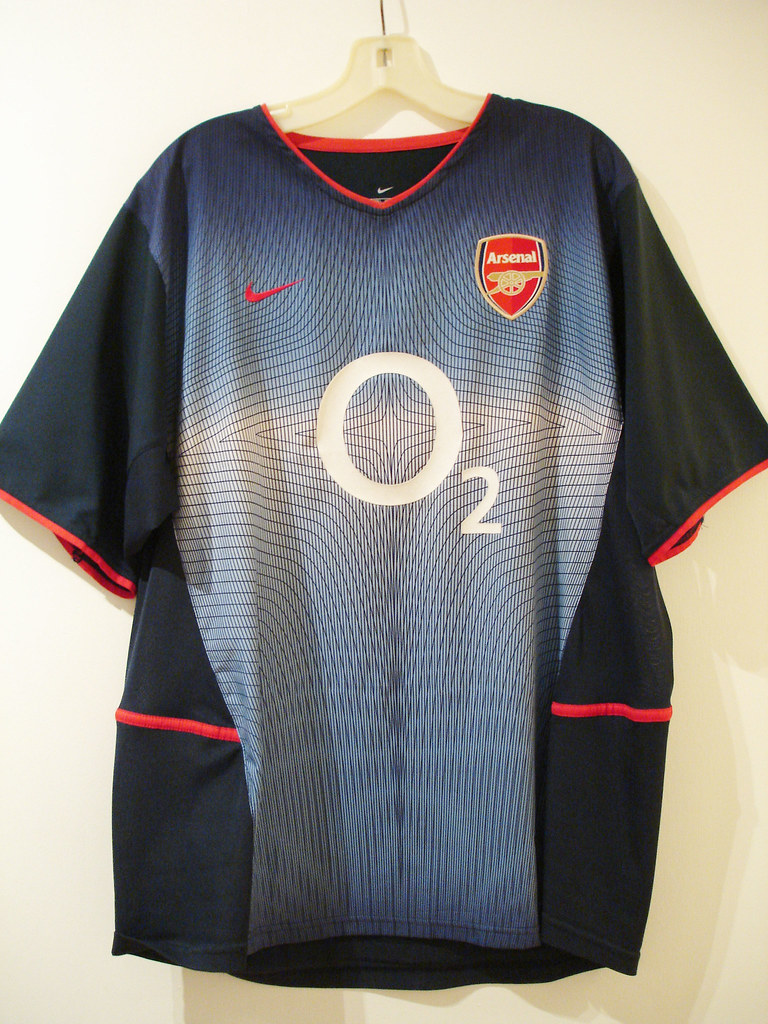
This shirt was part of an all–navy away strip Arsenal wore in the 2003/2003 season. Made by Nike, this was a very innovative shirt in many ways.
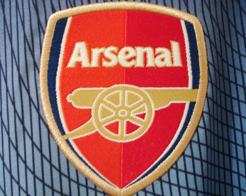
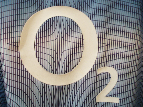
This was the season Arsenal introduced their new crest. The new crest was panned by some Gooner traditionalists, but I feel that the new design is classy enough and it brought the crest into the 21st century. Actually, now that you look at the old crest vs the new, you wonder why no one had thought of doing that any sooner. Then, there was the geometric fade pattern, another controversial design element that I actually like very much. One thing I especially like about the pattern is it makes the shirt match perfectly with my pair of hyper blue Air Max Plus. The O2 logo is simple enough and it actually works well with the pattern. The astroid in the middle of the pattern is also right in the center of the O, creating a target effect. Can you picture Thierry Henry running at you in this shirt? He must have looked like a super–hero. The shirt must have brought some degree of luck, as Arsenal won the F.A. Cup in '03, beating Man. United in this strip along the way.
Finally, this shirt was part of those dual layer "cool–motion" shirts that were so problematic during the 2002 World Cup. During the normal shirt–pulling that occurs during any soccer match, the layers would rip apart, forcing the player to have to change his shirt. Then it would take the player an eternity to remove the tangled mess of a shirt to change into a new one. This happened a few times during that world cup, it was absolutely maddening. Someone dropped the ball there big–time. Fortunately, I don't have anyone tugging at my shirt when I wear it so this is not an issue for me.
As a side note, this same template was used for Leeds United's away shirt that same season.
I happen to think the dual layer issue aside, this is one of Arsenal's best–ever away kits, and it must have been somewhat popular as it was also used as the 3rd strip in the 2003/2004 campaign. It holds a special place in my collection.
Subscribe to:
Posts (Atom)