Monday, September 22, 2008

2008/09 Season Preview

The season has kicked off all around Europe, so it is an appropriate time to reflect on the new kits that were released for the new season. So without further delay, here is the good, the bad, and the ugly:
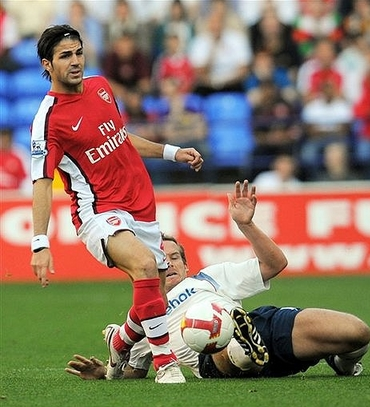
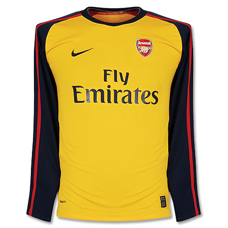
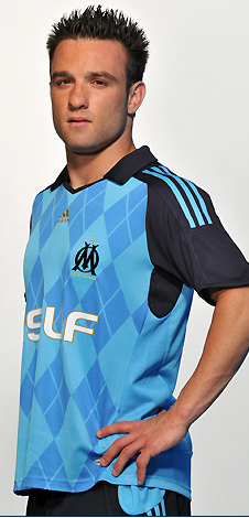
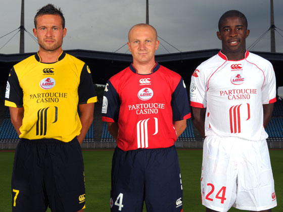
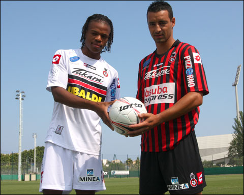
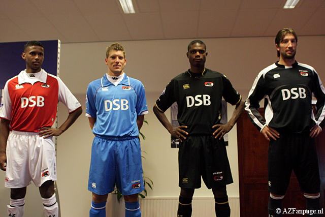
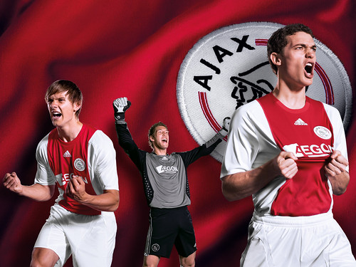
Let's start with the bad. I really don't like Arsenal's new home kit. Arsenal belong in all–white sleeves, period. That's my main gripe about the shirt. On the other hand, their away shirt is quite spiffy. Manchester United's new designs are so boring to me that I won't even link to them. I will give them credit though for not changing their home kit from last season's. I can't seem to get my head around Marseille's new away kit. Is it a breakthrough in football fashion or is it a horror show? I am leaning towards the latter. I think the argyle pattern might have worked if the colors were a bit more subdued. Honestly, can Lille's shirt sponsor be any bigger? Ligue 1 must be in major financial difficulty if French clubs are whoring out their shirts like this. It's been said in these pages before, that is no longer a football shirt. It is a racing shirt. AZ Alkmaar will be wearing collars reminiscent of 1890's football clubs. Big change at Ajax, where ABN–AMRO's familiar vertical advert has been supplanted by something called Aegon. I usually do not mourn the changing of a shirt sponsor, but c'mon. Ajax and that ad went hand in hand. 
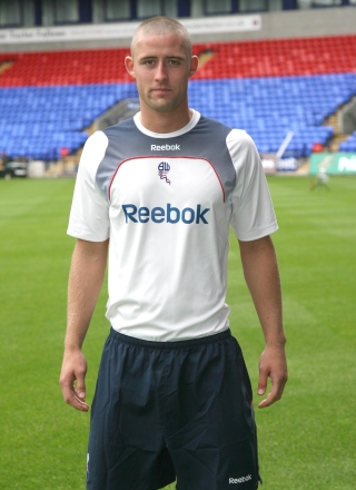
But the hands–down worst kit of the season has to go to Bolton Wanderers and this horrible Reebok outfit. That looks like a third–rate club's training shirt! Are they for real? Who looked at the prototype of that kit and said "Hey, that's nice. Let's go with that." ?
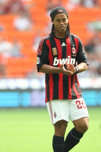
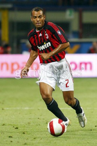
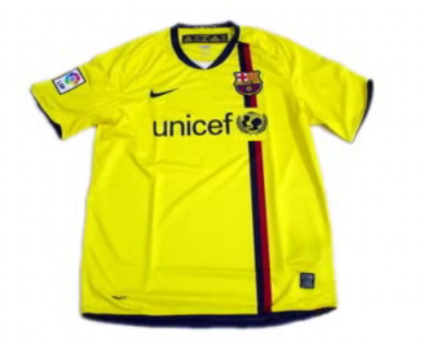
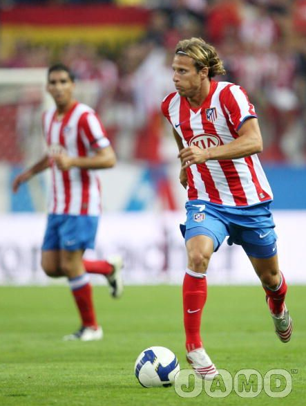
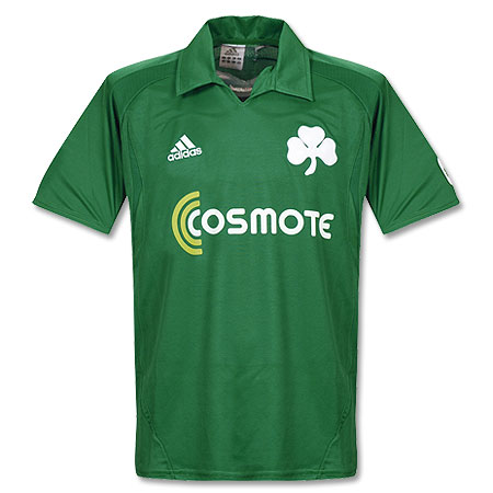
Now on to the good stuff: AC Milan restored order to their world by coming out with a fresh update to their timeless kit. A big improvement over last year's shirt. There was a lot of hubub over Barcelona's ditching of their famous stripes, but I say relax, people. That new home kit is splendid and evocative of their centenary shirt from back in the 1998 season. The away kit is also quite nice. Too bad they will continue to use their teal ensemble as their 3rd kit.  Let's hope there are not too many occasions for that. Athletico Madrid went back to wearing blue shorts with their home kit, and the results speak for themselves. That is one of the best kits in the world. I thought  Borussia Dortmund's home shirt was also a fresh take on a classic style. Those pinstripes just scream of the '80's to me. I like their away kit as well, but unfortunately it is ruined by that loud, diagonal sponsor. A couple of minimalist designs that I really like: Sporting Lisbon's away and Panathinaikos' home. I love that huge clover leaf on the shirt, reminds me of something out of the turn of the 20th century. Call me crazy but I like this design from Sevilla(one of their dozens of kits).
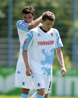
But my favorite kit of the new season: 1860 Munich. Here is a better view. I just love that design, it's fun and the color scheme ensures that it is not too tacky. This jersey would be absolutely perfect if they had Löwenbräu as the shirt sponsor(they used to back in the day).

Thursday, September 11, 2008

Best of the Strange Kits: Shimizu S–Pulse

Submitted here for you is Japanese Club Shimizu S–Pulse. I can't tell you much about Japanese football, but I can say that S–Pulse have a unique kit. There is usually some variation on the globe motif, perhaps because the club's shirt sponsor is Japan Airlines. This is the kind of kit that I admire in secret. I actually like the design but could never bring myself to wear it in public. Of course if I was a supporter, it would probably be a different story.
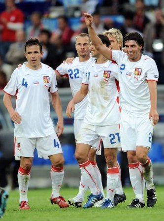
Update: My schedule's been pretty hectic lately, severely limiting my ability to post on a frequent basis. My apologies to those of you that been expecting our critique of the new kits released for the 08/08 season. Rest assured, the article is almost finished and will be published soon.

Friday, August 1, 2008

Best of the Strange Kits: Denmark '86

This interesting kit for the Danish National Team was made by Hummel for the 1986 World Cup. Denmark had a great opening round in this tournament, with famous wins over West Germany and Uruguay, who they beat 6–1. I was a young boy watching this tournament and I was mesmerized by the Danes' fantastic team play. They had some great players like Michael Laudrup, Preben Elkjaer, and Søren Lerby. I thought the Danes might be the heirs of total football.
I remember thinking at the time that the Danes kits looked like no other teams' in the tournament. I thought they looked so futuristic compared to the fairly simple designs of the other nations.
Unfortunately for the Danes, their good start in the tournament didn't carry over to the knock–out stage, where they were eliminated in the round of 16 by Spain.

Wednesday, July 30, 2008

The End of An Era

According to this article, Athletic Bilbao of Spain will start wearing advertising on their shirt for the 2008/08 campaign. This is an unfortunate development, as Bilbao was one of the last clubs to have a shirt without a sponsor. Is there any club left now that is sponsor–free?

Monday, July 7, 2008

Best of the Strange Kits: Borussia Dortmund


Over the next couple few posts we are going to exhibit some kits which deviated from the norm. I always try to keep an open mind when seeing new kits, and these kits certainly pushed the envelope.


First up is this neon yellow number from Borussia Dortmund, circa the mid 90s. Dortmund have been a Nike club for a very long time, save for a rather unfortunate period in the early 2000s when the club was making their own kits.


I liked this kit very much. It coincided with one of the greatest periods of success for the club, maybe that's why I always thought it looked so intimidating. To me it was futuristic yet classic. The thin hoops on the socks were a great touch.

Tuesday, July 1, 2008

New AC Milan Away shirt 08/09


This is rumored to be AC Milan's new away shirt for the 2008/09 campaign. Milan invariably choose white as their away color, and in fact, white has been viewed as a lucky color for the club. Assuming this leak is legit, I think this is a pretty nice shirt for my beloved rossoneri. I like the cross on the shirt, it goes well with the motif of the club. Though it's a little surprising that Milan would feature a cross so prominently on their shirt after all the controversy last year with Inter. What I don't like is that bwin advert, I wish Milan would dump them ASAP. All in all, a pretty good shirt. Now I hope that Milan will release a new home kit. Last season's home kit was one of the worst in memory.

Sunday, June 29, 2008

Euro 2008: The Football Kit Blog Report


VIENNA–Euro 2008 will go down in history as an outstanding tournament full of nail–biting finishes. That will be the consensus throughout the world media. But how many columns will be devoted to the uniforms of the tournament? Not many, I gather. Here, without further adieu, is my take on the kits used in Euro 2008.

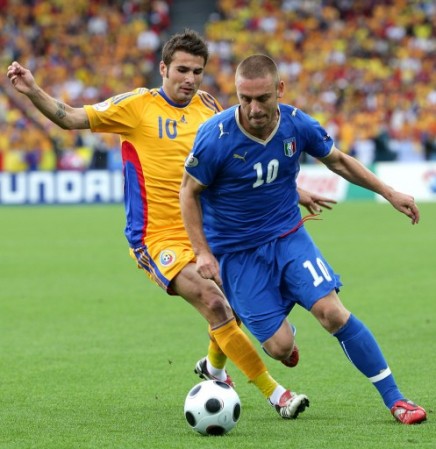
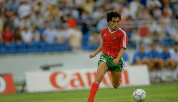
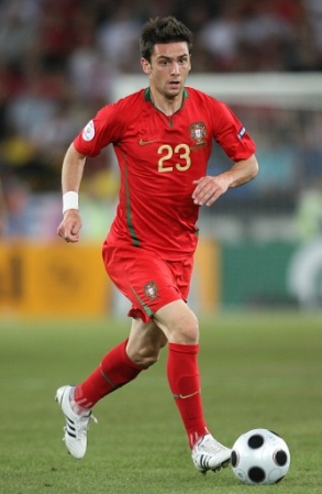
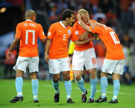
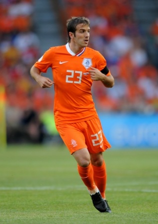
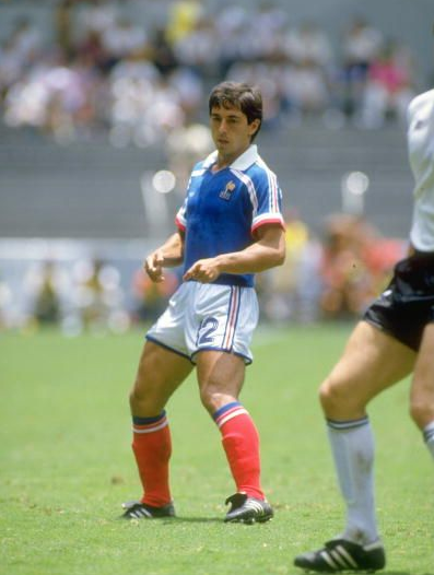
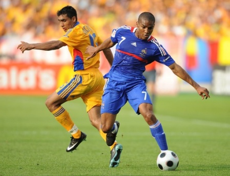
Let's start with the bad. In the past few major tournaments, I have noticed a trend of teams coming out in solid color kits. This is an unfortunate development. For example, Portugal used to wear this. In Euro 2008 (and going back further, actually) they have been wearing an all–red kit. It is certainly debatable which look is better, but the green shorts are no doubt more traditional. Take also the example of The Netherlands. When they came out wearing the orange shirt/white short/blue sock kit, they looked brilliant. But when they came out as they did in the majority of their matches in all–orange, it didn't work so well. And why, for example, can't France look like this when they play against Romania? Does UEFA really think television viewers won't be able to distinguish between the two sides?

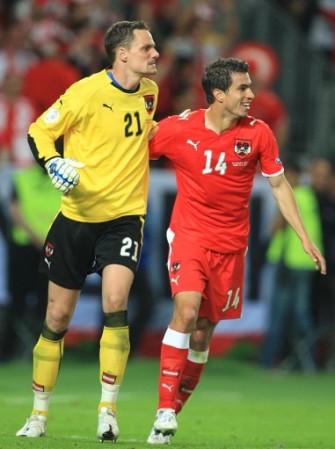
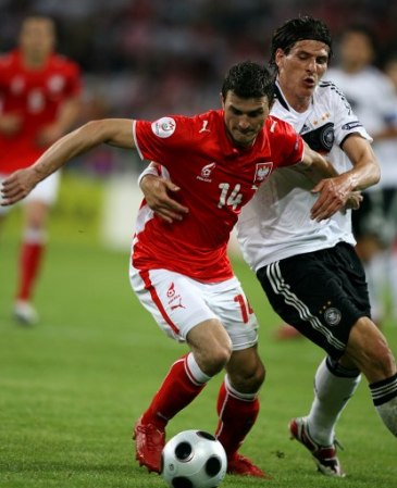
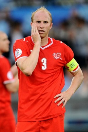
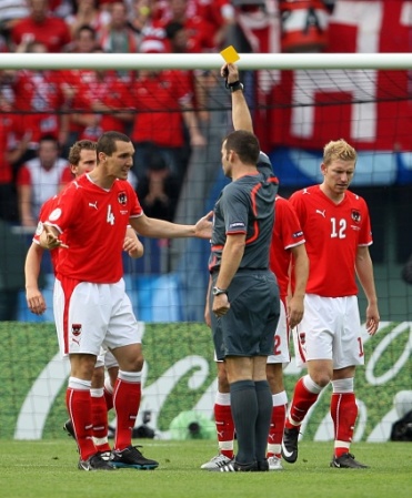
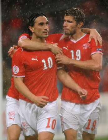
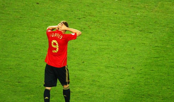
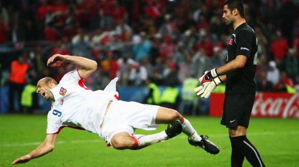
This tournament was a complete disaster for Puma. In footballing terms, only one Puma team (Italy) made it to the knock–out stages. Puma also outfitted Austria, Czech Republic, Poland and Switzerland. Game to game these teams looked indistinguishable from one another. Take a look at this, this, and this. Save for the crests, those kits are identical. It's the epitome of laziness. At least with Nike or Adidas there are some subtle touches that set each kit apart, but Puma apparently believes that all national teams should wear the same thing. The kits themselves are relatively nice but also a little boring. Those two sets of fonts they used for name & numbers weren't anything special either.

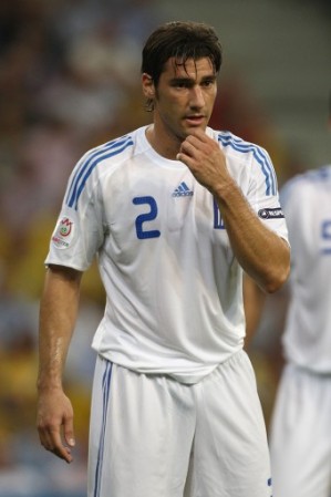
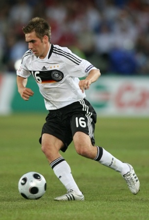
Adidas had a decent tournament, with several of the teams they outfit making it to the latter stages. The final was an all-adidas affair. The kits were pretty good too although somewhat predictable. My favorite of the lot was the German kit. My one major gripe would be those tacky name & number fonts.

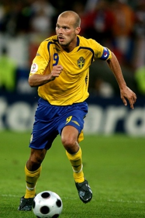
Umbro was represented in the form of Sweden, and I think you'll agree it was another ho–hum effort by Umbro. No wonder this company loses sponsorship after sponsorship. For the most part there is nothing in their designs that make you want to part with your hard earned cash. England should wise up and ditch Umbro for Nike.

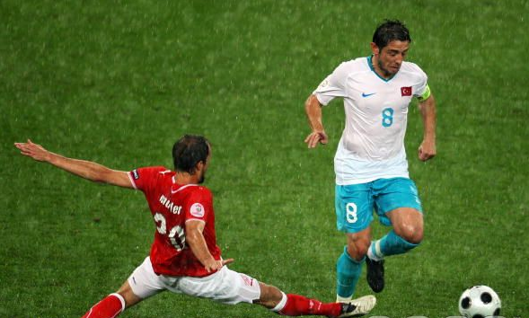
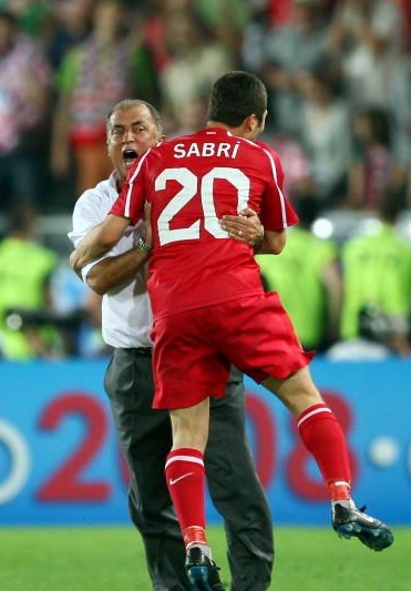
The big winner to me was Nike. Once again they took the effort of making unique kits tailored to each nation. A detail that particularly stuck out to me was the use of Turquoise in the Turkish away kit and other gear. I thought it looked great and was totally unique. I was intrigued and found this fantastic explanation by a Turkish fan on football shirts news:

"Turquoise means “Colour of the Turk” in french (or so they say) it is said that in medieval ages, only Turkish artists can paint ceramics in this colour. The european artists had tried so much to copy this colour but were unable to do so. A sportswriter Mehmet Demirkol first mentioned that Turkey must wear turquoise jerseys, a few months later manager Fatih Terim announced that the new away kit will include turquoise details. This jersey can be the beginning of a new era. It is planned to switch to a full turquoise shirt in a few years, and be recognized with this color like Azzuri of Italy and Orange of the Netherlands."

It would be really exciting if Turkey were to change their home shirt to a Turquoise shirt, but it's unlikely to happen. Remember when Mexico were going to change their home shirt to white? Tradition is sometimes very hard to part with. In this case, I think it would be a good thing. There are already so many other teams with red kits. I also thought the Turks' name & number font was nice and it looked appropriate.

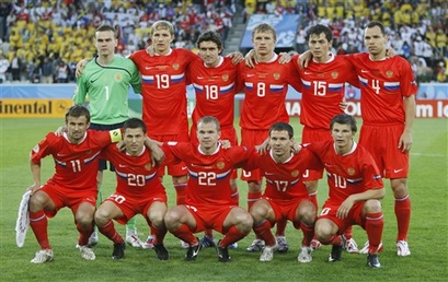
Another Nike highlight for me were the Russian kits. Both homee & away were really nice and looked sharp on the pitch. The white Russian kit was actually my favorite kit of the whole tournament.

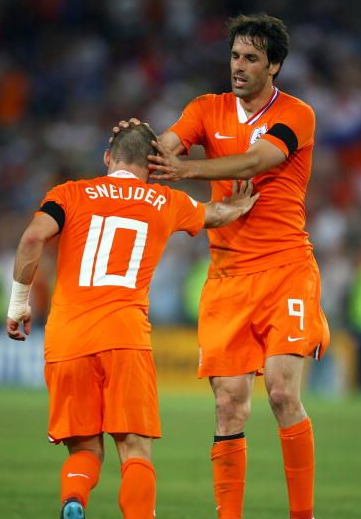
I had a couple of minor gripes with Nike. All their keepers looked exactly the same, and the number font they used for The Netherlands was ugly to say the least. Look for that keeper kit now on club teams all over the world in the upcoming season.

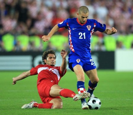
Croatia had the misfortune of not being able to wear their white and red checkered shirt in any of their four matches. It's unusual a team would go that deep in a tournament and never wear their home shirt.

All 16 teams had a sleeve patch on the left side that read "RESPECT." A nice idea, but it didn't really translate to more respect on the pitch.

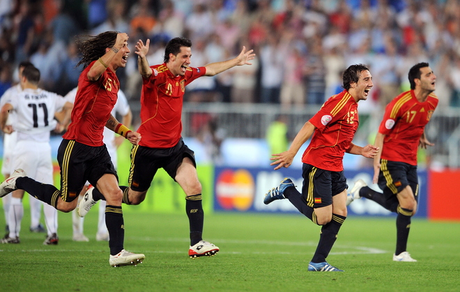
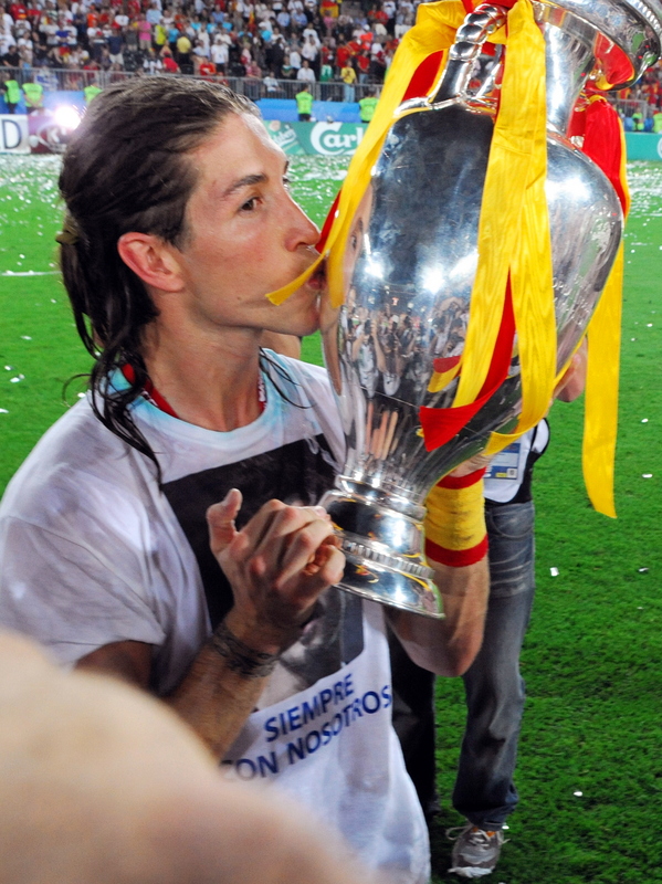
A couple of nice touches in the celebration after Spain's victory in the final: Sergio Ramos and his t–shirt dedicated to former teammate Antonio Puerta who passed away on the pitch last year. Also, back–up goalkeeper Andres Palop put on a throwback Spanish goalkeeping jersey, that of Luis Maria Arconada.


Our special offer is still in effect. The first person to donate $60.00 US to our blog will get the Manchester United 07/09 jersey shipped to them. Jersey is brand–new, size XL. Read all the details here.