Tuesday, September 4, 2007

Different Day, Different Kit


It's common nowadays for clubs to have a 3rd kit. The 3rd kit is a kit that is used when neither the home or away are used. Some teams even have a 4th kit. But what is going on at Sevilla FC has to be unprecedented.


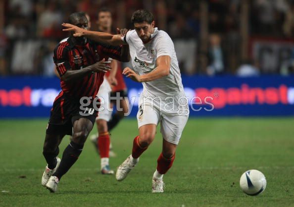
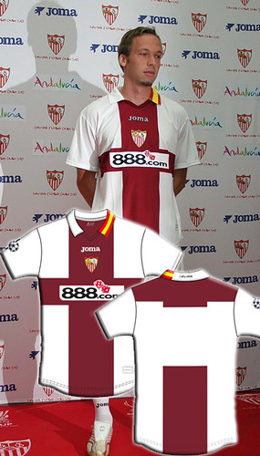
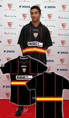
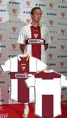
Last week we showed you Sevilla's new home, away, and 3rd kits for the 06/07 season. All well and dandy but on Friday I watched Sevilla play my beloved AC Milan in the European Super Cup. Sevilla wore a kit that is none of those previous kits. It's similar to the home in that it has all-white shirt and shorts, but other design elements are completely different.OK so that is the 4th kit. Then on the following Monday, Sevilla wore this against AEK Athens in the Champions League. So if you are keeping score at home, that is at least 5 different kits they will wear this season. Who knows, maybe they will wear yet another kit in their next match.


Actually, Maybe they will. After a little digging around I discovered that these two shirts are what Sevilla calls their "previa Champions" kits, meaning pre-Champions. I guess they are only going to be worn during the qualifying round of the Champions League, but who knows. What is for sure is that makes a total of 6 kits.


The kit they wore in the Super Cup was a one-off special edition for that event. It just shows you the difference in pedigree between Milan and Sevilla that Sevilla would get a special kit made just for the occasion. I could understand if there was a conflict between Milan' shirts and all of Sevilla's kits, but that is not the case here. It's almost as if Sevilla is celebrating just being there while Milan is there to take care of business. This one-off kit stuff is not new for Sevilla, they did the same thing for last year's UEFA Cup final. It's all a bit much for me.


That being said, the Super Cup kit is my favorite of the lot, with the all-black number running a close second. In fact, all the designs are pretty good except for the awful, vomit-inducing fuischia outfit. I've said it before pink is not necessarily bad, but that shade of pink belongs nowhere on any sporting field.

Saturday, September 1, 2007


Very Nice Tribute in Today's European Super Cup final between AC Mian and Sevilla FC. All the players on both teams wore the name "PUERTA" in honor of Sevilla's Antonio Puerta, who passed away this week after collapsing on the pitch. Milan won the match 3-1.

Friday, August 31, 2007

Adidas Is Ruining Football

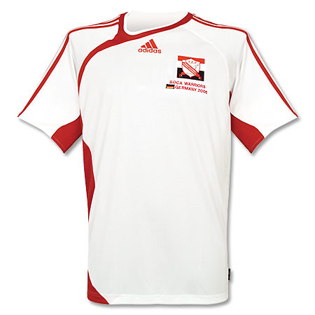
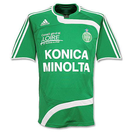
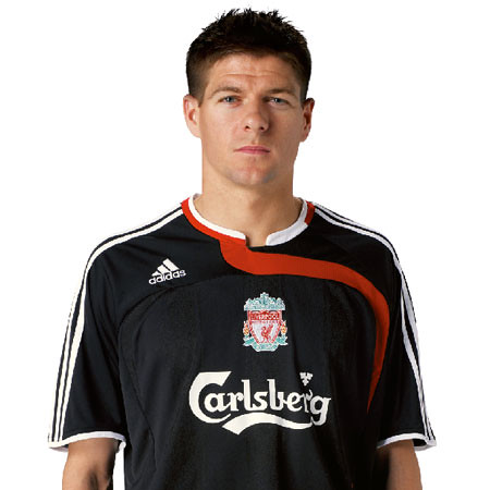
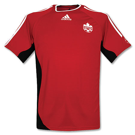
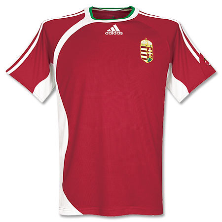
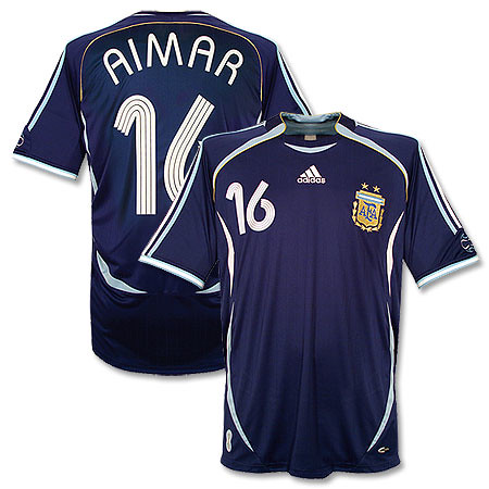
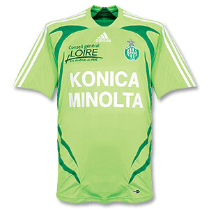
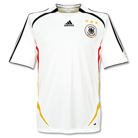
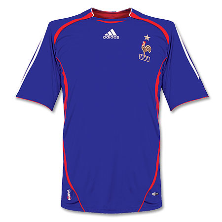
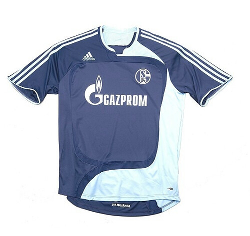
Adidas has been ruining the game from an aesthetic point of view. I know they have been a pioneer in football kit design for many years, but recently they have been coming out with some awful designs. Then they exacerbate the problem by using these crappy designs as templates that they use for many different teams around the world. Let's be honest a lot of these shirts look like training shirts. I mean it's friggin' ridiculous. They are taking all these football federations and clubs for granted. I mean some kid at Parson's could come up with something better than this crap. Say what you want about Nike, they were innovative this past world cup by ditching the templates and giving each team their own identity. The other major kit manufacturer is using templates. Templates, templates, templates. It's like if you are an Adidas-supplied team, you're getting one of 3 templates and maybe if you're lucky they'll embellish it a little bit. If you agree with me, leave a comment and hopefully someone at Adidas will read this and get the message. You are dressing some of the greatest teams in all of sport. Give them their own individuality. And not every single shirt has to have those damn stripes running down the sleeves. And if you do have to put the stripes on there, they don't always have to be contrasting. I've seen regular Adidas gear where the stripes are not contrasting and that looks pretty cool. Sometimes the best type of branding and marketing can be subtle.
Saturday, August 25, 2007

2007/2008 kits: An assessment


Now is the time of the year that clubs all over Europe release their new shirts for the upcoming season. I'm sure many of the die-hard football kit enthusiasts have already seen some of the designs that have popped up on the web and are slowly being introduced on the pitch. There have been some interesting designs, and I think the time is right for a report:


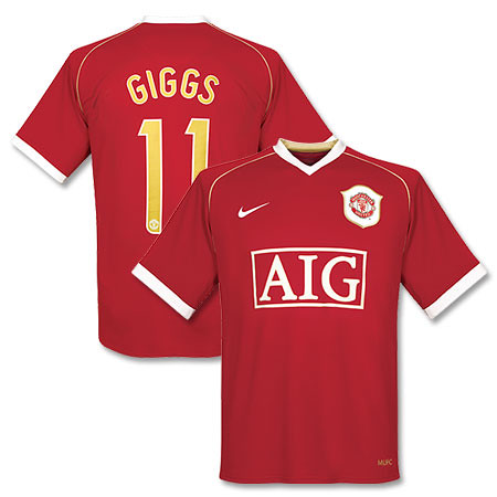
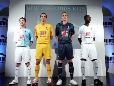
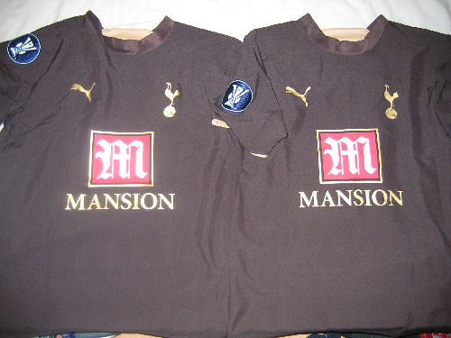
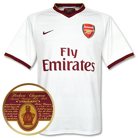
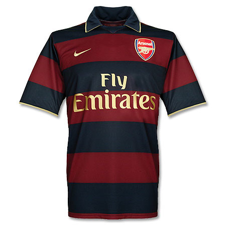
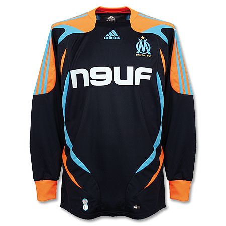
Some of the Worst - Let's start with the bad news. I think that Man. United's new home shirt is classy enough, but last year's shirt was nice and simple too, in fact, very similar to the new design. So why fleece your supporters so disgracefully by changing kits after just one season? It's just so unnecessary and anyone who buys both of those shirts is a sucker. Tottenham Hotspur released some really smart designs, but they should have kept their gorgeous brown shirt(trust me they looked better in action) , which was only in use for one season. Not that Arsenal's new designs aren't nice, it's just that they are a little boring for a team that has had some great kits. At least all of these teams have not fallen victim to those awful templates that are the bane of football shirt design. It's depressing how many teams and goalkeepers have that squiggly thing on their shirts.

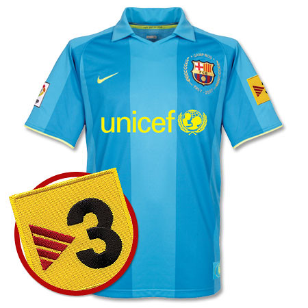
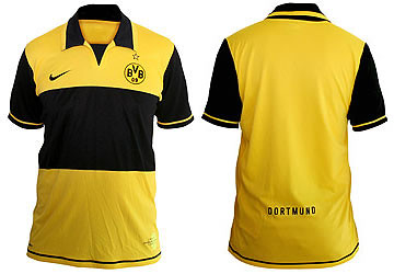
Barça's new away shirt is pretty bad. The greens used are ugly, which is the main problem with the shirt. Sevilla keeps insisting on that putrid fuschia outfit(although that white shirt with the red slash looks pretty sharp). Borussia Dortmund's new home shirt looks OK in pictures, but I'm sure in on the pitch they will make the players look like giant bumblebees, not a good thing.

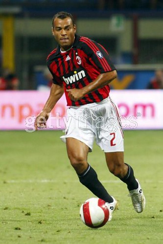
However the most disappointing development is over at my beloved AC Milan. that home shirt is really bad. It just breaks my heart because Milan haven't had a decent home shirt for years now. The new number font is bad too. A club as great as Milan doesn't have to resort to that futuristic B.S. Mr. Berlusconi needs to fire someone for this fiasco.

On a funny aside, this disgusting thing reminds me of the Islanders (of the National Hockey League) "Fishstick Guy" design in hockey.


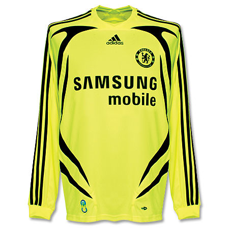
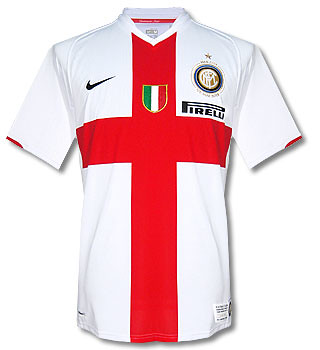
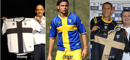
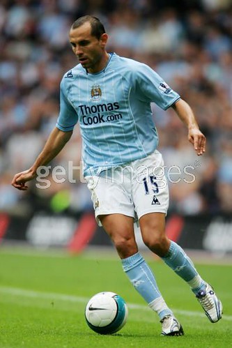
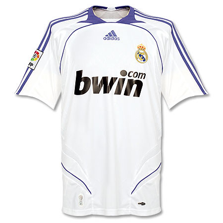
The Best - While adidas continues to try to make all clubs around the world look the same, there are some good designs that stand out, mostly from other manufacturers. Inter's new centenary shirt is really nice. Parma also looks good in the same design. I also like the new Manchester City designs. Real Madrid kept it simple as always. while Chelsea took a bold step in color. Very loud yes, but I'm not sure I don't like it. And boy do those new Premier League numbers look snazzy. And with the way the match up with the font of the Premier League wordmark means teams in England just took a major step up sartorially. All in all not a groundbreaking year for kit design but things can always be worse I suppose.


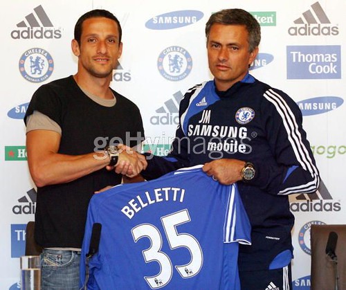
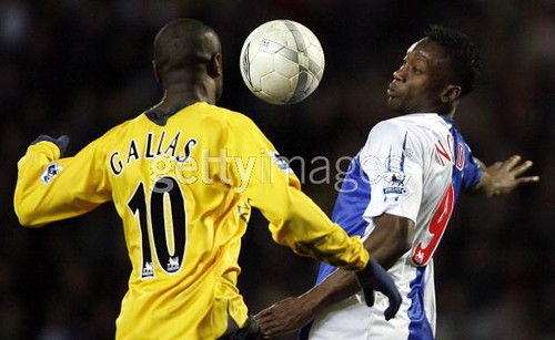
football kit blog Update: Khalid Boulharouz was loaned away from Chelsea, which means we no longer have to put up with the uncomfortable sight of seeing a defender wearing number 9. Now if only William Gallas would be so kind as to oblige.

Wednesday, July 11, 2007

David Beckham Will Wear 23 at LA Galaxy

There's been no official announcement yet, but it looks like David Beckham will wear #23 on the LA Galaxy. I was perusing through their team shop and noticed that they are already selling a t-shirt with "BECKHAM 23" on it. I must say that the new LA kits are classy and I'm glad that adidas didn't use that horrible squiggly template.

Friday, June 15, 2007

Digging in the Vaults: Atletic Bilbao Centenary Shirt


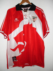
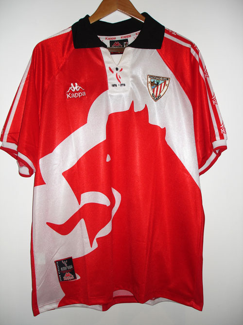
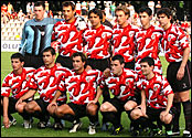
This little number is the Athletic Bilbao centenary shirt from 1998. I really like this shirt, I know it's really loud, but I don't really care. Bilbao's Basque-only policy is pretty admirable and they are one of only 3 clubs in Spanish football (the others being Real Madrid and Barcelona) that have never been relegated (that is in jeopardy at the moment). Perhaps best of all, they are one of a few clubs that don't wear any ads on their jersey. I hope they stay in the Primera Liga so that the no-ads policy can continue. I'm sure that if the club loses the revenue of not being in the top flight, they might compensate by getting a sponsor for their shirt.

The jersey is made by Kappa, whose male/female logo is pretty cool. Their logo is sewn on the right chest as well as running up and down the sleeves. The shirt is also a departure from the usual Bilbao home shirt, which has red and white vertical stripes. There is a huge dragon-like logo on the front of the shirt, and the back looks like the the back of the dragon if you look at it from the right angle. On the back of the shirt is the name and number of Bilbao stalwart Joseba Etxeberria. To top it off there's a special logo commemorating the centenary on the collar placket. This article says that Bilbao also had a second Centenary shirt in 2004, which looked like this. Not sure how they can have two centenaries but I have to say that second one is pretty hideous.

Sunday, June 10, 2007

Catalan Controversy


There was an interesting football kit related incident in last week's international friendly between Spain and Latvia. It seems that two players on Spain's team, Xavi and Carles Puyol, turned the top of their socks inside to hide the trim which is the color of the Spanish national flag. Xavi (#8) and Puyol (#5) are both from Catalonia, which is fiercely proud of being an "Autonomous community" within Spain. In this article, Xavi says that the suggestion that he and Puyol did this deliberately as a show of Catalan unity is to start a "ridiculous and malicious debate(s)." The photo from the match above shows that this has to be more than a coincidence. I personally dig it, and if Catalonia really is autonomous , UEFA should let their national team, which already plays friendlies, to play full internationals. It would be interesting to see how an all-Catalan team would do on the international scene.