Tuesday, May 15, 2007

This is Rumored to Be...


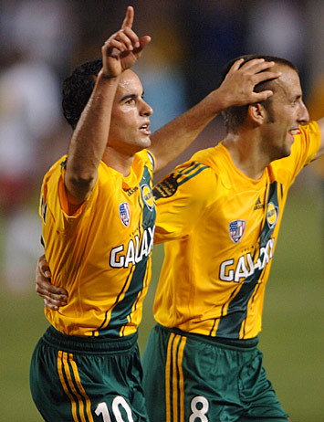
...The much-anticipated new LA Galaxy shirts. The image circulating on the web seems to be legit enough, if not it's a very good fake. The logo is another matter entirely as it does look somewhat amateurish. So who knows, we will just have to wait and see how this plays out. I wonder if Becks has any imput?

Wednesday, April 18, 2007

Preview of Premiership's New Names & Numbers


It looks like England's Premier League will launch their new name & number system on May 15th. I found this neat graphic illustrating the change, which I definitely think is a huge step forward. The new numbers are a lot more sleek than the previous version. The change also addresses one big problem with the old font, which was that the 1 and the 7 looked very similar. Kudos to England, I think these numbers look so good, I'm willing to overlook for the time being that England doesn't have an "open" shirt number policy. I'm strongly in favor of teams being able to choose their own fonts, but I also believe there needs to be some regulations and oversight so the disaster that Sevilla FC has been this season can be avoided at all costs.

Wednesday, April 4, 2007

Ajax Switch Things Up


On April 1st Ajax Amsterdam in a match against Heracles wore a special one-off kit. I noticed it on Tuesday when I was watching eredivisie highlights on Fox Soccer Channel. The kit is identical to the one they usually wear in the Dutch league save for the advertising on the shirt. For God knows how long Ajax have been sponsored by Dutch bank ABN-AMRO. In fact the only other sponsor I could think of Ajax having was TDK way back.


I couldn't make out what the advertising said on the highlights so I did a little digging and found out it was a one-off shirt to introduce ABN-AMRO's new mortgage branch Florius. The whole story can be found here. Also mentioned in that piece is that Ajax have done this before in 2003, which I didn't know about. There's not much to say about the change since it's not really a major one. The most important thing is that they preserved the tradition of aligning the lettering on the Ajax shirt vertically. Tradition is good.


Another interesting note from Holland is that Feyenoord has introduced their new kits for the 2007/08 season. Not much of a change on the home, but the new away kit is quite new and fresh.

Monday, March 26, 2007

MLS Gets With The Program


On Friday, Real Salt Lake (RSL) became the first MLS club to announce a front-of the-shirt sponsor (something called Xango). Technically, the New York Red Bulls were the first to do this last season, but their case is a little different because the entire team was purchased by the company that owns Red Bull and re-named ( A quick aside on Red Bulls, they need to tone down the size of that ad, that thing is way too big). RSL was followed by LA Galaxy and today by Toronto FC, who released their first ever kit sponsored by BMO Bank. I'm sure there are soccer fans here in the States and Canada that are up in arms about this development. We (and when I say we I mean me) here at footballkitblog hold a different, more pragmatic view. I believe this is a positive development for American soccer on its road to legitimacy.

Since its inception in 1996, MLS clubs have worn advertising on the back of the jersey, with the team name usually on the front. Of course, the rest of the football/soccer world wears ads on the front of the jersey among other places. This difference along with some others (the "breakaway" tie-breakers, the loud colors and cartoonish nature of most of the jerseys and logos, the huge, empty stadiums) differentiated the American game, and frankly, we were a laughingstock. Recently MLS has made strides towards putting out a better product, and putting ads on the front of the shirts is another step in the right direction. The advertising on the shirt boat has sailed, kids. Now our clubs will look like real football teams.

As far as the new Toronto shirt is concerned, I think the colors are pretty nice and the ad for BMO is done tastefully enough, and at least adidas used the least unattractive or their latest crappy templates. More on how adidas is destroying the game soon to come. I'm curious to see what LA Galaxy is going to do, they are due to release a complete re-design of their look soon. I hear that either black or navy blue will be used as one of the team colors. Anything is better than the puke-a-thon they've been wearing.

New U.S. 3rd Jersey Makes Its Debut


The new United States 3rd made its debut today in an international friendly against Ecuador. The jesey was paired with a blue short. I wonder why they didn't use the white short which I think would have looked much better. Also, Ecuador wore blue shorts, so the U.S. had a ready made excuse to wear the white shorts. I guess they intend on using the white shorts as change shorts, which is unfortunate.

The jersey proved to be lucky today as the U.S. won 3-1 on the strength of a hat-trick by Landon Donovan.

I personally think the jersey looks pretty good. It's true the other jerseys the U.S. is currently using are probably nicer, but this jersey is a nice change of pace. And really, it could be a lot worse. Just look at the horror that Ecuador was wearing.

Wednesday, March 21, 2007

U.S. Soccer Inroduces New 3rd Jersey


The United States national team has released a new 3rd jersey, a royal blue affair with thin white pinstripes. I don't hate the design, but I'm not sure yet if I like it. I have to soak it in a little and see how it actually looks on the pitch. This jersey will make its debut this March 27th when the U.S. takes on Ecuador in a friendly. A few observations:
I like the fact that a royal blue shirt has been re-introduced. The U.S. team has been wearing white home shirts and navy blue away shirts for some time but in the 80's I think the home shirt was royal blue. So the shirt is a throwback of sorts. I mention the 80's also because the pinstripes are definitely an 80's thing.

It seems the shirt will be paired with both royal blue or white shorts and royal blue socks. I think the kit will look much better with the white shorts.

The 3rd jersey is a rarity for national teams. I know I've seen a few national sides wear them, Wales being one other example.

One interesting note from the website: the shirt features "raised nodes on the underside that lift the shirt away from the players' bodies to keep their skin drier and reduce shirt cling." Now, I don't want to come off as a Nike marketing guy but that is pretty badass. That's some future-is-here type of stuff.


More on this story to come...

Friday, March 16, 2007

Is this Football or Racing?


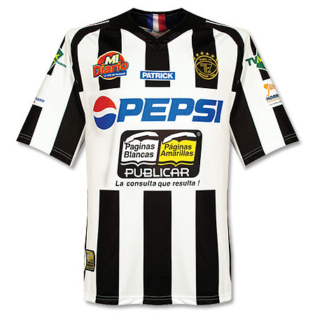
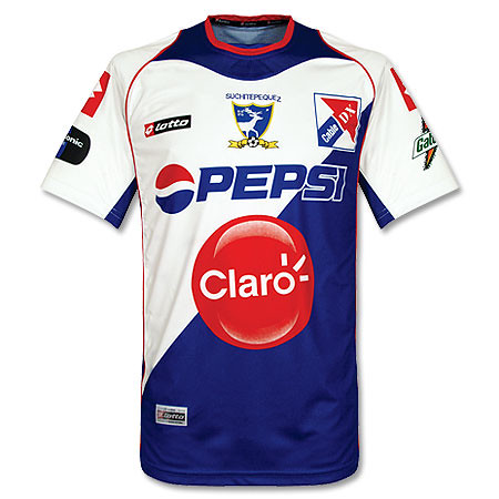
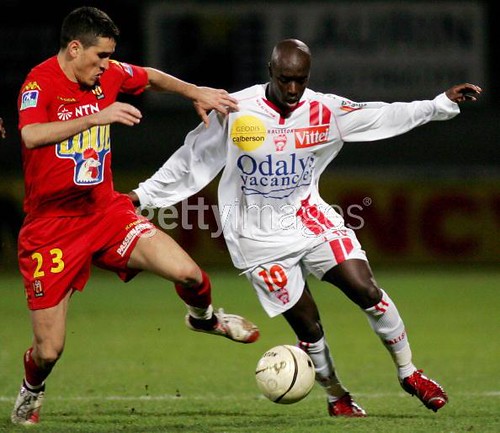
It's disturbing to me when I see certain football clubs go out of control with the advertising on the shirt. Take a look at this mess. Or this. That's a complete bastardization of the kit. While I know these uniforms are not sacred things (well, except maybe a one or two), they are the closest things the fans have to a connection with their favorite club and therfore should be treated with a little respect and reverence.

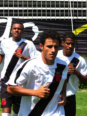
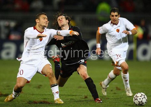
I've noticed some leagues are worse than others in terms of how many ads they'll allow on the shirt. The French league seems to be unfortunately liberal. I have to give the British credit, I don't think they would ever allow such a thing. There are some scattered holdouts throughout the world that don't have any ads on the shirt. Barcelona caved recently, although it was for a very good cause so you can't really be mad at that. I can think of Vasco Da Gama & Roma off the top of my head that don't have any ads at the moment. I don't mind the ads so much, especially when they don't take up a lot of space on the shirt. There needs to be a modicum of decorum.