Wednesday, October 15, 2014

Memo to New Balance: Don't Muck Up the 'Pool


For most fans of the world's game, Liverpool FC is one of the world's iconic clubs, and their all-red kit equally so. Granted, if you are a supporter of Everton, United, Chelsea, Arsenal, etc, you probably despise the Reds. But those of us outside the Kingdom with no dog in the fight appreciate the club's storied history and proud legacy. Liverpool FC is football. We're talking about Bill Shankly, 18 Leagues, 7 FA Cups, 5 UEFA Champions' Leagues, the Kop, Hillsborough. And of course, You'll Never Walk Alone, which, when sung by Liverpool supporters at Anfield(and abroad) before important matches, can be one of the most spine-tingling moments in world football. Mind you, all these plaudits are coming from an AC Milan supporter, who Lord knows should still be bitter about a certain tragic night in Istanbul...

I bring up Liverpool because this is a club that has recently lost its way in the kit department. Starting with the 2012-2013 season, Liverpool entered into a contract with new-kid-on-the-block Warrior Sports. The result has been a decidedly mixed bag of kits, with the good ones being few and far between, and the bad ones being really, really bad.

Warrior's best effort in my opinion was their first Liverpool home kit for 2012/13. I enjoyed the simplicity of it and I also liked the retro feel of incorporating the simple "Liverbird" logo as the crest as opposed to the more intricate badge of recent decades. I do love that intricate badge with the Shankly gates, the Hillsborough flames, and the "YNWA" inscription though, but a change for one season or a couple of seasons is not a big deal. After that, I really cannot say that I liked any of Warrior's other Liverpool efforts, be they home, away, 3rd, or keeper. Some of those designs are really garish and I have a hard time understanding how Warrior expects someone to wear that outside. There's always the die-hards, I guess. Also, the piping on the current home jersey just makes the shirt look ill-fitting somehow. It's really just a mess with this club right now and it is really unbecoming of a club of Liverpool's stature. Just look at some of these Adidas designs of the 90's. Those are some tremendous shirts with some fabulous detailing. I've had my issues with Adidas in the past, but it must be said that for the most part, Adidas outfitted 'Pool with the respect and reverence that the club deserves. Warrior's been trying to make them look like a red version of Bolton Wanderers.

Now comes word that Warrior's parent company New Balance will be folding the Warrior brand and incorporating it into New Balance. This means that starting with the 2015/16 season, Liverpool shirts will be made by New Balance for the remainder of the contract. We here at The Football Kit Blog hope that this change will provide New Balance with an opportunity to go back to the drawing board and give a club as big and important as Liverpool some class shirts that the supporters can be proud of. We are intrigued at the prospect of the New Balance brand entering the football kit market and will be monitoring developments closely.


Thursday, October 9, 2014

Best of the Strange Kits: Arsenal Away 91-93


Here for your viewing (dis)pleasure is the Arsenal 91-93 away shirt. This is the infamous "bruised banana" shirt. No great imagination required to see why that name stuck. On the pitch, it was the days of David Seaman, Ian Wright, and George Graham's "boring boring Arsenal." This is a truly ugly, ugly football shirt. If nothing else, one has to say that it was a ballsy shirt for a club of Arsenal's magnitude. The early 90's was a period of brash experimentation for most kit manufacturers, who implemented wild, vividly colorful, geometric designs on their kits to make them stand out. It seemed like the most liberties were taken with away kits. I think any rational human being can agree that this Arsenal shirt is truly dreadful. But the question is...why do I love it so???

For starters, there's the nostalgia factor. This kit was used in an era during which I was in my adolescent years, when I first started following club football deeply. My initial exposure to football was through the World Cup. Once I found out about club football and the rich traditions of all these global clubs, I just got more and more hooked on the game and the culture of the game. I remember thinking how cool it was that the north Londoners were simply called "Arsenal" in a league full of F.C.s, Uniteds, and Citys. So I gravitated towards them as I first immersed myself in the English league. Perhaps that is one reason I am partial to the shirt.

Another factor for me is that I have always believed that the away shirt is the right place for experimentation. Most clubs have iconic home shirts, and the vast majority of these designs are quite simple(see Liverpool, Real Madrid to name a couple). And that's the way most of us supporters like it. You don't mess with icons. But the away shirt(save for one glorious club) is another matter entirely. Why not have a little fun?

At the time, there were no blogs, no Bleacher Report to put this shirt in a "Top 10 worst kits" article. In fact, football kits were barely covered at all by the media save for the occasional snide remark by a commentator during a match, and I was not exposed to much live football at the time. So instead of having "tastemakers" influence my opinion, I was just left to my own sensibilities when assessing this or any other kit. And I must say, something about this kit appealed to me. Perhaps it was the "so ugly it's beautiful" frame of mind that also comes into play when looking at ugly dogs like pugs or a Jackson Pollock, for example. Or maybe I just liked the way the yellow pops when contrasted with the red and navy blue. One qualifier: this kit looked completely different and did not work for me at all when paired with the yellow change shorts. It is truly extraordinary to me how such a slight change could alter the whole look so.

This shirt is also a historical footnote for Arsenal as it is the first away shirt the club wore in the the Premier League. That was in the inaugural season of 92-93(notice also how the kit had a life cycle of two seasons). Nowadays, unanimous consensus seems to be that this is one of the worst if not the worst Arsenal shirt of all time. However, according to John Brewin, author of True Colors: Football Kits from 1980 to the Present Day, this shirt "became a major fashion must-have in early 90's London." So somebody must have liked it along with me!


Back in Effect

Wow, it has been way too long...apologies!

I haven't even looked at this blog in at least a couple of years. Life just kind of took over and blogging got pushed out of the picture. I never put a "farewell" post on the blog because I always intended to keep posting, but that next post never came, and eventually I just lost touch.

But I happened upon the blog tonight, and while reading and enjoying the old posts and comments from my wonderful readers from all over the globe, I realized that I still have something to say. I still love the sport and the culture of the football shirt. And I know from looking at the analytics that people do stop by here and read this blog, even so many years after my last post.

So maybe it's time to pick up the mantle once again.

I guess one of the other reasons I stopped posting is that I got frustrated with the back end of the blog– constantly looking for and linking to the photos especially. I always loved the writing but the back-end stuff is not really my bag. I also made the rookie mistake of linking to images not hosted by the blog, and got incredibly annoyed and somewhat discouraged by the inevitable torrent of broken links that followed. So, in order to minimize that frustration and discouragement for myself, I think the best thing to do for now is keep the posts brief, not so bloated. I'll save the big posts for season/tournament previews or other major stories that don't necessarily have a "due date." Who knows, a re-design of the blog may also be in the works. Stay tuned!

Tuesday, October 28, 2008

The East London Hammers?


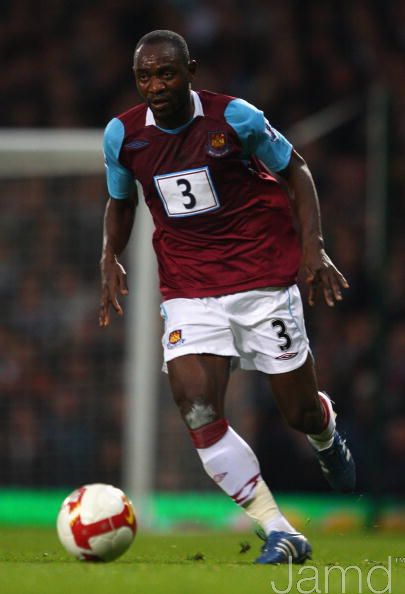
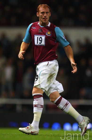
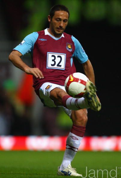
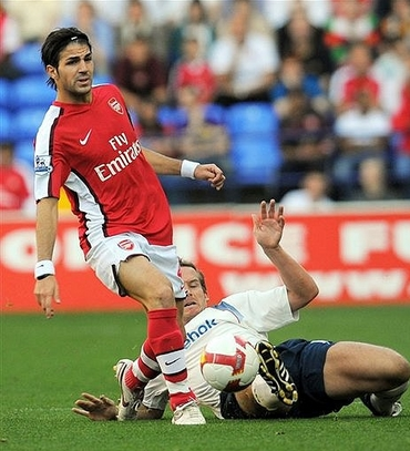
I was watching West Ham v. Arsenal last night when I noticed something peculiar: Instead of a shirt sponsor on the front of their jersey, West Ham had their players' individual numbers screened onto the shirt. Examples here, here, and here

It seems the Hammers have fallen victim to the global financial crisis. They entered the season sponsored by XL Leisure Group, who have since gone belly up. I guess that rather than leave the front of the shirt blank, the club decided to put something on there. 

We've certainly seen this type of thing before, most notably in the World Cup. However, we've never seen it executed in this fashion. The numbers are pretty big and set against that white backdrop the Hammers now look like long–distance runners or an NFL team.

Monday, September 22, 2008

2008/09 Season Preview

The season has kicked off all around Europe, so it is an appropriate time to reflect on the new kits that were released for the new season. So without further delay, here is the good, the bad, and the ugly:
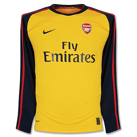
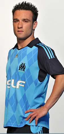
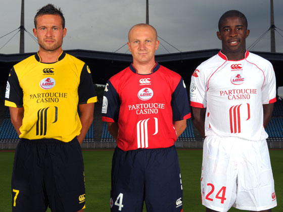
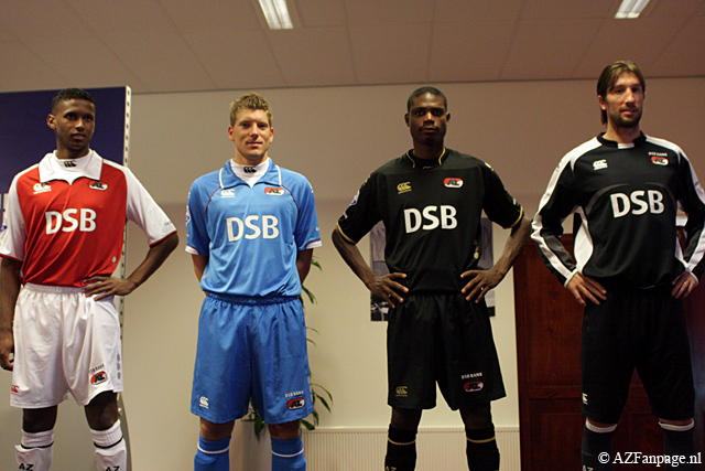
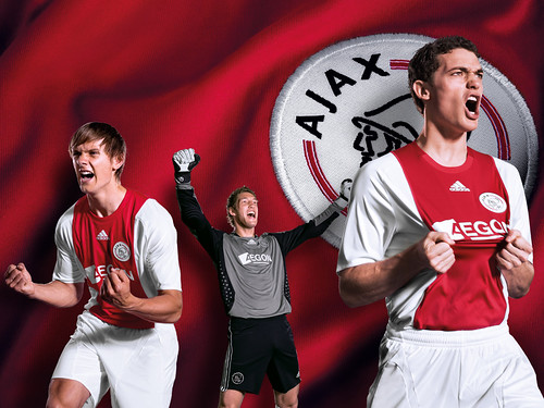
Let's start with the bad. I really don't like Arsenal's new home kit. Arsenal belong in all–white sleeves, period. That's my main gripe about the shirt. On the other hand, their away shirt is quite spiffy. Manchester United's new designs are so boring to me that I won't even link to them. I will give them credit though for not changing their home kit from last season's. I can't seem to get my head around Marseille's new away kit. Is it a breakthrough in football fashion or is it a horror show? I am leaning towards the latter. I think the argyle pattern might have worked if the colors were a bit more subdued. Honestly, can Lille's shirt sponsor be any bigger? Ligue 1 must be in major financial difficulty if French clubs are whoring out their shirts like this. It's been said in these pages before, that is no longer a football shirt. It is a racing shirt. AZ Alkmaar will be wearing collars reminiscent of 1890's football clubs. Big change at Ajax, where ABN–AMRO's familiar vertical advert has been supplanted by something called Aegon. I usually do not mourn the changing of a shirt sponsor, but c'mon. Ajax and that ad went hand in hand. 
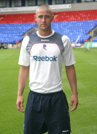
But the hands–down worst kit of the season has to go to Bolton Wanderers and this horrible Reebok outfit. That looks like a third–rate club's training shirt! Are they for real? Who looked at the prototype of that kit and said "Hey, that's nice. Let's go with that." ?
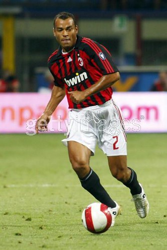
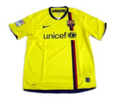
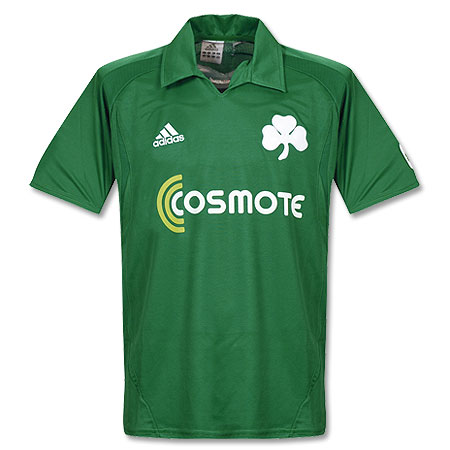
Now on to the good stuff: AC Milan restored order to their world by coming out with a fresh update to their timeless kit. A big improvement over last year's shirt. There was a lot of hubub over Barcelona's ditching of their famous stripes, but I say relax, people. That new home kit is splendid and evocative of their centenary shirt from back in the 1998 season. The away kit is also quite nice. Too bad they will continue to use their teal ensemble as their 3rd kit.  Let's hope there are not too many occasions for that. Athletico Madrid went back to wearing blue shorts with their home kit, and the results speak for themselves. That is one of the best kits in the world. I thought  Borussia Dortmund's home shirt was also a fresh take on a classic style. Those pinstripes just scream of the '80's to me. I like their away kit as well, but unfortunately it is ruined by that loud, diagonal sponsor. A couple of minimalist designs that I really like: Sporting Lisbon's away and Panathinaikos' home. I love that huge clover leaf on the shirt, reminds me of something out of the turn of the 20th century. Call me crazy but I like this design from Sevilla(one of their dozens of kits).
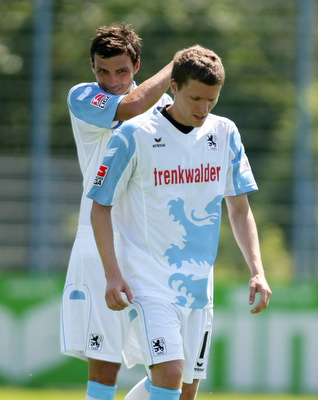
But my favorite kit of the new season: 1860 Munich. Here is a better view. I just love that design, it's fun and the color scheme ensures that it is not too tacky. This jersey would be absolutely perfect if they had Löwenbräu as the shirt sponsor(they used to back in the day).

Thursday, September 11, 2008

Best of the Strange Kits: Shimizu S–Pulse

Submitted here for you is Japanese Club Shimizu S–Pulse. I can't tell you much about Japanese football, but I can say that S–Pulse have a unique kit. There is usually some variation on the globe motif, perhaps because the club's shirt sponsor is Japan Airlines. This is the kind of kit that I admire in secret. I actually like the design but could never bring myself to wear it in public. Of course if I was a supporter, it would probably be a different story.

Update: My schedule's been pretty hectic lately, severely limiting my ability to post on a frequent basis. My apologies to those of you that been expecting our critique of the new kits released for the 08/08 season. Rest assured, the article is almost finished and will be published soon.

Friday, August 1, 2008

Best of the Strange Kits: Denmark '86

This interesting kit for the Danish National Team was made by Hummel for the 1986 World Cup. Denmark had a great opening round in this tournament, with famous wins over West Germany and Uruguay, who they beat 6–1. I was a young boy watching this tournament and I was mesmerized by the Danes' fantastic team play. They had some great players like Michael Laudrup, Preben Elkjaer, and Søren Lerby. I thought the Danes might be the heirs of total football.
I remember thinking at the time that the Danes kits looked like no other teams' in the tournament. I thought they looked so futuristic compared to the fairly simple designs of the other nations.
Unfortunately for the Danes, their good start in the tournament didn't carry over to the knock–out stage, where they were eliminated in the round of 16 by Spain.