Monday, November 26, 2007

You Could Set Your Calendar to This...


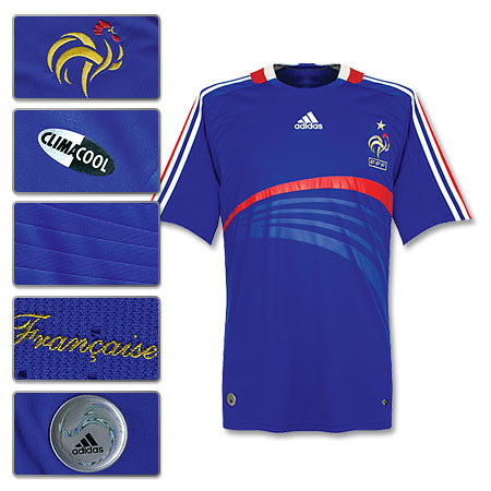
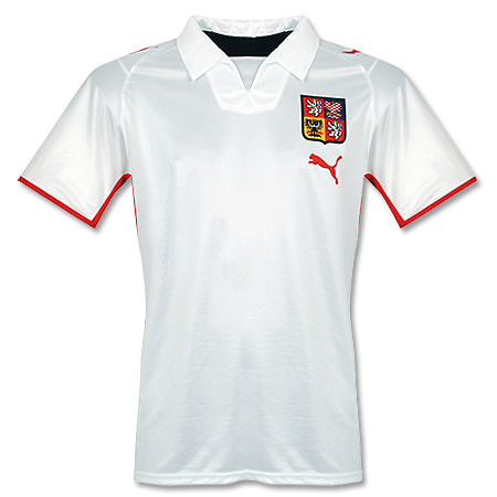
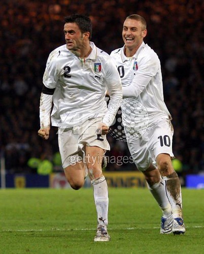
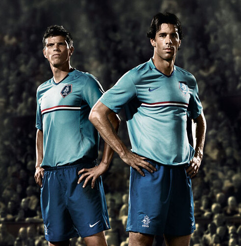
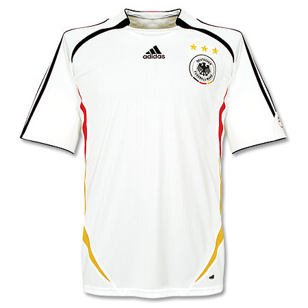
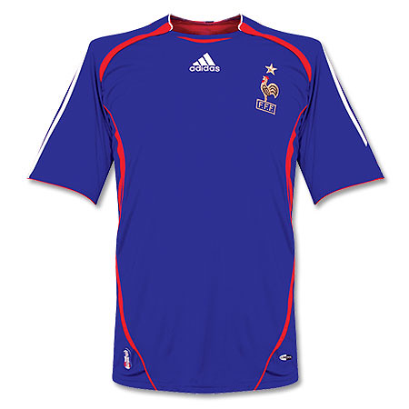
It is that time in the football kit cycle, when just before a major competition (in this case, Euro 2008), national sides introduce their new kits that they will wear for the next couple of years. There have been a whole slew of new national team shirts that have been released over the past few weeks. Many of them debuted during the last round of Euro qualifiers. Here are some of the highlights:

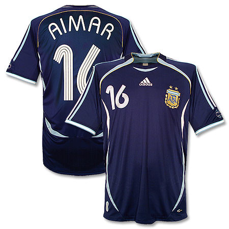
Adidas released new shirts for Germany and France, and I have to say both of them are quite nice. Looks like someone at Adidas was listening when we told them to ditch the boring templates. I especially like how the main design accents on the shirts reflect the respective cultures. The German design is rigid, with a lot of straight lines and seems to evoke the concept of moving forward together. Meanwhile, the French design is more artsy and the design seems to be splitting off in different directions. Sounds like France to me. Adidas also released a new shirt for Argentina, which is pretty basic and classic. Argentina almost always has a boss shirt.

Puma also released a bunch of new away shirts, for Austria, Czech, and others. Sad to see that Puma have adopted the former strategy of their German brethren Adidas with that template. It's pretty boring and lazy if you ask me. One exception is Italy's new away shirt, which I dig, except for that whacked–out font(you can't really tell from the photo, but trust me, it sucks–especially the lettering).

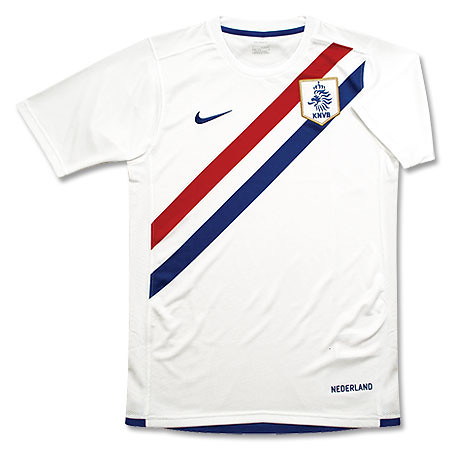
Nike also released some shirts, notably Brazil's new home and Holland's new away. Brazil's new shirt doesn't really do anything for me, but that new Holland away is really nice. It was always going to be tough to duplicate the success of Holland's previous away shirt, which was absolutely gorgeous. But Nike have done a pretty good job here.

All in all, it is a pretty successful period of kit releases as there was nothing absolutely horrible released, and we are heartened by Adidas' apparent ditching of the templates. Bravo.


footballkitblogupdate: looks like despite coach Hugo Sanchez's rantings about changing Mexico's home shirt from green to white, el tri will still be decked in green most of the time. They just released the new home shirt, and it is green. I wonder what that will do to Hugo's ego.

Wednesday, October 3, 2007

Blacked Out


I was looking at this image of last night's Champions League match between Glasgow Rangers and Olympique Lyon in Lyon when I noticed that Rangers usual "Carling" advertisement had been blacked out. I was very curious about this but I was too tired and lazy to look into it. Well, thanks to the fantastic uniwatch blog I now know why this was done. It turns out that advertising for alcohol on football shirts is banned in France, so that's why Rangers had to black out Carling, which I believe is a beer. Ahh, the French.
If you ask me, it would have looked better just to leave the logo off completely for this match instead of having a big black rectangle on the front of your shirt.

Saturday, September 22, 2007

Someone Should Get Fired For This

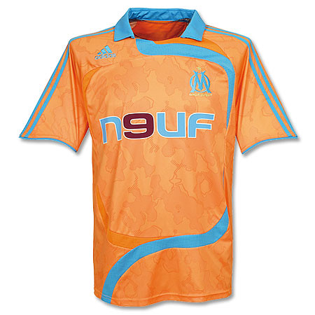
Very interesting and bush league development in a French Ligue 1 clash between Marseille and Auxerre last night. Apparently the change strip that Marseille brought with them(they were away) was too similar to Auxerre's home design. So match officilas ruled that Marseille had to wear Auxerre's away top. What a complete fiasco if you ask me. More pictures here and here.

Cuauhtémoc en Blanco

So according to this article the Mexican national team is going to switch their home jersey from green to white. The change is being made by Mexican coach/legend Hugo Sanchez, who says that the green shirts blend in too well with the pitch and therefore the players cannot pick each other out as well. In fact, Sanchez is going to do away with the green shirts altogether and introduce an all-red kit as the away. This is the first time I can think of that an established national team is going to change the primary color of their home shirt. Mexico has been using green shirts forever, so this is really a bold move. On a purely aesthetic level, I believe the change is great because an all-white kit will always look better than a green one. This is yet another sign that Mexico is an up and coming nation among the soccer powers.

Tuesday, September 4, 2007

Different Day, Different Kit


It's common nowadays for clubs to have a 3rd kit. The 3rd kit is a kit that is used when neither the home or away are used. Some teams even have a 4th kit. But what is going on at Sevilla FC has to be unprecedented.


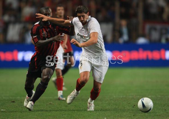
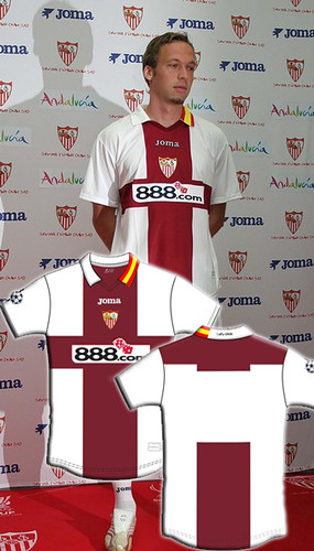
Last week we showed you Sevilla's new home, away, and 3rd kits for the 06/07 season. All well and dandy but on Friday I watched Sevilla play my beloved AC Milan in the European Super Cup. Sevilla wore a kit that is none of those previous kits. It's similar to the home in that it has all-white shirt and shorts, but other design elements are completely different.OK so that is the 4th kit. Then on the following Monday, Sevilla wore this against AEK Athens in the Champions League. So if you are keeping score at home, that is at least 5 different kits they will wear this season. Who knows, maybe they will wear yet another kit in their next match.


Actually, Maybe they will. After a little digging around I discovered that these two shirts are what Sevilla calls their "previa Champions" kits, meaning pre-Champions. I guess they are only going to be worn during the qualifying round of the Champions League, but who knows. What is for sure is that makes a total of 6 kits.


The kit they wore in the Super Cup was a one-off special edition for that event. It just shows you the difference in pedigree between Milan and Sevilla that Sevilla would get a special kit made just for the occasion. I could understand if there was a conflict between Milan' shirts and all of Sevilla's kits, but that is not the case here. It's almost as if Sevilla is celebrating just being there while Milan is there to take care of business. This one-off kit stuff is not new for Sevilla, they did the same thing for last year's UEFA Cup final. It's all a bit much for me.


That being said, the Super Cup kit is my favorite of the lot, with the all-black number running a close second. In fact, all the designs are pretty good except for the awful, vomit-inducing fuischia outfit. I've said it before pink is not necessarily bad, but that shade of pink belongs nowhere on any sporting field.

Saturday, September 1, 2007


Very Nice Tribute in Today's European Super Cup final between AC Mian and Sevilla FC. All the players on both teams wore the name "PUERTA" in honor of Sevilla's Antonio Puerta, who passed away this week after collapsing on the pitch. Milan won the match 3-1.

Friday, August 31, 2007

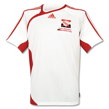
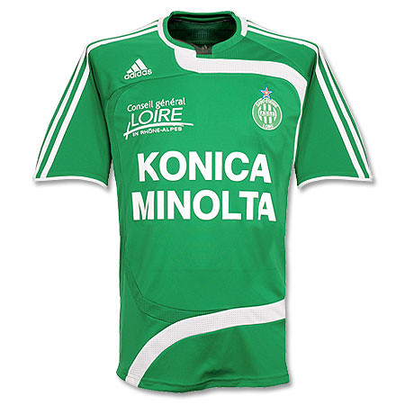
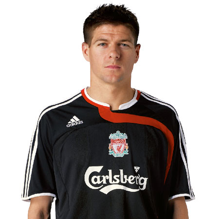
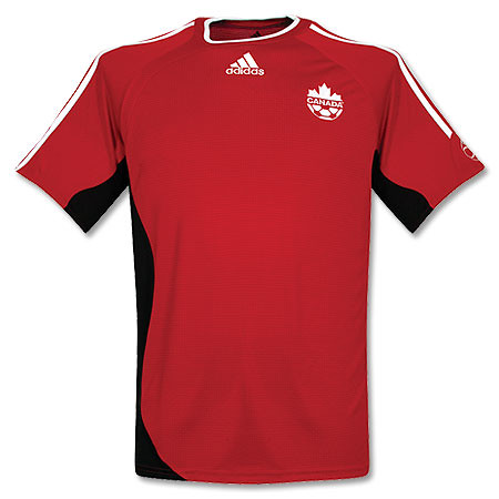
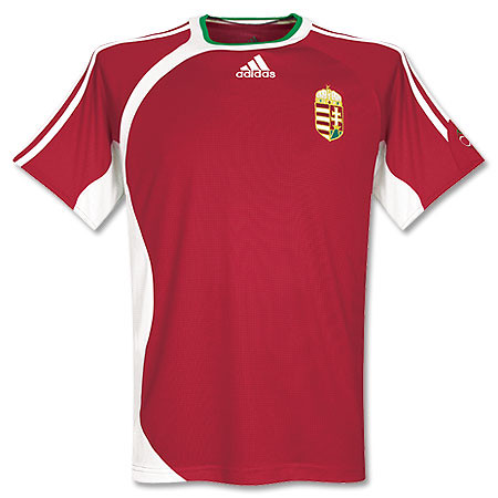
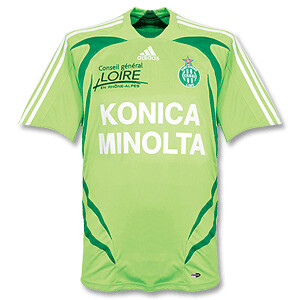
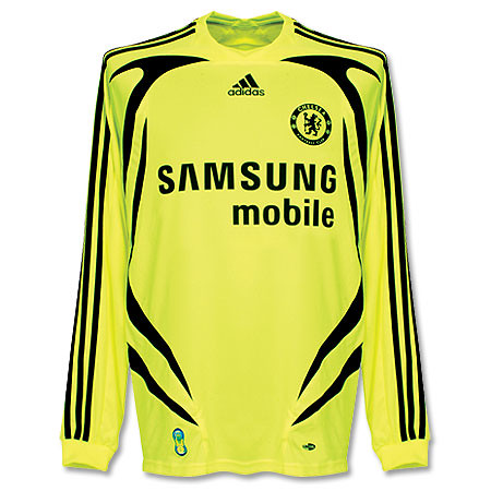
Adidas Is Ruining Football

Adidas has been ruining the game from an aesthetic point of view. I know they have been a pioneer in football kit design for many years, but recently they have been coming out with some awful designs. Then they exacerbate the problem by using these crappy designs as templates that they use for many different teams around the world. Let's be honest a lot of these shirts look like training shirts. I mean it's friggin' ridiculous. They are taking all these football federations and clubs for granted. I mean some kid at Parson's could come up with something better than this crap. Say what you want about Nike, they were innovative this past world cup by ditching the templates and giving each team their own identity. The other major kit manufacturer is using templates. Templates, templates, templates. It's like if you are an Adidas-supplied team, you're getting one of 3 templates and maybe if you're lucky they'll embellish it a little bit. If you agree with me, leave a comment and hopefully someone at Adidas will read this and get the message. You are dressing some of the greatest teams in all of sport. Give them their own individuality. And not every single shirt has to have those damn stripes running down the sleeves. And if you do have to put the stripes on there, they don't always have to be contrasting. I've seen regular Adidas gear where the stripes are not contrasting and that looks pretty cool. Sometimes the best type of branding and marketing can be subtle.