


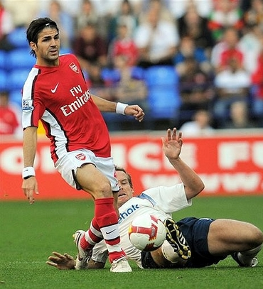
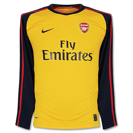
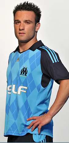
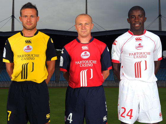
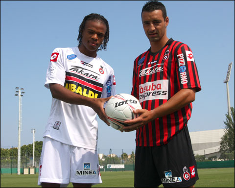
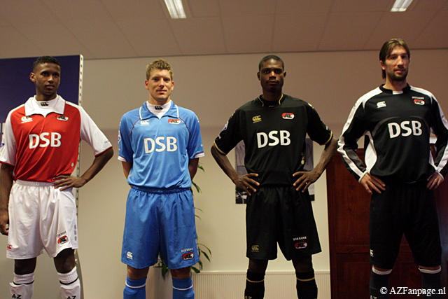
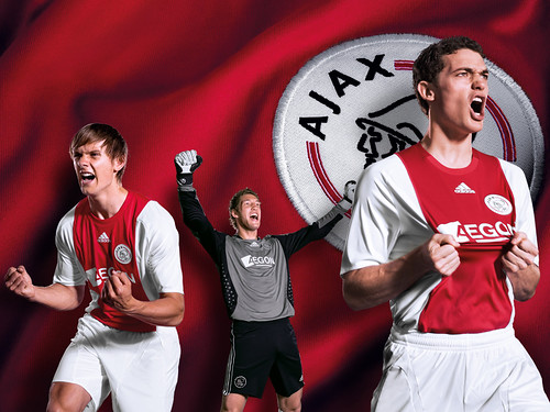
Let's start with the bad. I really don't like Arsenal's new home kit. Arsenal belong in all–white sleeves, period. That's my main gripe about the shirt. On the other hand, their away shirt is quite spiffy. Manchester United's new designs are so boring to me that I won't even link to them. I will give them credit though for not changing their home kit from last season's. I can't seem to get my head around Marseille's new away kit. Is it a breakthrough in football fashion or is it a horror show? I am leaning towards the latter. I think the argyle pattern might have worked if the colors were a bit more subdued. Honestly, can Lille's shirt sponsor be any bigger? Ligue 1 must be in major financial difficulty if French clubs are whoring out their shirts like this. It's been said in these pages before, that is no longer a football shirt. It is a racing shirt. AZ Alkmaar will be wearing collars reminiscent of 1890's football clubs. Big change at Ajax, where ABN–AMRO's familiar vertical advert has been supplanted by something called Aegon. I usually do not mourn the changing of a shirt sponsor, but c'mon. Ajax and that ad went hand in hand.
But the hands–down worst kit of the season has to go to Bolton Wanderers and this horrible Reebok outfit. That looks like a third–rate club's training shirt! Are they for real? Who looked at the prototype of that kit and said "Hey, that's nice. Let's go with that." ?
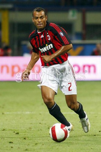
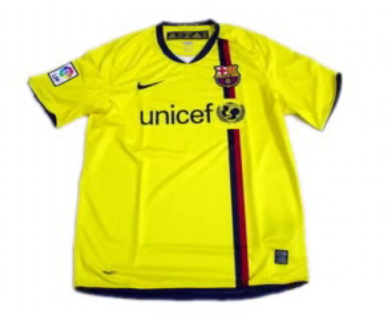
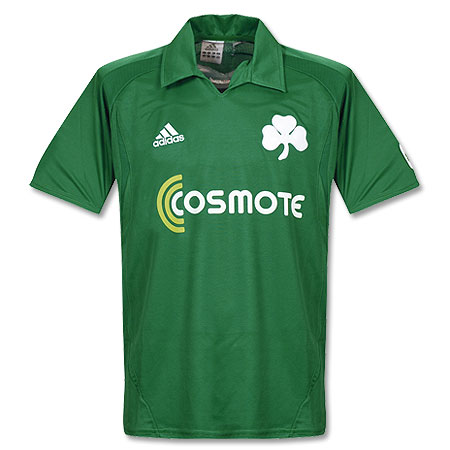
Now on to the good stuff: AC Milan restored order to their world by coming out with a fresh update to their timeless kit. A big improvement over last year's shirt. There was a lot of hubub over Barcelona's ditching of their famous stripes, but I say relax, people. That new home kit is splendid and evocative of their centenary shirt from back in the 1998 season. The away kit is also quite nice. Too bad they will continue to use their teal ensemble as their 3rd kit. Let's hope there are not too many occasions for that. Athletico Madrid went back to wearing blue shorts with their home kit, and the results speak for themselves. That is one of the best kits in the world. I thought Borussia Dortmund's home shirt was also a fresh take on a classic style. Those pinstripes just scream of the '80's to me. I like their away kit as well, but unfortunately it is ruined by that loud, diagonal sponsor. A couple of minimalist designs that I really like: Sporting Lisbon's away and Panathinaikos' home. I love that huge clover leaf on the shirt, reminds me of something out of the turn of the 20th century. Call me crazy but I like this design from Sevilla(one of their dozens of kits).
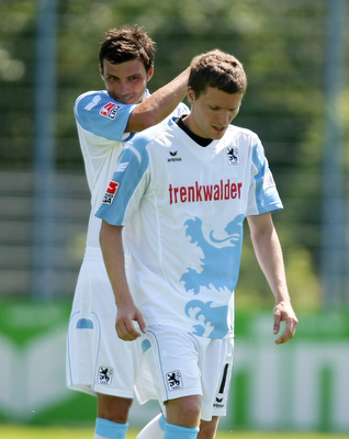
But my favorite kit of the new season: 1860 Munich. Here is a better view. I just love that design, it's fun and the color scheme ensures that it is not too tacky. This jersey would be absolutely perfect if they had Löwenbräu as the shirt sponsor(they used to back in the day).