Wednesday, May 21, 2008

Heaven for the Red Devils


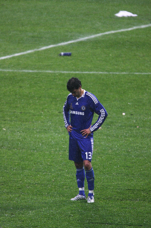
Congratulations to Manchester United for their victory in tonight's UEFA Champion's League Final. Football-wise it was a thrilling match, a very testy affair. There were many underlying dramas leading into this game and upon the start of the match a couple of other dramas were introduced. The rain and the condition of the newly installed grass field at Luzhniki Stadium were big factors in the game. The pitch tonight was a disgrace. UEFA must takes steps to make sure the fiasco that occurred today never happens again. The players were slipping all over the place and it wasn't just because of the rain. There were also many more players cramping up than usual and those lads all risked being injured on that poor excuse for a pitch. How can a stadium be a "UEFA 5 star" stadium and not have a proper natural grass pitch?

I actually thought Chelsea was the better team on the night but as we all know the penalty spot definition can be a lottery. So it's United who walk away with the trophy. Onto some of the kit analysis:

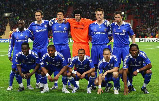
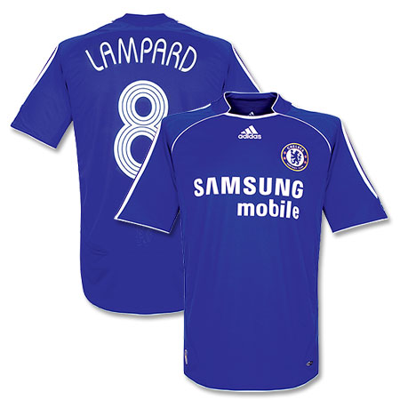
United came out in their red shirts, white shorts & socks look, I thought they might go with black socks since Chelsea usually wears white socks. Instead, Chelsea came out in an all–blue number right down to the socks. I still think they could have waited to introduce their new kit until after the final, but that being said that new Chelsea home kit is splendid. United's kit is nice too, although I think that "AIG" ad looks a bit, well, awkward. Chelsea were also sporting some new name and number font on the back of their jerseys. I tried to make out what the little logo was on the bottom of each digit, I think it was the Champions League logo. Could this be some new Champions League font? In last week's UEFA Cup final both Rangers and Zenit came out wearing the same font on the back of their jerseys with the UEFA Cup logo on the bottom. Maybe this is the direction UEFA is going in for the next season, making clubs wear standardized names & numbers in continental competitions. United were still wearing their Nike names & numbers.

According to this story, Chelsea goalie Petr Cech had a new kit designed for this final, a fluorescent orange number that he believes will trick players subconsciously to shoot right at him. It didn't seem to work too well, as Cech was only able to save 1 of United's 7 penalty shots.

Hat Tip: Football Shirts News

Thursday, May 15, 2008

Chelsea FC: Tempting Fate?


I am somewhat superstitious. I know football supporters are a fairly superstitious lot as well. That is why my eyebrows were raised when I caught wind of this: Chelsea FC is planning on wearing their 08/09 shirt in next week's Champions League Final against Manchester United.

Chelsea have been wearing this shirt (06/08) for the past two campaigns. Last weekend in a vital Premier League match against Bolton Wanderers Chelsea debuted their new kit which they will be wearing in the upcoming season(Chelsea ended up drawing 1–1 with Bolton). Debuting new kits during the final matches of the season has become somewhat of a tradition, especially in England. Here's my beef: Chelsea have had such a gritty campaign coming back from a lot of adversity. All along the way they did it wearing this shirt. Now, on the eve of the biggest match in Chelsea FC history they are going to wear a kit different from the one that got them there? Sounds like a bad omen to me. I had been leaning towards Chelsea winning the match in Moscow, but now I am not so sure. United will be wearing the kit they have worn all season. If I was a Chelsea supporter, I would be raising hell over this.

I would love to hear from Chelsea supporters. What do you say? Am I making too big a deal out of this? Or is there something to this?

Friday, May 9, 2008

Greatest Hits

If you're new to the blog I thought I'd save you the trouble of scanning through the archives for the best content. These are my favorite posts thus far (in chronological order) :

1. An Open Letter to the Premier League

2. Is This Football or Racing?

3. Adidas Is Ruining Football

4. A Bad Gamble

5. The Poll

Tuesday, May 6, 2008

New Liverpool 08/09 Shirt Makes its Debut


Liverpool debuted their new shirt for the 08/08 campaign in this past weekend's Premiership match against Manchester City. This kit replaces their 06/08 kit which was Liverpool's first Adidas kit in ages.
Some analysis:
The main differences between the old and the new kit are the lack of a collar and piping on the new shirt. The old kit had both. I personally like this new version of the iconic Liverpool shirt but I do have one gripe: that collar is a little weird. The way it juts out like that I think is a case of over–thinking. A simple white trim along the collar would have been so much nicer.

Btw that City kit is pretty sweet...

Saturday, May 3, 2008

I *&^%@# Hate Broken Links


I, like many of you hate broken links. That's why I'm so frustrated with myself for linking back to sites like yahoo sports in some recent posts. I should have known better. No more broken links here. As for those links already broken, I will try to go back and fix them when I get some time.

Thursday, May 1, 2008

The Best Looking Rivalry


This weekend there will be yet another edition of the Argentine Super-clasico between River Plate and Boca Juniors. This is a great time to talk about the aesthetic aspect of this rivalry, which we believe to be the best–dressed rivalry in all of world football. First off, both teams can wear their home kits when they play each other, which is critical. Second, no other rivalry has such a great combination of uniforms.

With all due respect to my beloved AC Milan, I've never though that vertically striped shirts where particularly impressive. The one striped shirt that I think is absolutely gorgeous is Argentina's national team kit. That means that the big Italian rivalries(except maybe Roma–Lazio) are not that great visually to me. Real–Barça looks pretty good. England has a few great visual rivalries, like Arsenal–Spurs and Man U.–Man City. I also like Celtic–Rangers from Scotland and PSG–Marseille from France. But the cream of the crop is definitely River–Boca. River with their distinctive white shirt with red diagonal sash. They usually wear black shorts with their home kit, but this season I have been noticing them wearing white shorts a lot. Boca has an equally distinctive kit, I know of no other club in the world that sports that blue shirt with the horizontal yellow band.

As far as club teams go, who do you think are the best dressed rivalries? I smell another poll coming on. If you vote Other, tell us in the comments what you think is the best–dressed rivalry.