Friday, April 25, 2008

Digging in the Vaults: Arsenal away kit 2002/2003


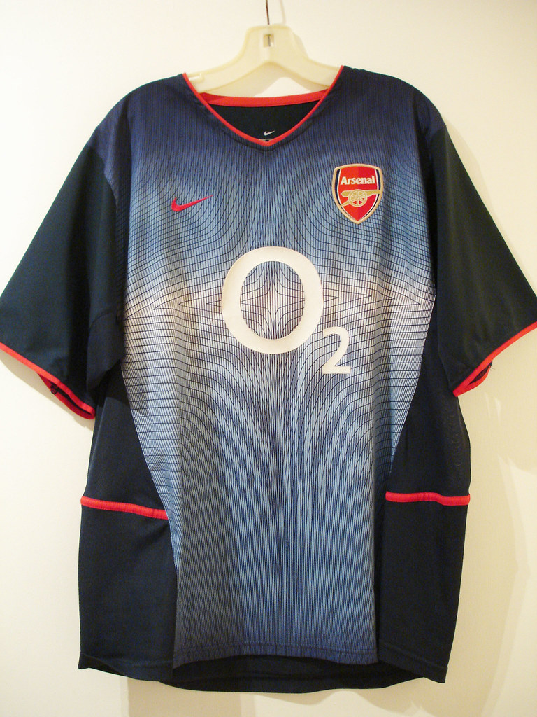
This shirt was part of an all–navy away strip Arsenal wore in the 2003/2003 season. Made by Nike, this was a very innovative shirt in many ways.
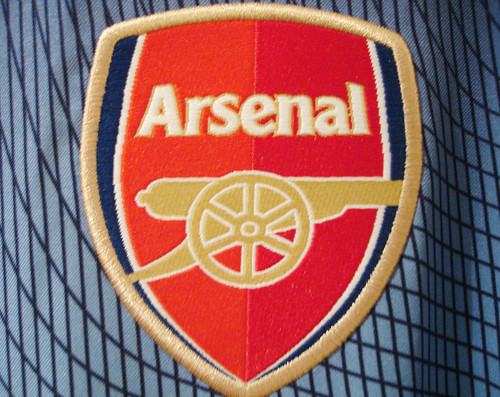
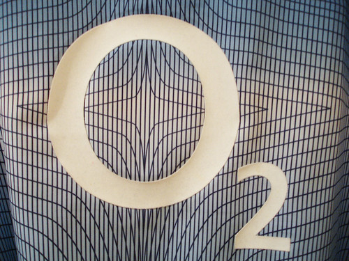
This was the season Arsenal introduced their new crest. The new crest was panned by some Gooner traditionalists, but I feel that the new design is classy enough and it brought the crest into the 21st century. Actually, now that you look at the old crest vs the new, you wonder why no one had thought of doing that any sooner. Then, there was the geometric fade pattern, another controversial design element that I actually like very much. One thing I especially like about the pattern is it makes the shirt match perfectly with my pair of hyper blue Air Max Plus. The O2 logo is simple enough and it actually works well with the pattern. The astroid in the middle of the pattern is also right in the center of the O, creating a target effect. Can you picture Thierry Henry running at you in this shirt? He must have looked like a super–hero. The shirt must have brought some degree of luck, as Arsenal won the F.A. Cup in '03, beating Man. United in this strip along the way.
Finally, this shirt was part of those dual layer "cool–motion" shirts that were so problematic during the 2002 World Cup. During the normal shirt–pulling that occurs during any soccer match, the layers would rip apart, forcing the player to have to change his shirt. Then it would take the player an eternity to remove the tangled mess of a shirt to change into a new one. This happened a few times during that world cup, it was absolutely maddening. Someone dropped the ball there big–time. Fortunately, I don't have anyone tugging at my shirt when I wear it so this is not an issue for me.
As a side note, this same template was used for Leeds United's away shirt that same season.
I happen to think the dual layer issue aside, this is one of Arsenal's best–ever away kits, and it must have been somewhat popular as it was also used as the 3rd strip in the 2003/2004 campaign. It holds a special place in my collection.

Monday, April 21, 2008

Raffle Winner

Congratulations to Patricia W. from Michigan, who won our first ever Football Kit Blog Raffle. Patricia wins the Adidas originals Peru home shirt that we were giving away. Patricia, you should be receiving the shirt in the coming days. Thanks to everyone that entered and keep an eye out for other great promotions in the future.

Friday, April 18, 2008

Toronto FC Kit: The Best of M.L.S. in 2008


Looking over the league's crop of new uniforms, what strikes me is the dullness of all the team's jerseys looking essentially the same just in different colors. All 14 M.L.S. clubs are outfitted by German sportswear giants adidas, and their famous/infamous three stripes. I personally like the stripes but I wonder if it's really necessary for adidas to put them on the sleeves of every single shirt. Some shirts would just look better without the 3 stripes.

Some other random observations:

The Red Bulls do not make sense to me. First, they go ahead and make their home shirt white. Huh? I thought it was Red Bulls, not White Bulls. Then, they make navy blue their away color, meaning they don't have a red shirt at all! I want to root for this team so badly, and I do, but c'mon. Someone get with the program over there. And tone down the size of that huge advertisement on your shirt. Don't they understand that they would sell so many more of those Angel and Altidore jerseys if that ad was just a little smaller? In fact, they should just put the "Red Bull" typeface right on the front, like a normal club. That would be so much more legit. The Clashing Bull logo is already on the crest. Which brings me to that. Why is the logo two red bulls clashing with each other? Shouldn't they be teammates? I know that's the logo on a regular can of Red Bull but couldn't they have put some effort and thought onto this? Just one bull in the crest would have been so much better. There, Red Bulls. That'll be $20,000.

The Galaxy re–branding was pretty lame. Their logo is decent, but they should have gone with navy blue instead of all–white as their home shirt. Don't give me that "Oh, it's summer and it's really hot in L.A., so white is the smart choice" b.s. Most M.L.S. games are at night and the season starts in April when it's still not that hot. Besides, during day matches where it's really hot, they could have always switched to the white kit. I just think this was a lame attempt to keep up the Beckham/Real Madrid continuity in order to sell more jerseys worldwide. Pfeh.

One place I actually miss the 3 stripes is on DC United. Adidas has been outfitting them since their inception and those 3 horizontal stripes across the chest where there forever. It's a little bizarre that adidas would remove them after all these years.

Colorado's jerseys are actually quite nice. They've got that whole Aston Villa/West Ham vibe. They would qualify as my 2nd favorite M.L.S. kit design. My favorite would have to be...
Toronto F.C. Last year's expansion team really has the league's best kit. Mainly because of the seldom used but gorgeous red and gray color scheme. I also think that the template used for the kits is one of the nicer ones adidas currently has on offer. I may be in the minority on this, but the gray away shirt is a thing of beauty too. I just wish it was paired with a black or gray short.

Note: Time is quickly running out on our first ever raffle. Don't forget to mail your entry to footballkitblog@gmail.com before 12:00 noon this coming Sunday, April 20th. Anyone that sends an email before then to the above address with the subject line "Raffle" will be entered in the drawing. Limit 3 entries per person please. The winner will be announced on Monday, April 21st. Full details here.Good luck everyone.

Tuesday, April 15, 2008

New Barcelona Away Shirt 2008/2009


This is the time of year that images on kits for the upcoming season get leaked onto the web. We here at FKB like to keep up with the comings and goings, and today we have a leak of the 08/09 Barcelona away shirt. Now, there is always the possibility that this is a fake meant to throw off the crowd, but my hunch is it's legit and as you saw with the latest USMNT Away shirt release, we were pretty spot–on. I actually like this very much, and actually drool at the prospect of how this shirt would look if it was released a few years back, before Barça had their new agreement with UNICEF. How sweet would this shirt look without any sponsor logo? My guess is very. When compared to Barça's current away shirt, we believe this one is much better. I do like the club's current 3rd all–orange strip, which will probably be mothballed next season as they have already used it for two seasons.

Barcelona is one of the world's great super–clubs, one of their team mottos is actually "More than a Club." Along with their success on the pitch they have also achieved sartorial excellence almost every time they have taken the field. Nike has been making the club's shirt since the late 90's, and I have to say they have done a great job outfitting the Catalans. Some of my personal favorite's include this, this, this, this, and this. A couple of exceptions would be this and this. Of course I can't stress enough that all these designs that I like so much probably look a lot better to me because there is no advertising on them.

P.S. Don't forget about our first–ever raffle...

Saturday, April 12, 2008

Raffle Time


Today folks is the first ever Football Kit Blog raffle. I was doing some spring cleaning and I need to get rid of some stuff. In that stuff was this lovely Adidas originals Peru home shirt. It is size large. It is not brand–new, I acquired it a couple of years back and have never worn it. It is in very good condition. There are just some a few small nicks right below the red sash on the front. What better way to part with it than to raffle it off to my fellow football kit enthusiasts? The shirt is white with a red diagonal sash on both the front and back. F.P.F. crest on the right side, adidas trefoil logo on the left. "Peru 10" on the back. Adidas 3 stripes in red along both sleeves.

The 1978 World Cup was perhaps both the all–time high and all–time low for Peruvian football. High for the outstanding play of Teofilo Cubillas(who wore #10), who was tied for second–highest goal–scorer of the tournament, and also for finishing first in a group that included Scotland and the Netherlands. Low because of the allegations of Peru taking a dive in their last game against the home nation Argentina. The Peruvians lost 6–0, helping Argentina get to the final on goal differential at the expense of Brazil. I've watched that match and I have to say it does look a little suspicious.

Anyways, the raffle is open to anyone that sends an email with the subject line "Raffle" to footballkitblog@gmail.com by 12:00 noon Eastern Standard Time on Sunday, April 20th, 2008. I'll accept up to 3 entries per person. International participants welcome. The winner will be announced on Monday, April 21st and the shirt will be shipped out shortly thereafter. Good luck to everyone.

Monday, April 7, 2008

A Tiff With Toffs


I think Toffs is a great site and store for the die-hard football fan. They sell retro shirts for almost every big club you can think of, and even some very obscure ones. But one beef that I have is that their website is not up to par. The navigation on the site is tolerable, but take a look at some of these pictures. How am I supposed to decide to buy something based off of that?

Like I said, they have some great shirts on the site, but I've got to be able to get a better look at the merchandise. I probably would have bought a shirt or two from Toffs already had it not been for this issue.